The Complete History of the Pepsi Logo: 130+ Years of Reinvention
Most brands settle on a logo and stick with it for decades. Pepsi has never worked that way, rebuilding its mark more than a dozen times since 1898. Each change traces back to something concrete, whether that was a merger, a rival’s misstep, or a shift in how people saw the brand.
If you’re curious about logo design, Pepsi’s history is a good place to look, since almost every version was a direct reaction to events of the time.
This is the story of how that happened, told one logo at a time.
The Pepsi logo timeline
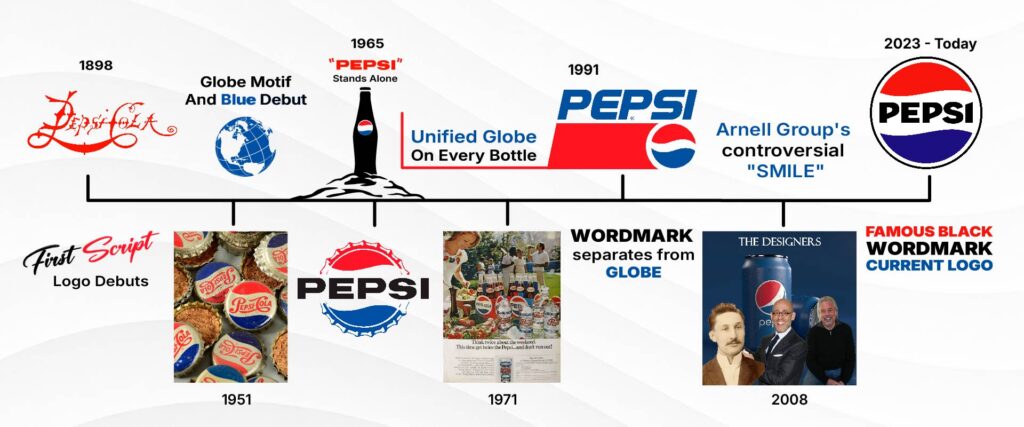
Pepsi has redesigned its logo more than a dozen times since 1898, and each version tells you something about what the brand was chasing at that moment. Some changes were small type adjustments, while others reshaped the entire mark from the ground up.
Here is how the logo moved from a handwritten drugstore sign to the globe we know today:
1893: Brad’s Drink, no logo yet
New Bern, North Carolina, 1893. Behind the counter of a small drugstore, pharmacist Caleb Bradham was mixing carbonated water with sugar, vanilla, and kola nut extract for customers looking for a pick-me-up. He called it Brad’s Drink, and since it existed only in his own pharmacy, it never needed a logo.
1898: Pepsi-Cola’s first script
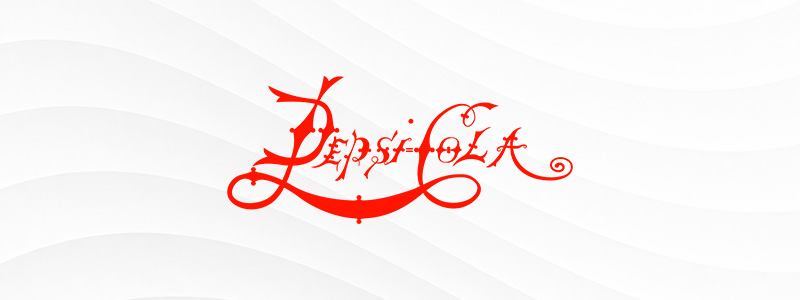
On August 28, 1898, Bradham renamed his drink Pepsi-Cola, a nod to its pepsin content, and began distributing it beyond his own store. That name change also forced the first real logo into existence, a red script wordmark that debuted that same year.
1903 to 1906: The script keeps shifting
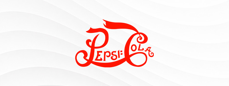
The script kept changing almost yearly right after launch, with new versions rolling out in 1903, 1904, 1905, and 1906. A trademark for the 1905 version was officially filed that year, even though little material from that exact period survives beyond the filing itself.
1934: The script finally settles down
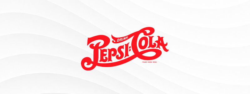
By 1934, the lettering had stabilized into a cleaner, more consistent script, right as Pepsi was recovering from two separate bankruptcies. That same year, the company started selling a 12-ounce bottle for a nickel, a pricing move that helped turn its fortunes around during the Great Depression.
1951: A refined script

In August 1951, Pepsi made its first major change to the script in 45 years, sharpening the lettering while keeping the same overall style. This version kept running in some advertising until 1962, even after a very different logo started appearing elsewhere.
At the same time, Pepsi rolled out a second logo: a red-and-white bottle cap design with a blue swirl running through the middle. This was the first appearance of the globe motif that would eventually define the entire brand, though at launch it was only used alongside the script rather than replacing it.
1962: A modern sans-serif cap

In 1962, the bottle cap logo adopted a cleaner, more modern sans-serif typeface, dropping the softer lettering it had launched with in 1951. This update landed right as Pepsi was rethinking how it wanted its name to look in print, setting up a bigger change just three years later.
1965: “Pepsi” stands alone

In 1965, designer Jerome Gould created a logo that used the word “Pepsi” on its own, without “Cola” attached. This was the first time the single word “Pepsi” served as its own trademark, a shift that aligned with the brand’s new pitch to a younger generation.
1969: A quiet test run

A modernized take on the swirl logo appeared in 1969, tested mainly in advertisements and on cartons rather than rolled out everywhere at once. At the time, bottles were still a patchwork of the older serif wordmark and the 1951 script, so the brand was clearly hunting for a unified look it could fully commit to.
1971: The globe takes over everywhere

That search ended in February 1971, when designer Frank B. Rupp led a full redesign that replaced every older script and serif version across all Pepsi bottles. This is the version most people still picture when someone says “classic Pepsi logo,” and it held that position for fifteen years.
The Pepsi Challenge launched in 1975 during this same stretch, putting Coke and Pepsi side by side in blind taste tests broadcast across the country.
1987: A new typeface for the globe

Pepsi redesigned its logo again in 1987, modernizing the fifteen-year-old primary logo to use Handel Gothic, a geometric sans-serif that replaced the older, rougher type style. The update also coincided with Pepsi’s fiercest years of competition with Coca-Cola, fueled by celebrity campaigns featuring stars like Michael Jackson.
1991: Wordmark and globe go their separate ways
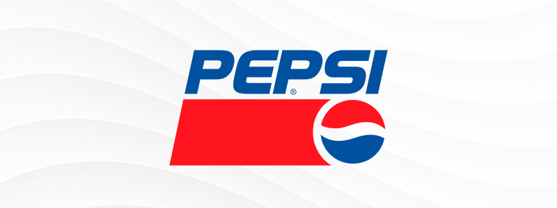
On September 22, 1991, design firm Peterson and Blyth Associates introduced a logo that broke a rule Pepsi had followed since the very first swirl design.
For the first time, the word “Pepsi” appeared completely apart from the globe, rather than nested between the swirls, set in italics meant to suggest speed and excitement. The white line separating the red and blue sections was also thinned out for a cleaner, more graphic look.
1996: Project Blue goes international
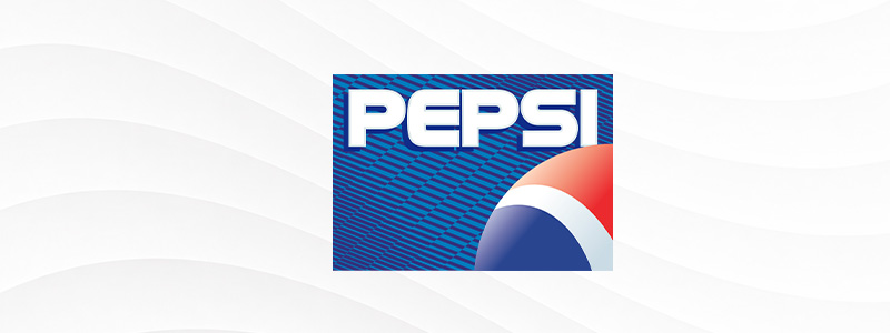
In April 1996, Pepsi launched something called Project Blue across several international markets, working with design firm Landor Associates on a Handel Gothic update. The rollout came with genuinely wild publicity stunts, including an Air France Concorde jet repainted blue and a banner flown on the Mir space station.
1997: The Worldwide Pepsi Globe
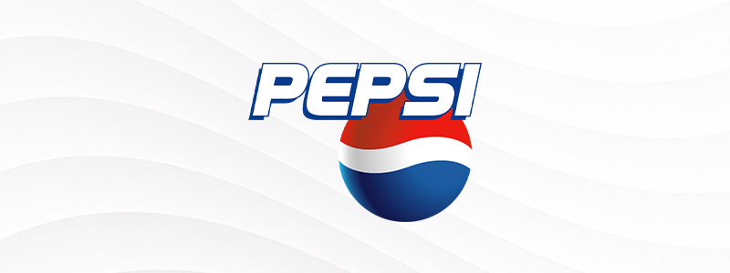
A related design went worldwide in June 1997, a year ahead of Pepsi’s hundredth anniversary. This is the point at which people began calling the symbol the Pepsi Globe, and the name stuck well enough that it remains the term most people use to describe the brand’s core mark today.
2003: Block letters and a 3D ball

On February 4, 2003, Pepsi introduced a more modern block letter typeface alongside a version of the globe rendered in true three-dimensional shading for the first time. The look landed right alongside a new wave of pop culture marketing, including the “Joy of Pepsi” campaign fronted by Britney Spears.
This version was replaced within a few years, though variants lingered on specific products like Pepsi One well into 2012.
2006: The wet glass logo

On June 2, 2006, Pepsi moved the wordmark below the globe and added a texture across the globe meant to resemble water and ice droplets on a chilled bottle. It is a subtle change compared to what came two years later, but it kept the brand’s habit of chasing realism and texture alive.
2008: The Arnell Group redesign that split opinion
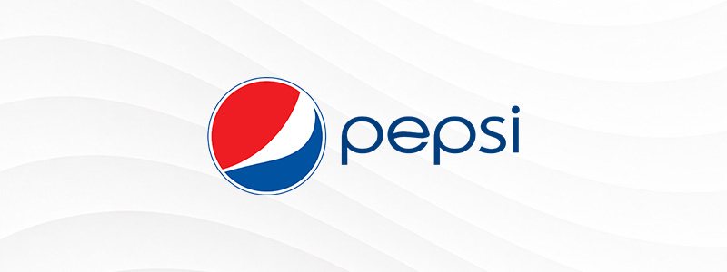
Nothing in Pepsi’s history sparked more debate than the logo the Arnell Group launched on October 15, 2008. The globe went flat again after years of three-dimensional shading, and the new wordmark ended up looking closer to Diet Pepsi’s old 1975 logo than to anything Pepsi itself had used before. Rollout was slow enough that most shelves did not fully reflect the new look until early 2009.
The redesign also gave each product line a slightly different “smile” inside the globe, with Diet Pepsi getting a thinner curve and Pepsi Max a wider one, a detail that was phased out by 2010.
A leaked 27-page internal document titled “BREATHTAKING Design Strategy” hit the press before the official launch, and its over-the-top language turned a serious rebrand into a punchline almost overnight.
2014: A slightly bolder wordmark
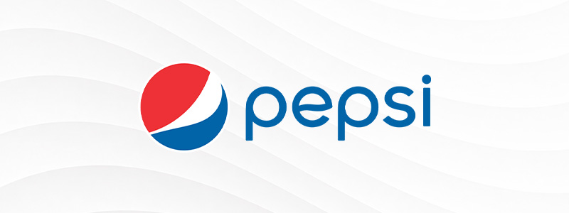
Designer Joe Finocchiaro led a smaller update on June 2, 2014, thickening the wordmark and shifting the typeface to Futura Bold. It was a modest change compared to 2008, more of a fine-tuning pass than a full rebuild, and the core globe shape from 2008 stayed largely intact.
2023: Pepsi looks backward to move forward

PepsiCo Design and Innovation unveiled a new globe on March 28, 2023, with lettering by Ian Brignell and a custom typeface called Pepsi Owners built by type studio MCKL. The design leans directly on the look Pepsi used between 1965 and 1991, and the wordmark returned to black for the first time since the bottle cap logo gave way to the abstract globe decades earlier.
The new look officially launched across North America on August 23, 2023, timed to Pepsi’s 125th anniversary campaign and a renewed push behind Pepsi Zero Sugar.
What All These Redesigns Have in Common
A few patterns hold up across more than a century of changes. The swirled globe has survived in some form since 1951, and blue took over as the brand’s defining color almost immediately, even as the exact look kept shifting around it. Nearly every redesign lines up with something specific, a merger, a rival’s stumble, a cultural moment worth chasing, and that logic holds up for brands far smaller than Pepsi, too.
Design.com offers a logo maker built for exactly that kind of early experimentation, along with business cards, brand kits, and website tools for carrying a new look across everything else a growing brand needs.
The best logos aren’t the ones that never change, they’re the ones that know when it’s time to.