How to Use the Color Wheel for Logo Design
Are you familiar with the color wheel?
You probably are, especially if you have been in any art class at school at some point.
But did you know that this simple wheel is actually a powerful tool when it comes to creating an eye-catching and visually harmonious logo design?
Think about it. Some logos just feel right. Others feel slightly off, even though there’s nothing obviously wrong about it.
What you’re probably picking up on is the color, more specifically, how well the colors work well together.
And that’s exactly what the color wheel can help you figure out.
So whether you’re designing your first logo or refining an existing one, understanding how to use the color wheel for logo design can help you make smarter, more intentional choices.
Let’s break it down below.
What is a color wheel?
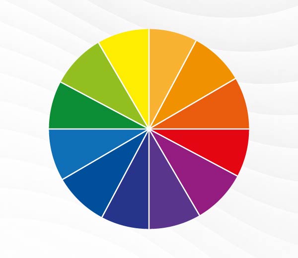
The color wheel is a simple visual tool used to show how colors relate to each other.
Each color is arranged according to its wavelengths, thus resulting in a gradual change as you go around the circle. This makes it easier to see how the colors work with each other and which colors work best together, depending on the impact you want to make.
Let’s take a closer look at the colors that are inside the color wheel:
Primary colors
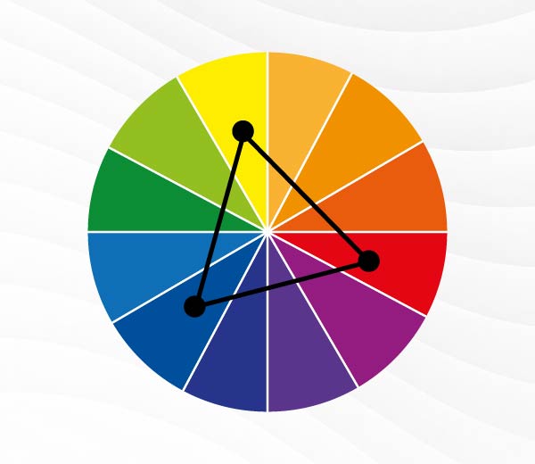
The primary colors are:
They are the primary colors because their true color pigments cannot be created by mixing any other colors. To put it simply, they are the starting point.
Every other color in the wheel is also derived by mixing two of them together, making them the foundation of the wheel.
Secondary colors
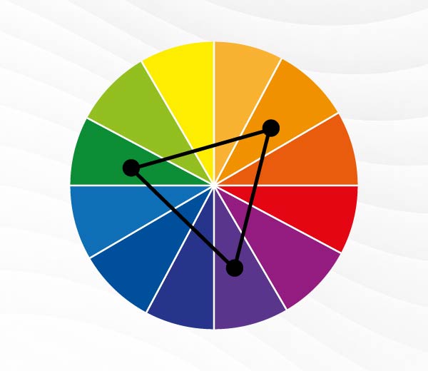
Secondary colors are made by mixing two primary colors:
Tertiary colors
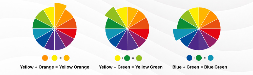
Tertiary colors are created by mixing a primary and secondary color together:
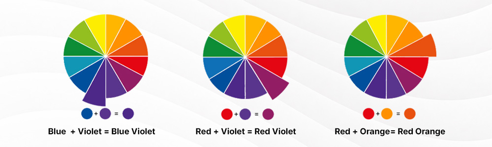
- Blue (primary) + Violet (secondary) = Blue-Violet
- Red (primary) + Violet (secondary) = Red-Violet
- Red (primary) + Orange (secondary) = Red-Orange
- Yellow (primary) + Orange (secondary) = Yellow-Orange
- Yellow (primary) + Green (secondary) = Yellow-Green
- Blue (primary) + Green (secondary) = Blue-Green
Warm colors vs. cool colors
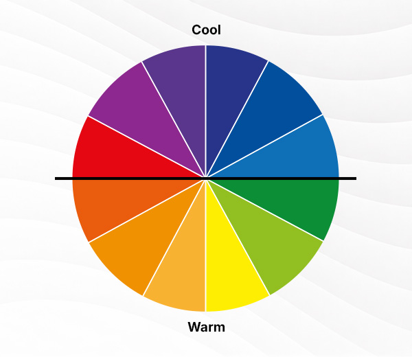
If you split the color wheel in half, you can see an obvious divide.
On one side are your warm colors. These are red, orange, yellow, and their variations (red-orange, orange-yellow).
Warm colors, as their name suggests, evoke the feeling of warmth, light, and sunshine. They give off an energetic, bold, and vibrant appeal. They are great for brands that want to feel youthful, exciting, or passionate.
On the other side are the cool colors: blue, green, purple, and their variations.
Cool colors represent serenity, relaxation, and calm. They are suitable for brands that aim to look relaxing and soothing. At the same time, the coolness of the colors is also suitable for brands that want to look professional, reliable, and stable, since it’s not as “harsh” or attention-grabbing as the warm colors.
Hue, shade, tint, and tone
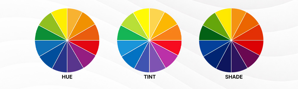
You probably heard all these terms before. But what do they actually mean?
- Hue – Is what you call the color itself, like “Blue” or “Red”
- Tint – Created by adding white to a color, to make it lighter
- Tone – Created by adding gray to a color, to make it muted or subtler
- Shade – Created by adding black to a color, to make it darker
These techniques adjust the value and intensity of colors. It can also help you get more colors out of the color wheel. For instance, adding white to red gives you the color pink. This gives you more flexibility and variations when coming up with logo color combinations.
Why using the color wheel for logo design matters
The best logos are those that look good and feel right.
This is where the color wheel can help you. Because instead of just randomly guessing, you can make logical and scientific guidance on which colors work best together. This helps make your logo look and feel visually harmonious.
The color wheel can also help you spot which colors create great contrast with each other. You can then use these colors to strategically highlight visual elements that you want to stand out, or use colors as mute or accent certain elements.
Color wheel for logo design can also be used to reinforce your brand personality. Remember the warm colors vs cool colors earlier? Depending on the color you use, you can reinforce a specific identity or personality with your logo.
You can refer to our article on color psychology for more information.
How to use the color wheel to choose logo colors
Now that we know how useful the color wheel is for logo design, let’s take a look at how we can apply it.
Here are the classic color schemes built directly from the color wheel, which could serve as your go-to formulas for logo design:
Monochromatic
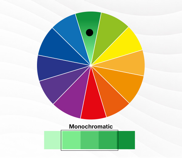
Monochromatic color schemes use just one base color. But they get variety by using tints, tones, and shades.
They are best for logos that want to feel minimalist and refined. It’s also great if you want a clean and professional logo as it has minimal distractions.
Some examples of monochromatic logos are Paypal and Animal Planet.

Analogous
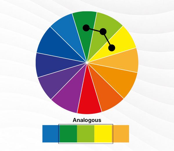
Analogous color schemes are composed of colors that sit next to each other on the wheel. For example: green and blue, yellow and orange, purple and red.
Analogous colors are great for logos that want to feel harmonious, calm, and approachable. They offer more contrast compared to monochromatic ones, but the contrast is still visually light, so it still looks easygoing.
An example of analogous logos is British Petroleum.

Complementary
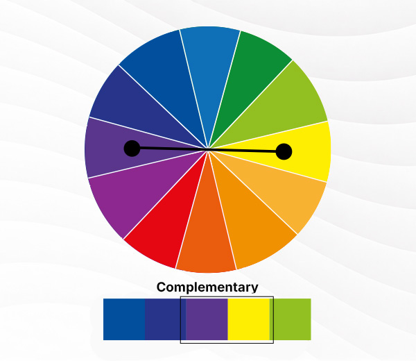
Complementary color schemes are those that use colors opposite of each other on the wheel. Think blue and orange, yellow and purple, etc.
If analogous colors have light contrast, complementary colors have stronger ones. That’s why it’s used by brands who want their logo to pop and stand out, or to give off a feeling of boldness, dynamicness, and energy.
Some samples are the logos of Los Angeles Lakers and Gulf Oil.

Split-complementary
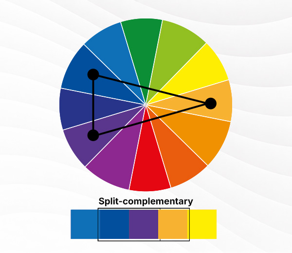
Split-complementary uses one base color plus two colors beside its opposite. It’s a great way to have a logo that feels balanced yet dynamic. Think of it as something that has less contrast than complementary but is bolder than analogous.
Famous examples of this are the logos of 7-11 and Taco Bell.

Triadic
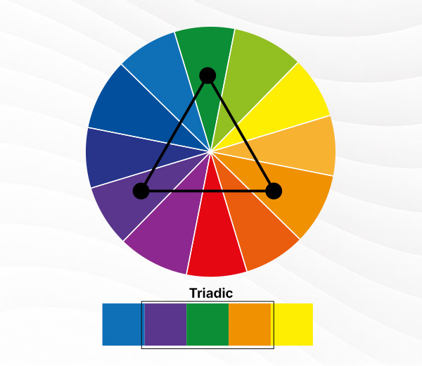
The triadic color scheme uses three colors that are evenly spaced across the wheel. Something like red, yellow, and blue, or green, orange, and purple. This leads to a very strong visual contrast.
But if you want to maintain harmony, it’s best to be disciplined with how you use the colors. Have one color lead, one color maintain, and one color to accent, instead of making them all the star of the show.
An example of this is the logo of Burger King and Wonder Bread.

Tetradic
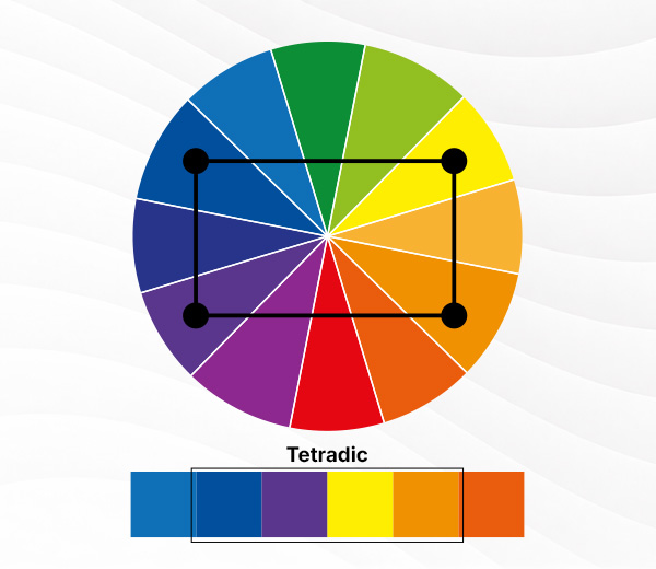
Tetradic color schemes use a pair of complementary color schemes. Think of it as drawing a rectangle across the color wheel to find your match.
This gives a more complex and expressive logo look. It’s a careful tightrope to get right, but can lead to very visually memorable designs when done successfully.
You can see this in play with the iconic logos of Google and Microsoft.

TL; DR
Don’t have time to read the whole article? Here’s a quick recap of how to use the color wheel for logo design color palettes.
| Color scheme | How it works | Best for logo designs that feel |
|---|---|---|
| Monochromatic | Uses one color with different tints, shades, or tones | Minimal, refined, modern, focused |
| Analogous | Uses colors next to each other on the wheel | Harmonious, calm, approachable, cohesive |
| Complementary | Uses colors opposite each other on the wheel | Bold, energetic, high-contrast, memorable |
| Split-complementary | Uses one base color plus two colors beside its opposite | Balanced, dynamic, less intense than complementary |
| Triadic | Uses three evenly spaced colors | Playful, vibrant, balanced, creative |
| Tetradic | Uses two complementary color pairs | Rich, expressive, more complex |
The next time you think “what colors go together for a logo?” you can just refer to this handy sheet.
You can also refer to our 100 Logo Color Combination article for more guidance.
Choosing colors based on brand personality
Planning to create your logo? Wondering how to create a brand color palette?
Before you start anything, ask yourself one key question: How do I want my brand to feel?
Because the color wheel isn’t just about finding the most aesthetically appealing color combinations. It’s also a tool to help you translate emotion into design.
So start with your brand identity. Do you know what it is?
If yes, then you can go to the next step:
- Want to feel trustworthy and professional? Use cool colors and simple schemes like monochromatic or analogous.
- Want to feel bold and exciting? Try complementary or triadic palettes.
- Want to feel luxurious or refined? Use muted tones and controlled color variation.
Practical logo design tips (especially for beginners)
You don’t need to be a color expert to create a strong logo. These simple tips will help you get started:
Keep it simple
How many colors should a logo have? While it’s tempting to use the whole rainbow, you should ideally start with just 1-3 colors. Too many colors can make your logo feel cluttered.
If you’re planning to use three colors, a good rule of thumb to follow is:
- 1 main color (your brand’s core identity)
- 1 supporting color (for contrast or depth)
- 1 accent color (used sparingly for emphasis)
Check contrast
Your logo should be easy to see and read. Make sure your logo has enough contrast, as it improves readability. Avoid too pale color palettes or overly vibrant ones as it’s too difficult for our eyes to parse.
Think about accessibility
Good logo design should work for everyone.
Not all users see color the same way, so it’s important to make your logo accessible:
- Avoid relying only on color to communicate meaning. Give enough visual cues or make use of typography to help communicate your point.
- Test for colorblind visibility. There are mainly online tools you can use to check for these, so make sure you utilize those. You can also avoid (or use sparingly) color combinations that can be difficult to see (red and green, for example).
- Ensure strong contrast for digital use, especially since we have smaller screens on our mobile devices. There are also contrast checkers online, so make sure you run your chosen palette there first.
Designing with accessibility in mind doesn’t limit creativity. It actually makes your logo more effective and inclusive.
Test on different backgrounds
Your logo won’t live in the same background forever. There will come a time when it will have to be placed on a light, dark, gray, colored, or busy background. Make sure to test how your logo looks on different backgrounds first to see if it still pops or is still properly visible.
Use tools
Still stuck on what the best color scheme to use? Try using online color palette generators, color gradient tools, or experimenting with premade logos here in Design.com. Check out our colorful logos or our monochrome logos to get inspiration.
These tools make it easier to experiment and refine your choices without guesswork especially if you’re just starting out.
Final thoughts
The color wheel is one of the most powerful tools in logo design. Once you know how to use a color wheel for logo design, you can create logos that are not only beautiful but also meaningful.
If you were inspired by this article and are pumped to start designing your logo, why don’t you head on to our logo maker tool? Here you can create anything from monochromatic logos to rainbow logos.
We also have other tools to help support your branding journey. Check out our AI business name generator, domain name generator, and AI website builder. It’s an easy way to get your business up and running, without having to do everything from scratch.
Check out our other articles as well:
- Serif vs. Sans-Serif: How to Choose the Right Font Style
- The Complete Guide to Logo Shapes for Modern Branding
Till next time!