50 Blue Logos That Make a Bold Statement
Blue is one of the most trusted colors in branding. More than half of the world’s most recognizable brands use blue as their primary logo color.
The color blue instantly communicates reliability, professionalism, and confidence. When paired with the right design, the right shade of blue can help your brand make a strong first impression and build trust from the start.
And with the right logo maker, finding the perfect shade of blue is simple. In just a few minutes, you can create a logo that reflects your brand and helps you stand out.
To inspire your next design, we’ve curated a collection of blue logos that get it right across different industries and styles. Explore what makes them effective, see how different shades of blue shape brand perception, and discover ideas you can apply to your own.
What makes a blue logo effective?
Not every blue logo is created equal. According to color psychology, the shade, saturation, and how blue is paired with other elements all determine if a logo feels sharp and trustworthy or flat and forgettable.
Here’s what separates strong blue logos from weak ones:
- The right shade matched to your industry: navy for authority, royal blue for confidence, sky blue for approachability, electric blue for innovation
- Clean shapes and typography that let the color do its work without competing visual noise
- Strategic contrast that makes the blue pop on a white background, a dark screen, or printed packaging
- Versatility across every format, from a tiny app icon to a full-size billboard
- A timeless feel that won’t look dated when design trends shift again.
Famous brands that got blue right
Before diving into styles and templates, it helps to see what blue can do at the highest level. These three brands have built global recognition on the back of a well-chosen shade of blue.

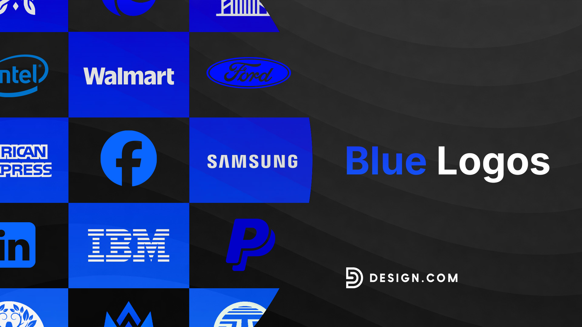
Facebook‘s choice of blue was partly practical: Mark Zuckerberg is red-green colorblind, making blue the color he sees most clearly. But the effect has been anything but accidental. That flat, confident mid-blue now carries the weight of billions of daily interactions and signals connection, familiarity, and scale. It’s one of the most recognized logo colors in the world.
PayPal

PayPal operates in one of the highest-stakes spaces in business: people’s money. Blue was a natural fit. Their dual-blue logo, pairing a deep navy with a lighter, more electric tone, communicates security and forward momentum. Users handing over financial information feel reassured before they’ve read a single word of copy.
Samsung

Samsung’s deep royal blue wordmark has remained largely consistent for decades. In a category full of visual noise and rapidly shifting aesthetics, that consistency has built enormous brand equity. The blue signals technological precision and global reliability, qualities that have helped Samsung compete at the very top of the consumer electronics market.
IBM

IBM’s iconic striped blue logo is a masterclass in using color to communicate credibility. Known in the industry as Big Blue, the company leaned so hard into the color that it became part of its identity. The bold, structured lettermark paired with that unmistakable shade of blue says one thing above all else: we’ve been doing this longer than anyone, and we’re still here.
Ford

Ford’s blue oval is one of the most enduring logo marks in automotive history. The deep, rich blue wrapping around the classic script wordmark projects reliability, craftsmanship, and American heritage all at once. Generations of car buyers have associated that specific shade of blue with a vehicle that simply gets the job done.

LinkedIn’s clean, confident blue wordmark does exactly what a professional network’s logo should do: it looks like it belongs in a boardroom. The bold sans-serif type set against a solid blue background communicates authority and trust without any visual fuss. It’s a logo built for business, and it shows.
Visa

Visa’s navy and gold wordmark is one of the most globally recognized logos in existence, appearing on over three billion cards worldwide. The deep navy projects financial authority and stability, while the gold trim adds a layer of prestige. In an industry where trust is the entire product, Visa’s blue has done its job every single time a card is swiped.
Intel

Intel’s soft, bright blue has long communicated innovation and forward-thinking technology. The clean wordmark enclosed in an open oval frame give the mark a sense of motion, which is fitting for a company that has driven the pace of computing for decades. It’s a blue that feels less corporate and more cutting-edge.
American Express

American Express has made blue central to its identity since the beginning. The centurion blue they use is formal, serious, and unmistakably premium. It works because the color does the heavy lifting that the brand promise needs: this is a card for people who expect more, and the logo makes that clear before the tagline says a word.
Walmart

Walmart’s blue is a different kind of trust signal. It isn’t corporate or financial but approachable and dependable, the kind of blue that says we’re here every day, for everyone. Paired with the bright yellow spark, it creates a balance between reliability and warmth that has made it one of the most recognized retail logos on the planet.
What are the most popular blue logo styles?
Blue is versatile enough to work across a wide range of design approaches. The best style for your brand depends on your industry, your audience, and the specific message you want your logo to send.
Three approaches dominate the blue logo landscape right now.
Flat blue logos
Flat blue logos strip everything back to clean shapes, purposeful lines, and strong typography. This restraint is exactly what makes them so powerful. When a logo relies entirely on clarity and color, every element has to earn its place.
Navy and deep blue tones work especially well here, giving flat designs a sense of gravitas and credibility. Pairing them with crisp sans-serif fonts like Helvetica, Futura, or Montserrat keeps the design feeling current without chasing trends.
Browse through our flat blue logo examples below:

Graph Statistics Marketing by Design.com
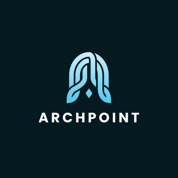
Elegant Leaf Letter A by Design.com
Property Mortgage Broker by Design.com

Garden Woman Tree by Design.com
Wave Media Letter W by Design.com
Technology Digital Letter AA by Design.com
Property Management Building by Design.com
Motion Startup Media by Design.com

Finance Cryptocurrency Coin Letter by Design.com

Infrastructure Contractor Property by Design.com
Square Consulting Agency by Design.com
Generic Digital Shield by Design.com
Pie Chart Generic by Design.com
Split Hexagon Wave by Design.com
Modern Blue Flower by Design.com
Geometric blue logos
Geometric blue logos use circles, hexagons, triangles, and grids to create structured, precise visual identities. Blue and geometry are a natural pairing as both carry associations with order, intelligence, and reliability.
The tech and finance sectors have long relied on this combination because it communicates competence without saying a word. But geometric blue logos work just as well for healthcare, consulting, and professional services. Circles suggest unity and completeness. Meanwhile, hexagons signal structure and efficiency.
Check out our geometric blue logo samples here:
Blue Geometric Software Technology by Design.com
Modern Blue Flower by Design.com
Blue Geometric Snowflake by Design.com
Blue Geometric Professional by Design.com
Generic Modern Asterisk by Design.com
Blue Geometric Company by Design.com
Blue Geometric Technology by Design.com
Blue Geometric Technology 2 by Design.com
Geometric Blue Window by Design.com
Digital Tech Cube by Design.com
Gradient blue logos
Gradient blue logos blend two or more shades to create depth, movement, and visual energy. As screen technology has improved, gradients have come back stronger than ever, and blue gradients in particular have a richness that flat color simply can’t replicate. Moving from a deep navy into a vivid electric blue gives a logo a sense of dimension that catches the eye and holds attention.
This approach works especially well for tech companies, digital agencies, and any brand that wants to feel innovative without sacrificing professionalism. The key is choosing a gradient range that stays within the blue family or transitions thoughtfully into a complementary color.
Get started with our gradient blue logos now:
Blue Marketing Creative by Design.com
Tech Blue Modern by Design.com
Professional Blue Cube by Design.com
3D Marketing Gradient by Design.com
Professional Motion Blue by Design.com
Loop Fluid Gradient by Design.com
Blue Technology Marketing by Design.com
Blue Gradient Wave by Design.com
Professional Blue Company by Design.com
Modern Gradient Blue by Design.com
Business Blue Gradient by Design.com
3D Gradient Blue by Design.com
Fluid Blue Gradient by Design.com
How to choose the right shade of blue for your logo
Blue isn’t a single color, and each shade sends a different message. Choosing the wrong one for your brand is one of the most common mistakes business owners make when designing a logo.
Here’s how to navigate the blue palette with intention.
Match your shade to your industry
Navy blue is the go-to for law firms, financial institutions, and any business where authority matters. It’s formal, serious, and carries centuries of trust. Royal blue sits in the middle: confident enough to command attention, approachable enough not to feel intimidating. It’s a strong all-rounder for consulting, healthcare, and service businesses.
Sky blue and lighter tones lean toward creativity, wellness, and technology brands that want to feel open and modern. Electric and vivid blues are for brands that want to make noise: startups, apps, and digital-first companies competing for attention in crowded markets.
Consider how blue behaves with other colors
Blue paired with white is clean, clinical, and professional, the combination of choice for healthcare and finance. Blue and gold suggest premium quality and prestige. Blue and orange create a high-contrast pairing that’s bold and energetic. Going monochrome blue, make sure you have enough variation in shade and weight to give the logo visual interest without adding a second color.
Test across every context
Blue shifts depending on background color, screen brightness, and print conditions. A shade that looks vivid on a website may appear dull on a printed brochure. Always test your blue logo on light backgrounds, dark backgrounds, and in single-color formats before committing to a final version.
Conclusion
Blue is a branding powerhouse that has helped some of the world’s most iconic companies build identities that are instantly recognizable and deeply trusted. Choosing blue for your logo means choosing credibility, calm authority, and staying power all at once.
The right blue logo can set your brand apart from the very first impression. Head over to Design.com to explore thousands of customizable blue logos built for every industry and brand style. You can tweak fonts, colors, and layouts until every detail feels exactly right. If you want to move even faster, the AI logo generator can bring your vision to life in seconds.
Start building a blue logo that is bold, trustworthy, and built to last.
Read more on logo designs here: