30 Famous Red Logos to Ignite Your Marketing Strategy
Red is one of the most powerful colors a brand can choose. It grabs attention, stirs emotion, and leaves a lasting impression before a single word is read. No other color commands a room quite like red.
In this article, we rounded up some of the most iconic red logos from global brands and paired them with fresh design inspiration to help you build a brand identity that truly stands out.
Whether you are starting from scratch or refreshing your logo with a logo maker, this is your go-to guide for all things red.
Key elements of red logos
Red is not just a color choice. When you understand color psychology, you know choosing red is a strategic branding decision that shapes how customers feel about your business at first glance. Here is what makes red logos so effective.
- High visibility: Red naturally draws the eye faster than most other colors, making it ideal for logos that need to stand out in crowded spaces.
- Emotional impact: Red triggers feelings of excitement, passion, urgency, and confidence, which are all powerful drivers of consumer behavior.
- Strong memorability: Brands with red logos tend to be more recognizable and easier to recall, giving them a competitive edge.
- Versatility across industries: From food and entertainment to fashion and tech, red works across a wide range of business types.
- Timeless appeal: Red has been a dominant force in logo design for decades and remains fresh, bold, and relevant.
Famous brands with red logos
Some of the most recognized companies in the world have built their entire visual identity around red. These brands prove that the right shade of red paired with smart design can create a logo that lasts for generations.
Here are some of the most iconic examples.
Coca-Cola

Coca-Cola is one of the world’s most recognized beverage brands, known for its classic soft drinks and a logo that has barely changed over the past century. The design features flowing white script on a bold red background.
Red is so closely associated with Coca-Cola that people genuinely call the shade “Coca-Cola red.” It is a rare example of a brand owning a color so completely that the two become inseparable.
McDonald’s

McDonald’s is the world’s largest fast-food chain, and while the golden arches are its most famous symbol, red is the foundation of its visual identity. It runs through the signage, packaging, and uniforms across every location on the planet.
Red stimulates appetite and encourages quick decisions, both of which favor a brand built around quick, satisfying meals. It is a deliberate choice that has driven the brand’s look for decades.
Pizza Hut

Pizza Hut is one of the world’s largest pizza chains, with thousands of locations serving its signature pan pizzas and sides across more than 100 countries.
Red is a natural fit for a food brand because it drives appetite and energy. For Pizza Hut, it also reinforces the warmth and comfort people associate with sharing a pizza.
Heinz

Heinz is best known for its ketchup, but it also offers a wide range of condiments and sauces used in kitchens and restaurants worldwide. Its logo uses clean red lettering inside the brand’s distinctive keystone shape.
The red is almost self-explanatory for Heinz since it mirrors the color of its most famous product. It creates a direct visual connection between the logo and the food that feels completely natural.
Kellogg’s

Kellogg’s is one of the most recognized names in breakfast food, behind iconic cereals and snacks that have been in households around the world for over a century.
The red gives Kellogg’s a sense of energy and warmth that fits a brand tied to the start of the day. It is a familiar, comforting color that has helped the brand feel like a household staple rather than just another product on a shelf.
Target

Target is one of America’s most popular retail chains, known for its wide product range and a shopping experience that feels a cut above the typical big-box store. Its logo is a red bullseye, so recognizable that it rarely needs the brand name alongside it.
The red bullseye is bold, and the circular shape itself does smart visual work by telling shoppers they have landed exactly where they need to be.
Levi’s

Levi’s invented blue jeans and remains one of the most trusted denim brands in the world, having done so for more than 150 years. Its most iconic brand mark is not a logo on paper but a small red tab stitched onto the back pocket of every pair.
The tab began as a way to distinguish Levi’s from cheaper alternatives and has since grown into a globally recognized mark of authenticity. Red here is quiet and confident, letting the heritage do the talking.
H&M

H&M is one of the largest fast-fashion retailers in the world, with stores across hundreds of cities that sell affordable clothing for every style and age. Its logo is a clean, bold red wordmark that’s easy to spot anywhere.
The red keeps the brand feeling energetic and accessible without overcomplicating things. It is a fitting color for a brand whose entire pitch is that good style should be within reach for everyone.
Uniqlo

Uniqlo is a Japanese casual wear brand with a global presence, known for its simple, high-quality basics that work for almost anyone. Its logo shape is a bold red square with the brand name in clean white lettering, offered in both English and Japanese versions.
Red gives Uniqlo a strong, confident identity that contrasts with the simplicity of its clothing. It is a brand that lets its products speak quietly while the logo does the visual heavy lifting on storefronts and packaging worldwide.
Supreme
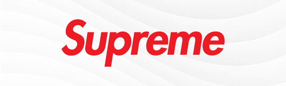
Supreme is a New York streetwear brand whose logo, white text inside a red rectangle, has become one of the most imitated marks in fashion history despite being almost aggressively simple. The brand built its identity around limited drops and an exclusivity culture.
The red box works because it feels urgent and unapologetic, perfectly matching the hype Supreme generates with every release. It is a logo that has turned a color and a shape into a cultural statement.
YouTube

YouTube is the world’s largest video-sharing platform, with billions of users watching everything from tutorials to live events every single day. Its logo pairs a bold red play button with clean, modern typography.
The red play button is one of the smartest logo designs around because it tells you exactly what to do the moment you see it. It makes the platform feel exciting and immediate, which is the whole point.
Netflix

Netflix is the streaming platform that changed how the world watches film and television, offering original content and licensed titles to millions of subscribers globally. Its logo is simply the word Netflix in bold red, nothing more.
Against the dark backgrounds the platform favors, the red wordmark stands out instantly. It has become one of the most recognized logos in entertainment, requiring only a color and a typeface.
CNN

CNN is one of the most widely watched news networks in the world, delivering breaking news and reporting around the clock. Its logo is bold red lettering in a clean sans-serif font.
Red has always been a natural fit for news because it carries an urgency that other colors do not. The CNN logo tells viewers something important is happening before a single word is spoken.
ESPN

ESPN is the leading sports media brand globally, covering live games, highlights, and analysis across television and digital platforms. Its logo uses bold red lettering with a typographic confidence that matches the intensity of the sports it covers.
Red and sports have always gone hand in hand. ESPN’s branding taps into that energy, making it feel like the obvious home for fans who take their sports seriously.
Nintendo
Nintendo is one of the most iconic video game companies in history, responsible for franchises like Mario, Zelda, and Donkey Kong that have defined gaming culture for generations.
Red fits Nintendo because the brand has always centered on fun and bringing people together. Its gaming logo sparks playfulness without feeling juvenile, which mirrors Nintendo’s ability to make games that genuinely work for everyone.
Adobe
Adobe is the software company behind Photoshop, Illustrator, Premiere Pro, and a suite of other tools that creative professionals rely on every day. Its logo features a stylized red “A” with a clean geometric design.
Red is a fitting choice for a brand that exists at the intersection of technology and creativity. It is bold and decisive, which lines up with what Adobe encourages its users to be.
Canon

Canon is a Japanese company and one of the most respected names in cameras, printers, and imaging equipment worldwide. Its logo is a clean red wordmark in a custom typeface that has remained largely unchanged for decades.
There is something fitting about a photography brand choosing red. It is the color most associated with passion, and Canon has always positioned itself as a brand for people who genuinely love the craft of making images.
Huawei
Huawei is one of the largest technology companies in the world, with operations spanning smartphones, telecommunications equipment, and consumer electronics across more than 170 countries. Its logo features a stylized red flower or signal motif, paired with modern typography.
Red holds strong cultural significance in China, where it represents prosperity and good fortune, making it a natural choice for a brand rooted in Chinese identity. It also gives Huawei a bold presence that stands out confidently on a global stage.
Time Magazine

Time is one of the most influential news magazines in the world, known for its in-depth reporting, cultural coverage, and its iconic Person of the Year issue.
The magazine’s red typography has been a constant fixture on newsstands for decades, making each issue impossible to miss. It carries a sense of authority and importance that matches the weight of the stories Time has covered throughout its history.
Beats by Dre

Beats by Dre is the premium audio brand co-founded by Dr. Dre and Jimmy Iovine, known for turning headphones into a fashion accessory as much as a listening device. Its logo is a red circle with a lowercase white letter B.
Red set Beats apart from the clinical look of traditional audio brands from the very beginning. It gave the brand a cultural edge, positioning it squarely at the intersection of music, style, and self-expression.
Santander

Santander is one of the largest banks in the world, serving personal and business customers across Europe and Latin America. Its logo features a red flame paired with bold red typography, a striking choice for a financial institution.
Most banks default to blue, so Santander’s red immediately makes it stand out. The flame adds a sense of forward momentum, positioning the bank as active and progressive rather than merely stable.
HSBC

HSBC is one of the most internationally connected banks in the world, operating across personal, commercial, and investment banking in markets globally. Its logo is a red-and-white hexagon inspired by a Scottish flag pattern, paired with clean red lettering.
The red gives HSBC a commanding presence that travels well across all the markets it operates in. For a bank of its scale, the logo needs to feel authoritative and trustworthy at the same time, and the red does both.
Wells Fargo

Wells Fargo is one of the largest banks in the United States, offering a full range of personal, business, and investment banking services nationwide.
Red reinforces Wells Fargo’s identity as a bold, established institution with deep roots in American commerce. It gives the brand confidence and solidity that customers expect from one of the country’s biggest financial names.
Vodafone

Vodafone is one of the world’s largest telecommunications companies, providing mobile, internet, and digital services to customers across Europe, Africa, and Asia.
Red is central to everything Vodafone does visually, giving the brand a strong and consistent identity across dozens of countries. It projects energy and connectivity, which fits a company whose entire business is about keeping people connected.
DoorDash

DoorDash is the leading food delivery platform in the United States, connecting millions of customers with local restaurants through its app and delivery network.
Red is a smart choice for a food delivery brand because it triggers both appetite and urgency. It tells customers their food is on the way and makes the brand feel fast, reliable, and ready to deliver.

Pinterest is a visual discovery platform where people save and organize ideas across categories like home design, food, fashion, and travel. Its logo is a red circular letter “P” that doubles as a pin, tying the mark directly to the platform’s core function.
Red gives Pinterest a warmth that suits the personal, aspirational way people use the platform. It feels inviting for a space built around collecting things you love.
Lego

Lego is one of the most beloved toy brands in history, built around colorful interlocking bricks that have inspired creativity in children and adults for generations.
Red captures the excitement of building something from scratch. It is a color that has always suited a brand whose entire purpose is to make people happy through creativity.
Colgate
Colgate is one of the most widely used personal care brands in the world, best known for its toothpaste and oral hygiene products, which are found in households across virtually every country. Its logo features warm red lettering in a clean, consistent style.
Red is an unexpected but effective choice for a dental brand. Against Colgate’s white packaging, it creates a strong contrast and gives the brand an energy that feels clean and trustworthy rather than clinical.
Budweiser

Budweiser is one of America’s most iconic beer brands, self-described as the “King of Beers” and a fixture of American culture for over 150 years.
Red suits Budweiser because the brand has always been about boldness and shared good times. It is a color that fits naturally into the celebrations and social moments the brand has always positioned itself around.
Virgin Group

Virgin Group is the British conglomerate founded by Sir Richard Branson, spanning industries from aviation and music to telecommunications and space travel. Its logo is a red handwritten wordmark that looks more like a personal signature than a corporate identity.
Red was the right call for a brand built on disruption and doing things differently. It gives Virgin a personality and energy that most companies at its scale would never risk putting on a logo.
Red logo design ideas
Now that you have seen how the world’s biggest brands use red, it is time to find the right style for your own logo. Below are three popular red logo design categories to help spark your creativity.
Browse through the options and find the look that best fits your brand personality.
- Red Bold Logos
- Red Vintage Logos
- Red Minimalist Logos
Red bold logos
Bold red logos use strong typography and high-contrast visuals to create an identity that is impossible to overlook. It works best for brands in competitive spaces where standing out is non-negotiable.
Check out our red bold logos below:
Triangle Arrowhead Direction by Design.com
Pepperoni Pizza Slice by Design.com
Red Heart Valentine by Design.com
Blood Donation Letter Z by Design.com
Professional Industrial Company by Design.com
Bowling Sports Tournament by Design.com
Eagle Wildlife Predator by Design.com
Shopping Cart Grocery by Design.com
Garden Leaf Letter by Design.com
Residential House Property by Design.com
Red vintage logos
Red vintage logos lean into heritage and craftsmanship through badge-style layouts and retro typography. It is a great fit for brands that want to feel established and trustworthy from the start.
Browse our red vintage logos below:
Baseball Varsity Sport by Design.com
Western Bull Skull by Design.com
Royal Beard King by Design.com
Countryside Cowboy Hat by Design.com

Jewelry Necklace Pendant by Design.com
Handmade Ring Jewelry by Design.com
Regal Lion Crown by Design.com
Scrunchie Poppy Flower by Design.com
Arizona Cowboy Hat by Design.com
Red minimalist logos
Red minimalist logos strip everything back to clean shapes and simple typography, letting the color do most of the work. It suits brands going for a premium, modern look.
Get started with our red minimalist logos below:
Minimalist Professional Bird Wings by Design.com

Minimalist Orange Generic Firm by Design.com
Modern Minimalist Company by Design.com
Minimalist Woodpecker Bird by Design.com
Minimalist Tuna Seafood by Design.com
Minimalist Gradient Wing by Design.com

Magnifying Glass Play Button by Design.com
Abstract Maze Path by Design.com
Modern Ribbon App by Design.com
Modern Regal Crown by Design.com
Ready to go red?
Red is more than just a color. It is a branding powerhouse that has helped some of the world’s most iconic companies build identities that are instantly recognizable and deeply memorable. Choosing red for your logo means choosing visibility, emotion, and impact all at once.
The right red logo can set your brand apart from the very first impression. Head over to Design.com to explore thousands of customizable red logos built for every industry and brand style. You can tweak fonts, colors, and layouts until every detail feels exactly right. If you want to move even faster, the AI logo generator can bring your vision to life in seconds.
Start building a red logo that is bold, beautiful, and built to last.