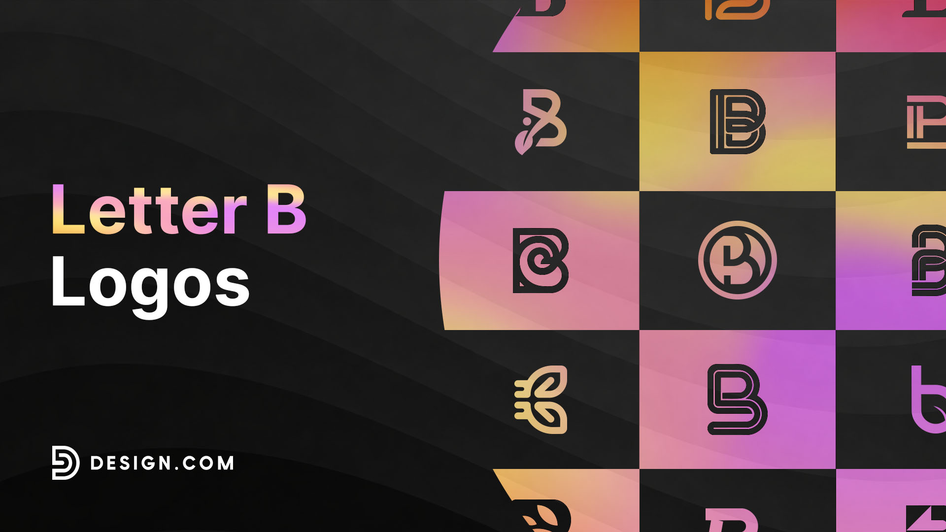
50 Letter B Logo Design Ideas
Big brands can start with a single letter! Just look at how a simple B can turn into a logo people recognize on headphones, luxury cars, burgers, and more. With the right design, even one letter can give your business a look that sticks.
The fun part? There are so many ways to play with the letter B. Keep it clean and minimalist, give it a colorful twist, or turn it into a symbol that hints at what your business does. Whether you’re sketching ideas yourself or using a logo maker to explore different styles, you can go bold, quirky, elegant, or completely unexpected.
Ready to find your style? Let’s check out famous B logos, explore creative design ideas, and pick up a few tips for creating a letter B logo that gives your brand some personality.
What makes the letter B a great choice for logo design?
The letter B has plenty of character. Those two curves make it easy to recognize, but they also leave room for creative twists. You can stretch them, stack them, turn them into shapes, or pair the letter with an icon to create something that’s all your own.
It’s also a flexible choice for all kinds of businesses. A sleek B can give a fashion label a premium feel, while a rounded, playful version might suit a bakery or children’s brand. Add the right colors and details, and you’ve got a design that can look just as good on a storefront as it does on a tiny social media profile picture.
Here are a few reasons why the letter B makes such a good logo and a fun starting point:
- It’s easy to customize. Play with different fonts, curves, and shapes to create a B that matches your brand’s personality. You can keep it simple or give it a more decorative look.
- It works across different industries. From bakeries and beauty brands to tech startups and fashion labels, the letter B can suit almost any business when the design fits the brand.
- It can stand on its own. A well-designed B can work as a standalone symbol on social media profiles, website icons, packaging, and business cards, even when there’s no room for your full business name.
- It pairs well with other symbols. Combine the letter with logo shapes or imagery related to your business to make the design more meaningful. For example, a bakery might add a wheat detail, while a fitness brand could use sharper, more energetic lines.
- It gives you plenty of style options. Go for a minimalist design, experiment with bold geometric shapes, or try a handwritten look. You can take the letter in many directions without losing its identity.
- It can grow with your brand. A versatile B logo can work across different marketing materials as your business expands, helping you maintain a consistent look from your website to your product packaging.
The trick is to choose a style that feels right for your business. You don’t need to add every possible detail. Sometimes, a clever font choice or a small design twist is all it takes to turn a familiar letter into a memorable logo.
Letter B logo design ideas
Need a little inspiration before sketching your own logo? These B logo styles show just how much personality one letter can pack. From simple initials to playful symbols, there’s a look for almost every kind of brand.
Famous letter B logos
Some B logos are so recognizable that you barely need to see the full business name.
Each brand gives the letter its own personality. Take a closer look at what makes these logos memorable, from their shapes and colors to the way they fit the products. You can borrow inspiration from their design choices without copying the logo itself.
Bentley

Bentley’s winged B combines the initial with a pair of eagle wings, creating a look associated with luxury, craftsmanship, and performance. It’s a great example of turning a single letter into a distinctive emblem.
Beats

The bold lowercase b inside a circle is simple and easy to recognize. Its clean design works well on headphones, packaging, and digital platforms.
Burger King

Burger King’s logo uses rounded lettering between bun-like shapes. The design connects the brand name to its signature food, showing how typography and imagery can work together.
BMW

BMW’s circular emblem features the letters BMW around a blue-and-white center. The initials are integrated into a compact badge that looks distinctive on cars and other brand materials.
Baskin-Robbins

Baskin-Robbins uses pink and blue lettering, with the number 31 worked into the BR initials. It’s a playful example of hiding an extra brand detail inside a letter-based logo.
Burberry

Burberry’s branding shows how typography can carry a luxury identity. Its wordmark uses clean, confident lettering, making it a useful reference for fashion and lifestyle brands exploring text logos.
Balenciaga
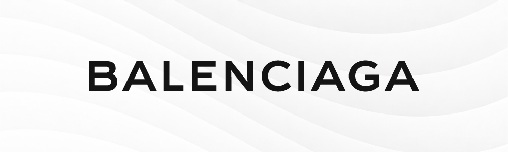
Balenciaga’s bold, minimalist wordmark demonstrates how simple typography can make a strong impression. Brands looking for a clean identity can take inspiration from its restrained lettering and uncluttered presentation.
BIC

BIC pairs its bold orange lettering with a small character symbol. The result is friendly and memorable, showing how a simple wordmark can gain personality through a supporting illustration.
Bosch

Bosch uses strong lettering alongside a circular technical symbol. Its straightforward design feels practical and established, making it a useful reference for engineering, manufacturing, and technology businesses.
BOSS

BOSS uses bold, uppercase lettering to create a confident, understated look. It’s a good example of how a wordmark can feel distinctive through font weight, spacing, and simplicity rather than extra decoration.
Minimalist letter B logos
Sometimes, less really is more. Minimalist B logos skip the extra decoration and let the letter do the talking. Think clean lines, simple typography, and just enough detail to make the design stand out.
This style is a great fit for brands that want a polished, modern look without overcomplicating things. Try a distinctive font, a subtle color combination, or a clever cutout in the letter. The goal is to keep it simple while giving people something worth remembering.
Check out minimalist logos below:
Professional Modern Letter B by Design.com
Professional Commerce Letter B by Design.com
Generic Firm Letter B by Design.com
Media Studio App by Design.com
Initial Jewelry Letter B by Design.com

Minimalist Letter B by Design.com
Professional Modern Letter B II by Design.com
Modern Minimalist Business Letter B by Design.com
Geometric Brand Letter B by Design.com
Cyber Tech Letter B by Design.com
Generic Company Letter B by Design.com
Generic Studio Letter B by Design.com
Modern Business Letter B by Design.com
Generic Business Letter B by Design.com
Creative Studio Letter B by Design.com
Generic Media Letter B by Design.com
Professional Company Letter B by Design.com
Baking Pastry Chef by Design.com
Nature-inspired B logos
Want your brand to feel fresh, calm, or connected to the outdoors? Try bringing nature into your B logo. A leaf can hint at sustainability or natural products, while a tree can represent growth, strength, and new beginnings
You could weave a branch into the letter, shape its curves into something organic, or place a small nature-inspired icon beside it. This look can work especially well for eco-friendly businesses, gardening services, wellness brands, and shops selling natural products.
Get started with our nature logos below:
Studio Gradient Letter B by Design.com
Natural Botanical Letter B by Design.com
Eco Leaf Letter B by Design.com
Cyber Game Software Letter B by Design.com
Natural Leaf Letter B by Design.com
Eco Leaf Letter B II by Design.com
Green Natural Letter B by Design.com
Eco Leaf Letter B III by Design.com
Botanical Floral Letter B by Design.com
Natural Product Letter B by Design.com
Leaf Nature Letter by Design.com
Nature Leaf Letter by Design.com
Leaf Garden Letter by Design.com
Eco Leaf Letter II by Design.com
Leaf Organic Letter by Design.com
Studio Company Letter B by Design.com
Organic Plant Letter by Design.com
Eco Leaf Letter III by Design.com
Environment Eco Letter by Design.com
How to design a letter B logo
Got a style you like? Now it’s time to make it your own. You don’t need to be a professional designer to start exploring ideas. A few smart choices can help you turn a plain initial into a logo that feels right for your business.
Here are five ways to get your creative juices flowing and bring your B logo to life.
1. Give your brand a personality
Before picking fonts or colors, think about your brand’s vibe. Is it fun and friendly, sleek and sophisticated, or bold and adventurous? Your logo should give people a little taste of what your business is all about.
For example, a playful shop might use bright colors and rounded lettering, while a premium brand could go for a more refined look. Pick a few words that describe your business and use them as your design guide.
2. Find a font that fits
Fonts have personalities, too! A serif font can feel classic and elegant, while a sans-serif style often looks clean and fresh. You can also try custom lettering if you want your B to have a look that feels more unique.
If your logo includes your business name, pay attention to how the initial works with the rest of the text. Try a few combinations and check that everything is easy to read, even when the logo is small.
3. Play around with shapes and symbols
Here’s where you can get creative. Put your B inside a circle, use its curves to create a new shape, or combine it with an icon that reflects your business. A heart could suit a caring or wellness brand, while an animal shape might be perfect for a pet shop or wildlife business.
You don’t need to squeeze every idea into one design, though. Pick one or two elements that make sense for your brand and let them shine.
4. Choose colors that pop
Color can completely change the feel of your logo. Blue might give it a calm, trustworthy look, green can bring a fresh feel, and black can add a touch of sophistication. Or you can break the usual rules with a bright combination that makes your brand stand out.
Try a few color combinations and see which one best fits your business. And here’s a handy tip: check your logo in black and white, too. If it still looks good without color, you’re off to a strong start.
5. Put your logo to the test
Your logo might look amazing on your screen, but how does it look on a business card, website, product label, or social media profile? Give it a quick logo test in different sizes and settings before calling it finished.
Ask a few people what the design makes them think of. If they can connect it to the right kind of business and remember the shape, that’s a good sign. Make a few tweaks if needed, then get ready to put your new logo to work.
Design your letter B logo now
A single letter can do a lot of heavy lifting for your brand. Keep it simple, give it a clever twist, or pair it with a symbol that tells your story. The best design is one that feels like your business and looks great wherever it’s seen.
Ready to turn your idea into a logo? Start exploring Design.com today.