How to Test a Logo Before Launching Your Brand
So you just finished creating your logo. Right now, it looks great when viewed full-size on your logo maker tool or AI logo generator.
But what happens when you have to squeeze it into a tiny social media profile photo? Or when you enlarge it for your storefront? Or when you place it on a different colored background? Does it still look good? Or does it now look blurry, unreadable, or just plain off?
These are problems you want to find before you fully introduce your brand to customers. Luckily, you can easily spot these issues with logo testing.
Below are eight tests you can run to ensure your logo looks as good as possible.
What is logo testing?
Logo testing is the process of checking whether a logo remains recognizable, readable, usable, and appropriate across the situations where your brand will actually use it. Ideally, you should also check whether your audience understands the message you want to convey and whether your logo stands out from competitors’ logos.
Thus, your logo design checklist should answer yes to these questions:
- Is the logo still legible in a small size?
- Is the logo clean and balanced when enlarged?
- Does the logo work in one color or alternate color versions?
- Is the logo visible on different colored backgrounds?
- Does the logo work on actual brand materials?
- Does the logo stand out from competitors?
- Can someone unfamiliar with your logo understand it at first glance?
- Does the logo have the correct brand perception (luxurious, charming, sporty, etc)
How to test a logo design
To test a logo design, check its readability, scalability, color versatility, visibility on different backgrounds, distinctiveness from competitors, and how it is perceived by your target audience.
Here’s how you can evaluate these:
1. Shrink your logo to favicon size
Reduce your logo to around 16 × 16 or 32 × 32 pixels and see how it looks.
- Pass: The logo remains recognizable, and important details remain clear.
- Fail: Details get lost, text becomes unreadable, the logo looks blurry, or you can no longer tell what the symbol is.
This is one of the quickest ways to find out whether your design is too complicated.
This is because the smaller your logo gets, the more easily its finer details can disappear. Your thin lines are harder to see, your letters can look squished together, or the shape might just turn into a blob.
But the simpler your logo is, the easier it is to look the same even when it’s shrunk. Think of the minimalist logos of Nike and Apple. It looks great no matter where you see it since the logo is very simple.
Now what if the logo fails the test? This doesn’t mean you need to throw away the logo design instantly. What you may need is a simplified logo version.
An example is Google. They use the full Google text logo most of the time, but they have the simplified G icon that they use for small spaces.
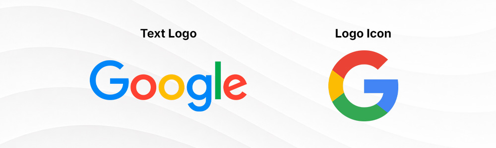
The same goes for you. You can reserve your full or intricate logo for bigger spaces, then just use a simplified icon logo or initial logo for smaller materials like a favicon, social media profiles, or business cards.
2. Enlarge your logo for signage use
Enlarge your logo to the size it might appear on a storefront sign or large banner. This could be anywhere from 12 to 30 inches.
- Pass: The logo looks balanced and recognizable from a distance, with clean shapes and consistent spacing.
- Fail: You can see rough edges, awkward spacing, poor proportions, or details that make the logo look unnecessarily busy.
If small sizes can lose the details, big sizes make them easier to spot. This means uneven spacing, awkward curves, inconsistent line thickness, or poor proportions are now front and center in your audience’s eyes.
This is why it’s important to see your logo in an enlarged version as well.
Ideally, you should test out the logo on a real-life mockup, so try printing out a banner or a large poster if you can. Then try to view the mockup as to how it will be seen normally, like across the street, rather than from six inches away.
Then fix the specific problem you find. Adjust spacing if letters feel crowded. Clean up uneven shapes. Simplify decorative elements if they become distracting at scale.
You should also make sure you have a vector copy of the final logo. SVG and EPS files can be enlarged without becoming blurry or pixelated, making them much better suited to signage and other large-format uses.
So to sum up, the logo file formats you will need to cover all bases are JPG, PNG, SVG, EPS, and PDF.
3. Turn your logo into one color
Convert the entire logo to solid black and place it on a white background. Then try a solid white version on a black background.
- Pass: You can still recognize the logo and understand its main shapes without the original colors.
- Fail: Important elements disappear, merge together, or become difficult to distinguish.
Imagine a logo containing two overlapping shapes. If the only thing separating them is that one is blue and the other is yellow, they might merge into one confusing blob when converted to a single color.
This is why this test is crucial: it determines whether the logo is too dependent on color to be understandable.
Now what if it fails? Try to look at the shapes and spacing first, rather than the color. Increasing the gap between elements, simplifying overlapping details, adjusting the silhouette, or just changing the shape entirely may solve the problem.
This test is also helpful as it can help you get a usable monochrome version of your logo. That logo can then be used for receipts, stamps, engravings, embroidery, certain packaging, and any situation where full-color printing is unavailable or unnecessary.
4. Place your logo on different backgrounds
Put the logo on different-colored backgrounds, such as white, black, and your main brand colors, and include at least one photograph.
- Pass: Every important part of the logo remains clearly visible.
- Fail: Text, outlines, or symbols disappear into the background.
A logo that can work perfectly against the white canvas of your logo maker may not work everywhere else.
Dark navy lettering can disappear against black packaging. A light pastel pink logo may be difficult to see against a bright, busy photograph. Even a single section of a multicolored logo can disappear if it matches the background behind it.
The solution is not to have one logo that magically works everywhere. Instead, prepare appropriate logo variations.
For example, you might have your standard full-color logo for white backgrounds, a white version for dark backgrounds, and a solid black version for situations where color isn’t available.
5. Put your logo on real brand materials
Create mockups of at least five places where you expect customers to see your logo.
For example, a restaurant might test storefront signage, menu, packaging, employee uniform, and a voucher card. While a sales consultant should test a website header, LinkedIn banner photo, business card, presentation, and invoice.
- Pass: The logo fits naturally into your important brand materials without becoming cramped, unreadable, or awkwardly positioned.
- Fail: You repeatedly have to shrink, crop, stretch, rearrange, or otherwise force the logo into the space.
This tests whether your logo physically fits the space of whatever material you may place it on.
A long horizontal logo might look excellent across a website header, but it would look weird and squished up in a circular Instagram profile picture. A tall logo may work well on packaging, but could take up too much space on a business card.
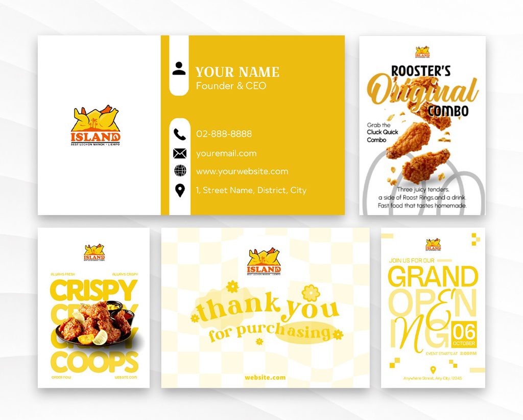
The solution is to again create logo variations, this time in alternate layouts: horizontal logo, vertical logo, icon-only, and text-only. This way, you have the right logo size, length, and arrangement to fit whatever scenario you may need it.
6. Put your logo next to your competitors
Collect five to ten direct competitor logos and place yours alongside them. Have the same background, the same size, and approximately similar conditions.
- Pass: Your logo feels appropriate for your industry and is still easy to distinguish from other brands.
- Fail: It could easily be mistaken for a competitor or blend into a lineup of near-identical designs.
This test is particularly useful in industries with obvious visual shortcuts. Dental logos often feature teeth. Coffee shops use cups and beans. Environmental brands frequently use leaves.
So with everything side by side, it should help you see if your logo relies too much on obvious imagery that your logo looks identical to everyone else.
If it fails, identify why it looks similar before changing everything.
Perhaps the symbol is just too common and should be replaced. Or maybe the symbol is fine, but you are using the same green-and-black palette and similar typography as three competitors. This should help you determine whether to change the composition, typography, colors, illustration style, or treatment of the symbol to create a clearer identity.
This might also be a good way to see whether a more conceptual or abstract logo is better for your brand. For example, Airbnb’s logo doesn’t feature any mountains, airplanes, hotels, or other obvious vacation-inspired icons. Yet their logo stands out, specifically because it is completely different from the common travel logos in the industry.
7. Ask someone else to check the logo for clarity
Show your logo to someone who hasn’t seen it before and ask them to point out anything that is difficult to see, read, or understand.
- Pass: Someone unfamiliar with the design can clearly see, read, and distinguish its important elements without needing an explanation.
- Fail: They struggle to identify the icon, read the text, distinguish colors or shapes, or understand an important part of the design.
When you’ve spent a long time working on a logo, it’s easy to overlook problems because you already know what every element is supposed to be. A fresh pair of eyes can catch issues you no longer notice.
This works for both text-based and icon-only logos. For example, someone may immediately notice that the script font makes two letters difficult to distinguish, or that an icon you intended to look like a bird actually looks like a leaf.
And don’t end the test with just one person. Try testing it with the largest group you can. This way, you weed out preference-based critiques. So if several people have the same problem, you’ll know it’s a sign that something needs adjusting.
8. Check if the logo has the right impression
Show your logo to people in your target audience and ask what they think the brand is like based on the logo alone.
- Pass: Your target audience generally associates the logo with the qualities you want your brand to convey and can recall its key identifying features.
- Fail: People consistently get the wrong impression, misunderstand what type of business it represents, or struggle to remember anything distinctive about the logo.
Your logo is supposed to convey your brand identity to your audience. If your audience fails to get your message from your logo, it means you’ll have some editing to do.
And remember that this test isn’t simply just to see if they like it. What you want to know is what the logo communicates to someone encountering it for the first time.
So if you are asking “How can I tell if my logo is good?”, ask your audience these questions:
- What three words come to mind when you see this logo?
- What kind of business do you think this belongs to?
- What type of customer do you think this business serves?
- Does the brand seem luxurious, playful, professional, sporty, friendly, traditional, or something else?
- What part of the logo did you notice first?
- What do you remember about the logo after a few minutes?
Then look for patterns, not individual opinions, in their answers. If you want your logo to look more premium yet most people would describe it as “approachable” or “casual”, then you’ll know you’ll need to change something in the design.
Memorability should also be tested. You can place the real logo within the same design, with slight variations (maybe swap the orange triangle for a yellow one, or change the font to something similar). You can also show people your logo among a series of logos with a similar style. If they can spot your logo easily, it means your logo is memorable.
The pre-launch logo design checklist
If you are thinking “what should I check before finalizing a logo?”, run through this list once:
| Check | Pass? |
| Clear and recognizable at favicon size | ☐ |
| Looks clean and balanced on large signage or banners | ☐ |
| Works in full color, one color, and alternate color versions | ☐ |
| Visible on light and dark backgrounds | ☐ |
| Works over photographs or busy backgrounds | ☐ |
| Fits naturally on business cards, packaging, websites, and other important brand materials | ☐ |
| Distinct from direct competitors | ☐ |
| Icon, text, colors, and other elements are clear to someone seeing the logo for the first time | ☐ |
| Gives the target audience the intended impression of the brand | ☐ |
| High-resolution and vector files are available | ☐ |
| Logo variations are prepared | ☐ |
| Logo elements are cleared for commercial use | ☐ |
If something fails, don’t automatically start over. Identify the specific problem, then make the smallest change that solves it. You then need to run that test again to ensure that the change works. If everything looks good, you can export the final design.
A useful logo testing workflow is:
Create → Test → Refine → Retest → Export
The important thing to remember is that logo testing should always happen before you launch, and not after you have already ordered packaging, printed business cards, or installed a storefront sign. You don’t want to waste money or time with all of those, only to redo them because you spot an error.
Another crucial thing to check is if you have permission to use any fonts, icons, illustrations, or other third-party assets included in your logo for commercial purposes. This is especially important when using assets from design platforms, stock libraries, or downloaded font collections, as their licensing terms can differ. You don’t want to use your logo and get hit by a copyright claim.
Luckily, you don’t have to worry about that with Design.com. All logos are cleared for commercial use, so you can use any of them without worry.
Final thoughts
A logo isn’t ready just because you like how it looks.
It needs to prove that it can stay clear at different sizes, work across colors and backgrounds, stand apart from competitors, and give your target audience the right impression.
Logo testing can help you find all of those out. This then saves you from having to change your logo after it is already on your website, packaging, signage, and other brand materials, which can truly be a costly mistake.
If you’re still creating or refining your logo, Design.com’s logo maker can help you out. You can explore over 500,000+ designs and easily customize the colors, fonts, icons, and layout until you create the logo that passes your tests. Once you’re happy with it, you can place your logo on materials like digital business cards, presentations, or use our AI image generator to start building your brand.
Frequently asked questions
- How do you test a logo before launching a brand?
Test the logo at small and large sizes, convert it to one color, place it on different backgrounds, and apply it to realistic brand materials. You should also check its readability, compare it with competitor logos, and gather feedback from people in your target audience.
- How do I test whether a logo is scalable?
Shrink the logo to a small favicon size of 16 × 16 or 32 × 32 pixels, then enlarge it to the size of a signage or banner. If important details disappear when small or flaws become obvious when large, adjust the design or create simplified logo variations for different sizes.
- How do I test a logo in black or white?
Convert the entire design to solid black on a white background. Then create a solid white version on a black background. If the shapes remain recognizable and the text remains readable without relying on color differences, the logo passes the test.
- How should I get feedback on a logo design?
Show the logo to people who resemble your target customers. Ask them about the legibility of text, if the color contrast is good, what type of business they think it represents, what words they can describe it as, and whether anything was difficult to understand. This should help you spot any usability or brand-mismatch issues.
- How do I know if my logo is too similar to competitors’?
Place your logo beside five to ten direct competitor logos at similar sizes. Compare the symbols, colors, typography, composition, and overall shape. If it looks identical to theirs, change the parts that make yours blend in. Your logo does not need to look completely different from everything in the industry, but customers should be able to distinguish it easily from competing brands.