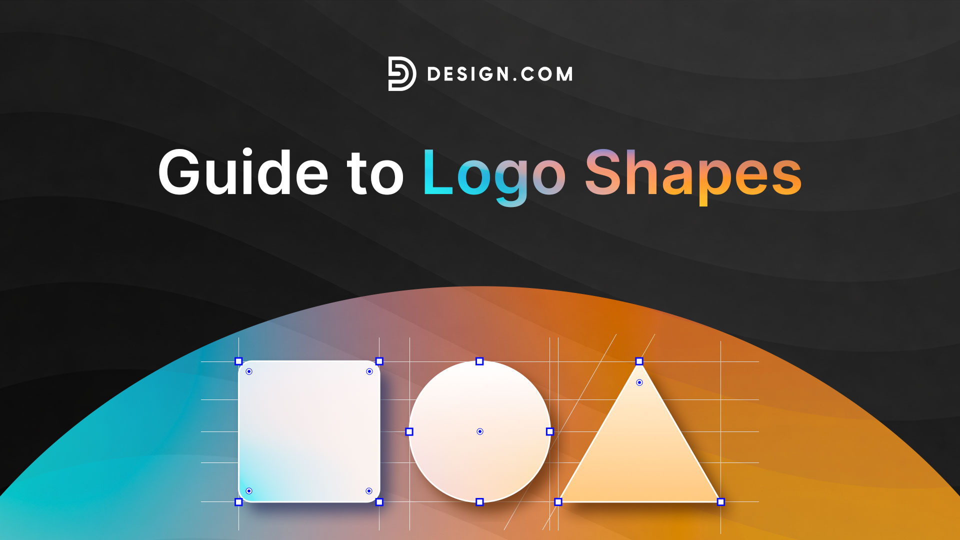
The Complete Guide to Logo Shapes for Modern Branding
Let’s do a quick exercise: close your eyes and think of the most recognizable logos you know.
Done?
You’ll probably notice a pattern with the logos you thought of. And that is how shapes like circles, squares, or triangles are always present in the design.
And that’s not a coincidence. Shapes play a huge role in how people perceive a design, which is why brands strategically use shapes to convey the identity that they want to be known for.
Logo shapes are indeed one of the most powerful design elements. Luckily, you don’t need a huge marketing agency behind you to know what the “right” logo shape for your brand is. You just need to understand shape meaning. In this guide, we’ll explore everything you need to know about logo shapes to help you create the best logo design that aligns with your brand identity.
What does shape mean?
Shape is the outline or boundary of an object. Shape can also be described as the visual area that is enclosed by lines that form a recognizable figure.
To put it simply, these are your circles, rectangles, squares, triangles, etc.
And no, shapes aren’t limited to geometric, “mathematical” shapes. Even shapes from organic and real-life objects can also be counted as shapes. Think clouds, leaves, or flowers.
Shapes can also be 2D or 3D. A flat square is 2D, while a cube is 3D. A triangle is 2D, while a cone is 3D. And so on!
Shapes can also be classified as open and closed. Open shapes are those with lines or curves that do not meet. An example is the letter C or V. Meanwhile, closed shapes are those that meet without any breaks. An example is the letter D or B.
What is shape in graphic design?
How shape functions in graphic design and branding is completely different from how it is used in math.
In math, shapes are meant to define angles or areas. They are used for calculation or measurement.
In graphic design, shapes function as visual language. They are meant to communicate emotion, convey a specific identity or meaning, or build brand identity. Understanding shape meaning allows designers and business owners to make more intentional branding decisions.
Shapes in graphic design are also used to:
- Organize visual space
- Create hierarchy
- Guide the viewer’s eyes
- Add visual interest
- Harmonize other visual elements
Shapes are the building blocks of visual communication. Knowing shape meaning and utilizing them properly (while also keeping in mind the rules of graphic design) can ensure that your logo or visual assets accurately convey your brand’s message.
Shapes in graphic design can also be grouped into three main types:
- Geometric shapes
- Organic shapes
- Abstract shapes
We will dive deeper into these three types later, so make sure you keep reading.
What do shapes represent?
Each shape can communicate a specific identity, message, or value.
For example:
- Circles often evoke unity and community
- Squares and rectangles communicate stability and reliability
- Triangles represent energy and direction
- Organic shapes can evoke the feeling of nature
- Abstract shape can be seen as unique and modern
These associations aren’t random. According to research, humans instinctively connect shapes with emotions and ideas.
That’s why understanding what shapes represent is critical when designing logos. Choosing the right shape meanings can help your brand feel more aligned, intentional, and impactful.
Geometric shapes in logo design
Geometric shapes are mathematically precise forms such as circles, triangles, and squares. These shapes are widely used in logo design because they are simple, scalable, and timeless.
Let’s explore each shape below:
Circles
Circle logos are one of the most popular logo shapes. This is because it can symbolize many great messages, such as:
- Unity
- Community
- Connection
- Inclusiveness
- Love
- Harmony
- Friendship
This flexibility is because of the shape of the circle itself. It’s smooth and round, and lacks any harsh lines. It’s why it’s commonly seen as friendlier and more approachable compared to other shapes.
Meanwhile, the continuous and never-ending line of circles can also convey connection and unity. It can be used in any context, from technological connection, global connection (for language apps or travel agencies), connecting packages from faraway places (for logistical and shipping couriers), down to uniting for one dream (for sports or training centers).
This list of famous circle logos across industries can show you just how versatile this shape is:
AT&T
The globe-like circle suggests global connectivity, which reinforces AT&T’s identity as a worldwide communication service.
Mastercard
The smooth overlapping circles are meant to symbolize cooperation and unity. It is in line with their brand values of making transactions and exchanges easier and hassle-free.
Pepsi
Pepsi’s smooth circle, combined with a bright color scheme and subtle waves, conveys energy and dynamism, which is perfect for their cheery brand image.
Olympics
The Olympics’ logo uses the five interlocked circles to represent the unity of the five continents, whose athletes all came together to play in one space, reflecting principles of color psychology.
Xbox
There are many debates on why the Xbox logo is a green sphere. Some say it’s meant to represent Xbox 360, while some say it’s representing Xbox as a complete gaming experience. Either way, the circle symbolizes completeness and immersion, which is aligned with their brand identity.
Nivea
Nivea uses a circle to reinforce their friendly and caring image. That, combined with their simple sans-serif font and blue palette, adds to their reliable skincare branding.
Looking for some more circle logo samples? Check out the ones here on Design.com:
Spiral Wave Tech by Design.com
Round Circle Shape by Design.com
Circle Shape Orb by Design.com
Modern Digital Brand Circle by Design.com
Square and rectangle
The sturdy looking, solid blocks of squares and rectangles are a favorite among corporate, finance, or consulting brands. This is because these shapes represent:
- Stability
- Reliability
- Professionalism
- Security
- Balance
Here are some famous square and rectangle logos:
Microsoft
The four grids in the Microsoft logo are meant to represent each product in their line (Windows, Outlook, etc.). At the same time, the perfectly aligned squares convey stability and organization, which reflects Microsoft’s promise of being a reliable computer service.
Deutsche Bank
The heavy square frame of Deutsche Bank’s logo suggests stability and security, while the upward slash conveys progress. It’s also combined with a deep blue color which also suggest security, which is the perfect visuals for a reputable organization like Deutsche Bank.
Notion
Notion’s 3D square is a more dynamic take on the shape, which reflects their more modern and tech-forward branding.
Lenovo
The rectangular block combined with the sleek corporate logo font reflects strength and consistency, reinforcing Lenovo’s dependable and professional image.
HDFC Bank
It is said that the stylized grid in HDFC Bank’s logo is meant to replicate a camera’s focus, showing that the bank will do their best to help their customers achieve their goals or target. We think it’s a cool way to convey a deeper meaning while still keeping in line with the usual structured and uniform bank logos!
Now, this doesn’t mean that squares and rectangles can only be used in a corporate manner. Some brands experiment with using them as frames or to serve as outlines to make the design neater. Some also have the corners rounded off to make it a bit more approachable and less rigid.
BBC
BBC uses its squares to frame each letter, making the logo look more distinct and eye-catching.
Ritter Sport
Ritter Sport uses a square to “frame” their design, making it look neater and drawing the audience’s eye to their playful typography.
Domino’s
Domino’s Pizza uses their rectangle to mimic a domino piece. They also used a brighter palette and softer edges to give it a more playful feel compared to the usual heavy structured vibe that rectangles give off.
Take a look at some more square logo and rectangle logo samples here:
Professional Clothing Apparel by Design.com
Cyber Tech Square by Design.com
Professional Geometric Square by Design.com
Colorful Creative Square by Design.com
Pixel Grid Royalty by Design.com
Triangles
Triangle logos are dynamic. Depending on the placement, it can symbolize different things. For example:
- Tip pointing upwards can convey stability plus motion and growth
- Ponting to the right can convey speed and movement
- Ponting downwards can draw the eyes to the item itself, which is why it’s commonly used in badge logos.
Still, a common theme among triangles is that they bring a sense of energy, progress, and innovation. This is why they are a favorite among tech, sports, clothing, and startup brands.
Adidas
Adida’s stylized triangle gives their brand that dynamic and sporty vibe. The slight upward tick to it is also a great way to mimic growth and progression.
Mitsubishi
Mitsubishi’s three diamonds form a triangle that represents strength, reliability, and precision.
Delta Airlines
Delta Airline’s bold red triangle is meant to show upward progress and direction. It’s also meant to symbolize an airplane.
Google Play
The triangle functions as a “play” button, which is a nod to their name as well as the actual motion of playing something that you get on the app. It also symbolizes action, entertainment, and forward motion.
HGTV
HGTV’s triangle is a clever take on showing progress and improvement while also symbolizing a roof on the house.
Reebok
Reebok’s stylized delta triangle represents transformation and progress, which is fitting for the sportswear brand.
HSBC
HSBC is another unique and creative take on triangles. The arrangement of it gives it a more distinct shape, while also symbolizing strength and structure.
Guess
The inverted triangle from Guess signals a bold and fashion-forward identity. It also works as a chic emblem for their clothes.
Check out more triangle logos here:
Industrial Triangle Technology by Design.com
Premium Triangle Deluxe by Design.com
Generic Dental Triangle by Design.com
Yellow Triangular Fish by Design.com
Organic shape in logo design
What is an organic shape?
Organic shapes are irregular, flowing forms inspired by nature. These are your leaves, waves, moon, sun, fire, or clouds. Unlike geometric shapes, they don’t follow strict mathematical rules. The shapes can be imperfect, the lines don’t need to close, and the shapes don’t need to follow their real-life counterparts as exactly as possible.
Organic shape in branding is a shape that feels natural, expressive, and less structured. They often represent:
- Creativity
- Authenticity
- Nature or Environment
- Flexibility
- Naturalness or Organicness
They are commonly used by brands in wellness, sustainability, lifestyle, and creative industries. These shapes help brands feel more human and approachable.
The Body Shop
The flowing shapes reflect nature and authenticity, aligning with the brand’s focus on ethical, natural products.
Dove
The dove icon conveys purity and gentleness, which is further reinforced with the soft lines and muted color palette.
Pond’s
Pond’s uses a tulip shaped icon to represent femininity, gentleness, and care, which is aligned with their brand values.
Evian
Evian uses a stylized mountain shape to connect the brand to nature, which is perfect for their organic, all-natural branding.
Nestea
Nestea uses a fluid leaf to represent their teas. The overall lightness of the design combined with the brighter colors also conveys refreshment.
Tropicana
Tropicana is another brand that uses a leaf shape to represent their fresh and all-natural ingredients.
Chupa Chups
The flower-like badge from Chupa Chups adds playfulness and creativity to the design, appealing to a youthful audience.
Need more organic logo inspiration? Check out our logos here on Design.com that you can easily customize:
Nature Organic Leaf by Design.com
Organic Farm Egg by Design.com
Pear Organic Farm by Design.com
Organic Apple Fruit by Design.com
Abstract shape in logo design
Last are abstract shapes.
Abstract shapes are forms and shapes that don’t directly mimic real-world objects. Instead, they use simplified or stylized geometry to convey ideas, motion, or emotion in a unique way.
Abstract logos are powerful because they allow brands to create distinctive and ownable symbols. Rather than being tied to a literal meaning, they invite interpretation, which makes them more memorable.
Abstract shapes are often used to represent:
- Innovation and forward-thinking
- Uniqueness and brand differentiation
- Movement and transformation
These shapes are popular among technology companies, startups, and global brands that want a modern identity.
Because they’re not tied to a specific object, abstract logos can evolve with a brand over time. They can also be used to be in line with the minimalist logo trend, as abstract shapes can be used to simplify complex ideas.
Airbnb
The abstract symbol is supposed to represent people, places, and belonging. It’s a mark that conveys their messaging while also being unique enough that people can instantly associate it with AirBnB.
Slack
Slack’s logo represents connection and collaboration, which is fitting for an office messaging app. It’s also a creative way to symbolize #, which is how each channel is sorted on the app.
Huawei
The abstract form is meant to mimic a blooming petal to evoke growth and innovation. The shape combined with the bold red color makes it a more unique logo in the tech space.
Squarespace
The interlocking abstract shapes represent both structure and creativity, which aligns with their promise of giving users flexibility with their web design templates.
Sprint
The dynamic abstract lines convey speed, motion, and forward momentum, which are Sprint’s brand values.
Here are more creative abstract logos that you can find here at Design.com:
Colorful Abstract Ellipse by Design.com
Application Software Technology by Design.com
Orange Swoosh Enterprise by Design.com
Minimalist Geometric Flower by Design.com
Generic Creative Brand by Design.com
What shape represents strength?
What shape represents strength in logo design? Typically, triangles and squares are the strongest symbols.
Triangles convey power, energy, and forward movement. They’re often used by technology companies to communicate innovation and growth.
Squares, on the other hand, symbolize structure, balance, and reliability. That’s why they’re widely used by finance and corporate brands as symbols of trust.
Both shapes are powerful symbols of trust and stability when used correctly.
Best shapes for logos
Now that you know all these details about logo shapes and shapes meaning, which is the best shape for logos?
The answer is… the best shape for logos will depend on your brand personality and goals. As you can see above, each shape has a specific meaning or identity attached to it. Therefore, there is no one shape that can be seen as universally better than anything else, as they focus on different things.
It’s best to use the shape that can accurately convey your brand values and messaging as you design your logo. Here’s a quick guide:
- Circle → Connection, friendliness
- Square → Stability, reliability
- Triangle → Progress, energy
- Organic → Creativity, nature
- Abstract → Modern, innovation
Choosing the right shapes for logos ensures your brand communicates the right message instantly. You can also combine shapes to create stronger symbolism and a more memorable visual identity.
Conclusion
Logo shapes are a fundamental part of effective branding.
By understanding shape psychology, businesses can create logos that feel right and tailored to them. Whether you prefer the precision of rectangles or calming vibe of flowy organic shapes, using the right shapes for logos can reinforce your brand identity and make a lasting impression.
Start experimenting with different logo shapes today and discover what best represents your brand. Feel free to hop on to our logo maker tools such as flower logos, diamond logos, and more. You can also check out our business name generator to get a catchy name that matches your new logo.
Build your brand with Design.com today!