What Makes a Good Logo? 10 Principles of Effective Logo Design
Before people read your tagline, check your products, or listen to your sales talk, they will get to know about you through your logo. That’s the mark that will shape their perception of your brand, whether to trust it or not. But what separates a logo that builds a brand for decades isn’t just edgy designs or cool font-color combinations — it’s a handful of proven principles.
This guide breaks down what makes a good logo, the 10 logo design principles behind it, and how to assess your own logo using a practical framework. Whether you hired a professional designer or created your own logo using a logo maker, these principles apply the same way.
What makes a good logo?
A good logo doesn’t have to be complex. What matters most is that it’s relevant to the brand it represents. It should also be instantly recognizable and versatile at any size — from business cards to billboards.
Your goal here is to create a logo that supports long-term brand recognition. You don’t need to adhere to any short-term trends.
Why good logo design matters
A good logo design is important. It creates instant first impressions, builds brand recognition, signals credibility, and sets you apart from your competitors. It’s not just a decoration. Your logo should accomplish all these things even before your target audience decides to check you out.
Here are some examples of famous logos that successfully helped their brands:
Apple (1998 monochrome logo)

When Apple replaced its rainbow logo (which it had used since 1977) in 1998 with a monochrome silhouette, the redesign reflected the brand’s evolution from a personal computer manufacturer into a premium consumer technology company.
Nike (1971 swoosh)
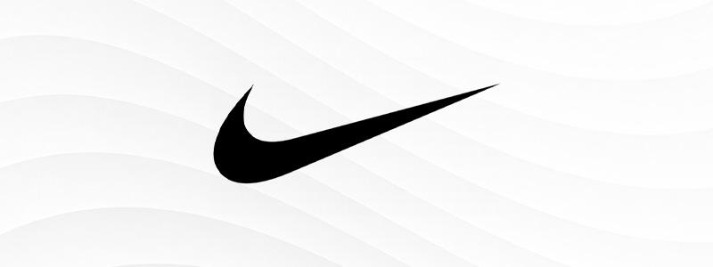
Nike has been using the same logo since 1971. Designed by then-graphic design student Carolyn Davidson, the swoosh has become one of the most recognizable logos in the world. Its abstract shape enables it to be scaled from a shoe tag to a stadium banner without losing its meaning.
McDonald’s (1993 standalone arches)

When McDonald’s started using a logo without the wordmark in 1993, the company proved that a logo can outgrow the need for text once brand recognition is strong enough.
FedEx (1994 wordmark)

Designed by Lindon Leader of Landor Associates, FedEx’s logo features a hidden forward-pointing arrow in the negative space between the “E” and “X.” While it may not be obvious at first glance, it doesn’t affect the wordmark’s function as it still reads clearly.
The 10 Principles of effective logo design
Here are ten logo design principles that set strong logos apart from forgettable ones. They include simplicity, memorability, brand personality, versatility, scalability, timelessness, intentional color, considered typography, accessibility, and responsive design.
1. Keep it simple
While it’s tempting to use striking colors, quirky fonts, and edgy icons, simple logos are easier to recognize and reproduce across different materials — regardless of resolution.
Logos with complex designs don’t translate well in small sizes. Their fine details vanish, especially in low-quality printing. Apple and Nike are perfect examples of simple logo designs that are recognized everywhere.
2. Make it memorable
Using complex design elements may grab people’s attention, but it doesn’t help them remember you. A good logo is easy to remember. You can do this with a single distinctive shape or concept.
One perfect example is McDonald’s arches and Target’s bullseye logo, which they started using in 1968 and only updated in 2004. Both work as pure shapes — no text required.
Target (2004 bullseye logo)

3. Match your brand personality
Fonts, icons, and colors are the most effective way to communicate who you are as a brand. Hence, you choose them based on your brand personality, not for pure aesthetics.
This is also how brands show what industry they’re part of. For example, children’s brands like Lego don’t have the same feel as luxury brands like Rolex.
Lego (1998 bold red wordmark)

Rolex (2002 crown emblem)

Lego’s bold red logo feels energetic and child-friendly. Meanwhile, Rolex’s crown feels more formal and luxurious. If they swapped designs, they wouldn’t be able to reach their target audience.
4. Design for versatility
You will be using your logo a lot. It will be on your business cards, packaging, merchandise, social media platforms, billboards, etc. You may use it on a variety of background colors.
Hence, your logo should come in different types. This means having your logo in transparent background, icon-only, one-color, and reverse-color versions. The catch is your logo should look perfect in all these versions.
| Design tip: Test your logo on different backgrounds, especially black and white, before finalizing it. If one version needs redesigning, your logo isn’t versatile yet. |
5. Prioritize scalability
Aside from versatility, you should also ensure your logo works in different sizes. Your logo may look good as a profile picture on your social media account, but it will look distorted and blurry when printed on posters and flyers.
This is why there are different logo file formats. Raster files like JPG and PNG are more suitable for digital applications, while vector files like SVG and EPS are for printing. This allows you to use your logo in different sizes without losing any intricate details.
| Design tip: Always keep a vector master file (SVG or EPS) of your logo. You can export a raster version from a vector file at any time, but not the other way around. |
6. Choose timeless over trendy
Trendy design elements, like gradients, 3D effects, and artsy fonts, can go out of style fast. This can cause you to redesign your logo sooner than you should, which is expensive. Meanwhile, timeless logos with their clear shapes and classic fonts can last for decades.
| Timeless logos | Trendy logos |
| Simple | Overly decorative |
| Long-lasting | Trend-dependent |
| Clear shapes | Effects-heavy |
| Works for years | May require frequent redesigns |
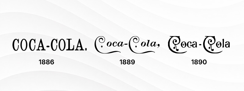
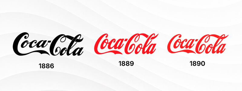
A perfect example of a timeless logo is Coca-Cola’s script. The red version was first used in 1934, but the company has used the script font since the 1880s. While there are differences from the Coca-Cola logo we see today, the company didn’t stray too far from the original design.
Coca-Cola (1887 script)
Coca-Cola (1934 script)
7. Use color intentionally
People’s perceptions are shaped not just by your brand name, but by colors too. Different colors can evoke different emotions and behavior, according to color psychology. For instance, UPS’s brown logo signals reliability and practicality.
UPS (2014 logo)

However, your logo shouldn’t rely only on color. Before you go crazy playing with different color combinations, your logo should also work in monochrome.
8. Select typography carefully
Typography may seem like a small detail in logo design, but it also carries personality like colors and icons. When choosing fonts, choose the ones that are easy to read and match your brand tone.
A good example is Disney’s stylized script. The first version debuted in 1937. It perfectly matches the company’s whimsical, playful, and imaginative tone.
Disney (1937 script)
9. Design for accessibility
When designing logos, we often focus on aesthetics that we forget about accessibility. However, this directly affects your logo’s usability.
It’s important to check contrast ratios between the logo and the background. Test your font’s readability for color-blind users. Check whether your logo performs on low-resolution displays, and confirm if it works in both light and dark modes.
10. Ensure it works everywhere
In this day and age, you’ll need a full responsive logo system. Aside from a single static file, there should also be a simplified icon, wordmark-only version, a social profile icon, and a favicon. This ensures that your logos can function across different digital and physical channels.
Characteristics of good vs. poor logos
The difference between good and poor logos usually comes down to seven qualities. Here’s a quick side-by-side comparison of the traits that separate the two.
| Good logo | Poor logo |
| Simple | Overcomplicated |
| Memorable | Generic |
| Scalable | Loses detail |
| Timeless | Trend-driven |
| Accessible | Poor contrast |
| Versatile | Works only in one format |
| Relevant | Doesn’t reflect the brand |
Common logo design mistakes to avoid
Most bad logos aren’t the result of a designer’s personal style choices. Rather, it’s because they skipped one of the logo design principles. Here are some of the most common mistakes:
- Making the design too complicated with various competing elements.
- Prioritizing trends over longevity.
- Using too many colors and/or fonts at once.
- Skipping to test your logo in small sizes, like a favicon or app icon.
- Having poor contrast and/or low accessibility.
- Copying a competitor’s visual language rather than coming up with something different.
- Saving your logo in only one format.
- Not testing your logo in black-and-white or grayscale form.
How to test if your logo works
You can only say a logo is ready once it passes tests across different formats, sizes, and backgrounds. Here are steps on how to test your logo.
- Shrink it: Scale your logo down to favicon size (roughly 16–32px). If the shape blurs, simplify it. This test catches most scalability problems early.
- Strip the color: Convert the logo to black and white. If it loses meaning or legibility without color, the design relies so much on color rather than the shape.
- Flip the background: Place the logo on a solid dark and solid light background. Both versions should stay legible.
- Test it on a busy background: Place your logo over a photo or textured background you’ll be using. Your logo shouldn’t work only on a flat background.
- Check how it looks on a phone screen: Don’t zoom in. Look at it as it will appear on a mobile header, app icon, or social media profile picture.
- Print it at business-card size: A physical test catches what digital previews usually hide.
- Blow it up at a large scale: Even just on-screen, enlarge your logo to signage or banner size. This will help confirm if any parts of the logo look distorted or stretched.
- Compare it to competitors: Check your competitors’ logos and compare them with your logo. If it looks just like the others, revise it to make it more distinct.
Logo evaluation checklist
Here’s a useful checklist you can use whenever you have to evaluate your logo before it goes live.
| Question | Yes | No |
| Is it simple? | ☐ | ☐ |
| Is it memorable? | ☐ | ☐ |
| Is it readable? | ☐ | ☐ |
| Works at small sizes? | ☐ | ☐ |
| Works in black & white? | ☐ | ☐ |
| Matches brand personality? | ☐ | ☐ |
| Accessible? | ☐ | ☐ |
| Looks good on digital and print? | ☐ | ☐ |
| Timeless rather than trendy? | ☐ | ☐ |
| Distinct from competitors? | ☐ | ☐ |
Scoring: If you get 8–10 “Yes” answers, it means you have a strong logo. Meanwhile, getting 5–7 means it’s worth refining. Below 5 suggests a redesign.
Creating a good logo with AI
A modern AI logo generator can help you create a complete, ready-to-use logo designed on the same principles covered in this guide. The only difference between the AI route and hiring a professional designer is that it’s faster.
AI can generate a variety of logo concepts in just seconds, enabling you to explore multiple directions and refine the one that suits your brand. This is especially useful for entrepreneurs and small business owners who want to create their own logo but don’t have design experience.
| Design tip: After generating a logo with AI, run the test and evaluate it according to the checklist. |
Final thoughts
Effective logo design is based on a solid strategy, clarity, and usability. It should be simple enough to remember, versatile enough to work everywhere, and consistent enough to build trust over time. Always run your logo against the 10 principles in this article and evaluate it based on the checklist above.
If you’re starting from scratch, a modern logo maker or AI-assisted workflow is a fast way to start. Platforms like Design.com let you create a logo from scratch in just minutes. It also automatically syncs your logo on other templates, so you can see how it looks on business cards, websites, flyers, t-shirts, social media platforms, and other assets.
Just remember: a great logo isn’t finished the moment it’s generated — it’s only complete when it holds up everywhere your brand shows up.