Which AI Logo Maker Produces the Most Original Designs?
AI logo makers work fast. Just type in your business name or a short prompt, and you get dozens to hundreds of finished logos to choose from within seconds.
However, fast doesn’t always equal a good logo. How does the design look? Are there any errors or visual flaws? And most importantly, do they actually feel original?
After all, there are only so many times a coffee company can use a coffee cup or a tech startup can use an abstract blue logo before it becomes boring and repetitive.
So instead of simply looking at who has the most features or who generates a logo fastest, we wanted to see which platforms are better at producing ideas that feel distinctive while still working as actual brand identities.
We decided to put these six popular options: Design.com, BrandCrowd, Canva, Wix Logo Maker, Adobe Express, and Fiverr Logo Maker to the test to see which is the best AI logo maker when it comes to originality. And rather than treating originality as simply “the weirdest design wins,” we paid attention to creative variety, use of predictable industry clichés, brand relevance, and whether the results felt deliberately designed rather than randomly generated.
Scroll down to see the results.
TL;DR: Which AI logo maker creates the most original logos?
| AI logo maker | Originality verdict | Best for… |
| Design.com | Best overall | Original designs that still feel on-brand |
| BrandCrowd | Most creative | More unique concepts |
| Wix / Wixel | Good, but a bit safe | Polished, conventional logos |
| Adobe Express | Creative, but produces flawed outputs | Experimental and illustrative ideas |
| Canva | Good, but too conventional | Quick and simple logos |
| Fiverr | Dependent on the library | AI logos whose foundations are designer-made |
Our winner is Design.com. It has the strongest balance between originality and brand relevance, helped by a huge design library and exclusive fonts, shapes, and other creative assets that aren’t available everywhere else.
BrandCrowd comes extremely close, with extremely varied and creative logos. Design.com wins because its logos still tend to feel like cohesive brand identities rather than creativity for creativity’s sake.
What does an “original” AI logo actually mean?
Original doesn’t necessarily mean that no similar logo has ever existed. That’s going to be impossible, particularly as many businesses deliberately use icons or colors to make them recognizable as part of an industry.
That means a dental clinic that uses a tooth icon or a landscaping company that has a green and brown color palette can still have an “original” logo.
What we’re looking at is how those elements are interpreted, combined, and how they work together with other visual elements. So for our standards, the AI logo makers are original when it:
- Avoided relying entirely on obvious industry clichés. Recognizable imagery is fine, but the logo shouldn’t feel like the first possible answer to the prompt. So slapping one tooth icon with nothing else and calling it a dental logo is not the way to go.
- Explored multiple visual directions. We want more than just the same icon having different background colors. We want to see different styles – minimalist, retro, 3D, or line art, whatever is fitting for the brand.
- Had its own visual personality. Typography, shapes, illustration style, colors, and composition should all contribute to produce a specific vibe or personality, rather than just compiling elements randomly.
- Still made sense for the brand. An unexpected logo isn’t useful if nobody can understand why it belongs to the company. It still needs to follow the branding.
- Looked like an actual logo. Generative AI can produce fascinating images, but sometimes the outputs are closer to illustrations, posters, or hero images than a logo.
How we compared the AI logo makers
Rather than using an extremely restrictive prompt such as “create a circular logo with a bird in the middle and use blue serif font,” the better way to test originality is to give the AI room to make some creative decisions.
That’s because overly specific instructions can unintentionally make every platform produce roughly the same concept. As our previous custom prompt testing found, this makes the AI focus on hitting every instruction rather than giving it an opportunity to suggest an unexpected composition or idea.
Our prompt ended up as:
“Create a logo for Moonwake, a coffee shop aimed at night owls, creatives, and people who do their best work after dark. The brand should feel modern and bright without being overly cheerful.”
…which describes the business and brand personality rather than highly specific instructions in terms of visual execution. With this, we can see how the AI interprets the prompt and how original it can get. It also makes us see:
- Does the generator simply put a coffee cup to signify that it’s a coffee shop, or do they use other elements related to coffee?
- Does it consider the nighttime aspect, or does the AI ignore it entirely?
- If they do consider it, are they just limited to a moon or dark palette?
- Does it find interesting ways to combine the two ideas?
- Does it use typography or a color palette to communicate the concept instead?
- Does it move away from literal imagery altogether?
So how did the six AI logo maker tools fare?
Which is the best AI logo maker for producing original logos?
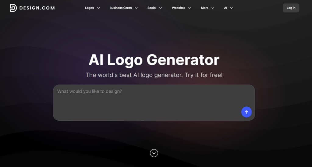
1. Design.com
Best for: Original designs that still feel like a cohesive brand
Design.com’s logo maker takes our top spot because it doesn’t treat originality as simply generating something unusual.
Instead, the platform is particularly good at staying on-brand and following industry conventions while finding different ways to visually represent the identity as a whole. So while we do see coffee cups and moons, we also see owls (to signify “night owls”), clocks, hourglasses, and more creative interpretations.
We also see different takes on the vibe of Moonwake: some leaning on the artistic side, some on the energetic side (to signify the buzz you get from the coffee), while some lean on the moody feel to hit the nighttime brief. While the platform experimented, they still remained on brief.
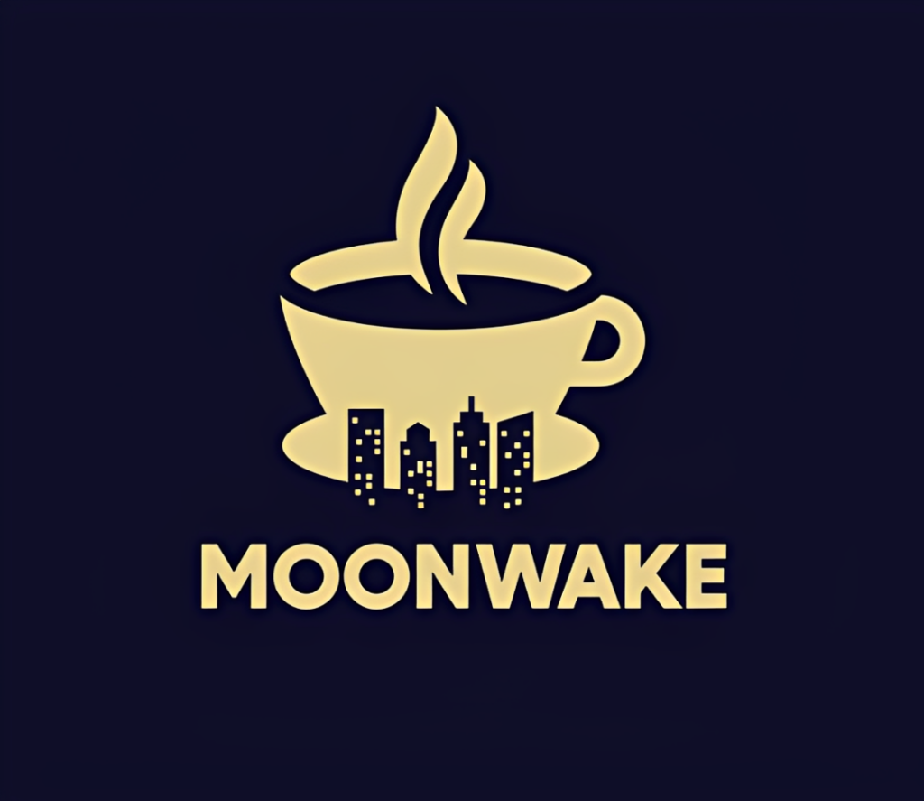
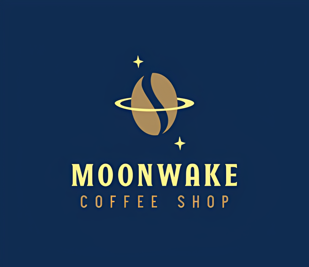
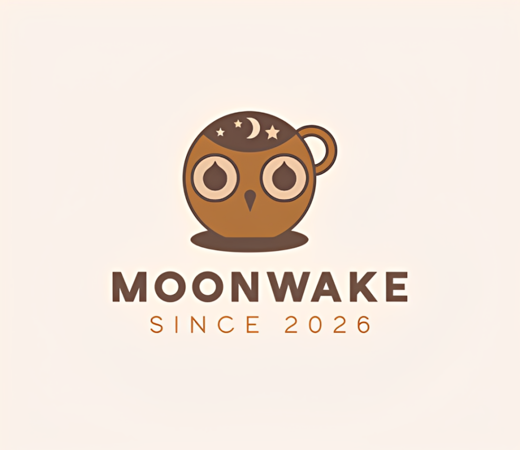
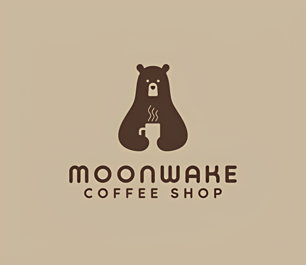
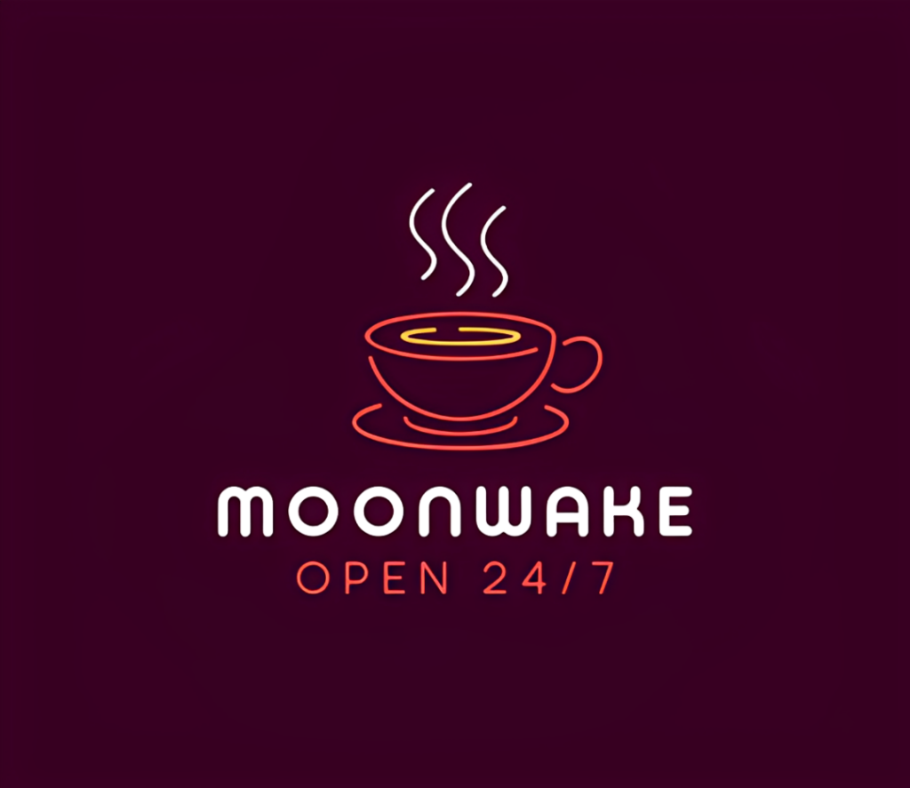
This is consistent with our previous testing of the best AI logo generators in 2026, where Design.com was particularly strong at interpreting both what a business sells and how the brand is supposed to feel. Its concepts also tended to combine typography, imagery, color, and hierarchy into something that felt like an intentional identity rather than simply an icon with a company name plastered underneath.
Why Design.com has an originality advantage
Another factor of how original an AI logo generator can get is the “ingredients” available to the AI in the first place.
Design.com’s AI pulls from their massive library of professionally designed logos, along with hundreds of exclusive fonts and tens of thousands of custom vector shapes.
And yes, that matters in making a logo look original. Because if a logo maker draws from stock libraries of fonts or icons, the logos will look like something you have already seen a million times (because you technically did, just as per individual element).
Design.com’s exclusive assets expand the visual vocabulary of its AI logo maker. A logo created from a font or vector shape in Design.com isn’t something you’ll see in other design platforms.
Of course, exclusive assets alone don’t automatically make a logo great. You could combine five unique elements and still end up with a terrible design.
The advantage is that Design.com combines those assets within a system that’s already heavily focused on branding. The resulting concepts tend to feel considered and intentional, rather than randomly assembled.
Another factor is the sheer variety. Instead of generating only a handful of concepts and forcing you to keep prompting, Design.com gives you hundreds to thousands of logo concepts to browse. That increases your chances of finding the interesting idea hiding beyond the obvious ones.
Verdict: Design.com produces the best balance of originality, polish, and brand relevance. Its exclusive design assets give it a more distinctive foundation, while its brand-focused approach helps those elements come together as actual logos.
2. BrandCrowd
Best for: Exploring more adventurous creative directions
BrandCrowd is an extremely close second in terms of best AI logo maker for original logos.
Where Design.com excels at building a cohesive identity around the brand, BrandCrowd tends to be more willing to explore different interpretations of an idea. You can see some vintage concepts, some more cartoony approaches, or more sophisticated wordmarks. It doesn’t just lean on obvious imagery to get the concept across, which is how human designers actually think. So in a way, you get more original logos in BrandCrowd.
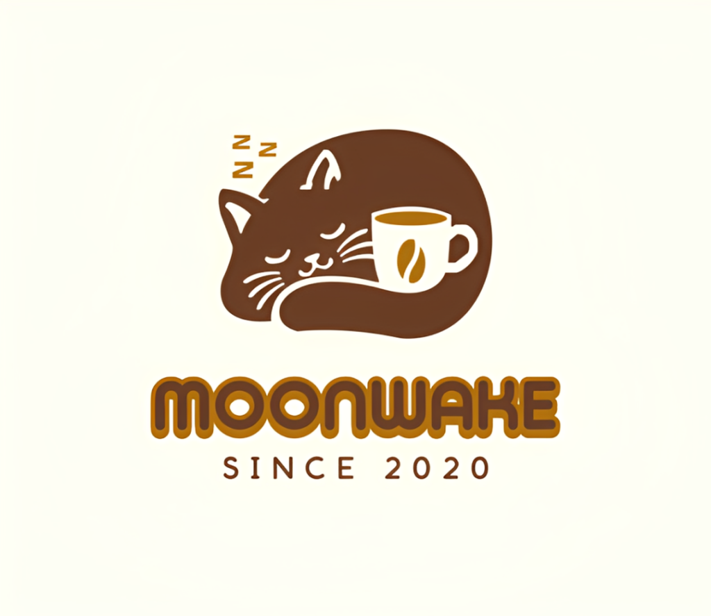
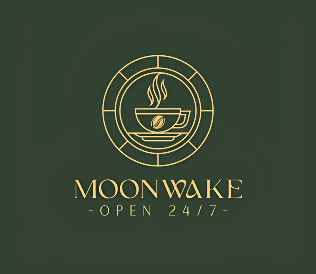
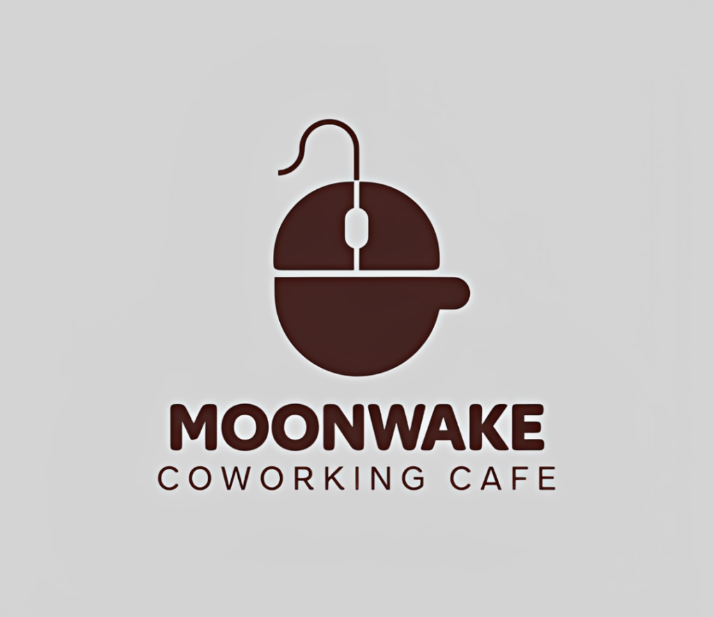
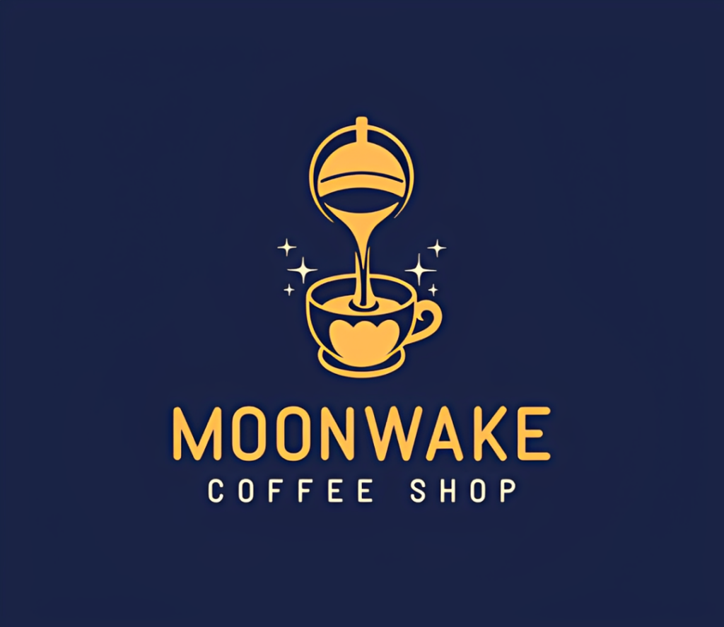
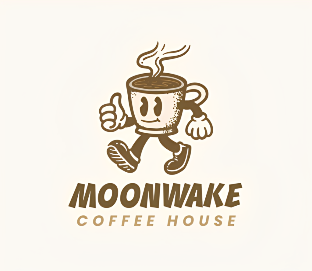
However, what makes Design.com stand out from BrandCrowd is the platform’s on-brandness. BrandCrowd is more experimental, but it does produce logos that may be slightly far from the desired vibe or personality. It’s good for creative exploration, but it’s not 100% accurate.
Verdict: BrandCrowd is one of the best choices if you want AI to push beyond the first obvious interpretation of your business. Design.com wins overall because of its stronger brand-focused consistency, but BrandCrowd is excellent for discovering unexpected ideas.
3. Wix Logo Maker / Wixel
Best for: Safe, competent, usable logos made from a step-by-step guide
Wix takes a considerably more structured approach. Instead of a prompt, Wix asks questions about your business, industry, desired identity, and visual preferences before producing its recommendations.
This is beneficial as the AI has fewer opportunities to completely misunderstand what you want. But this also means the results are more conservative.
Wix logos are good and look appropriate for the business. The typography and icons make sense, the colors used are popular in the industry, etc.
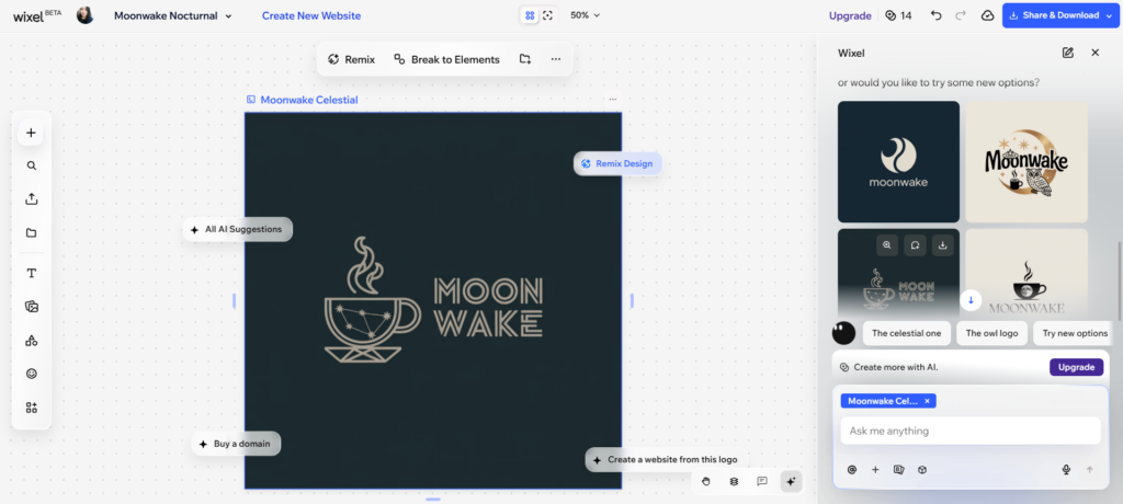
However, it’s not particularly adventurous or new. You won’t really get fresh takes or new ideas unlike Design.com or BrandCrowd.
That’s not necessarily a glaring weakness. Plenty of small businesses don’t need an experimental identity. If you’re starting an accounting firm, plumbing company, consultancy, or local restaurant, a professional and recognizable logo may matter considerably more than reinventing the visual language of your industry.
But since our testing is all about originality, Wix receives just average marks.
Verdict: Wix is better at dependable logo design than creative exploration. Its guided process helps keep designs relevant, but that same structure can lead to more conventional concepts.
4. Adobe Express
Best for: More colorful and busy visual concepts
Adobe Express presents an interesting problem in an originality test.
You can indeed get creative logos from the platform. This is because you can set their AI logo maker to generate based on different artistic movements, materials, illustrations, techniques, and so on. That creates considerably more room for experimentation than you’d get from a traditional template-based logo maker.
Adobe Express also produces more original takes on your brief. It’s not afraid to be more experimental, to do more intricate art, use bolder color schemes, etc.
So why isn’t it higher on our list?
Because original and good logo design aren’t exactly the same thing.
First, is that Adobe Express AI produces a lot of visual flaws. You can see misspelled text, weird composition, or random icons in places that don’t make sense. This can be edited and cleaned up, but it adds more work for the user.
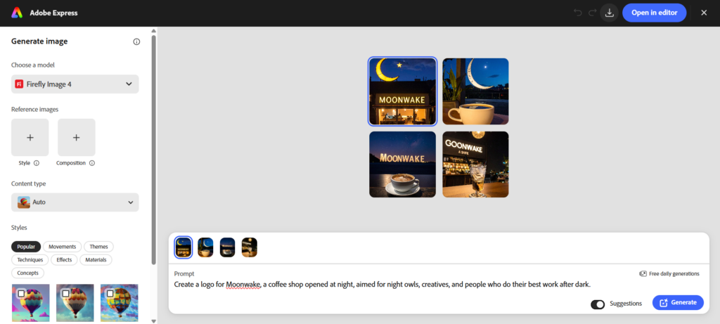
Next, their outputs don’t exactly look like logos. If anything, these images are better suited for posters or Facebook posts, not logos.
Lastly, while these may be creative, they’re not 100% on-brand. Again, it’s good for exploration, but it would have scored higher if it were original and on brand.
Verdict: Adobe Express can produce some of the most visually striking results, particularly if you’re willing to experiment with its generative controls. However, you’ll generally need to do more work to turn those ideas into polished, practical logos.
5. Canva
Best for: Quickly exploring familiar logo directions
Canva is one of the easiest tools here to start using, and that’s part of its appeal. You can describe what you want conversationally (like you are in ChatGPT), wait for it to generate ideas, and refine the result by asking for edits in the chat.
The issue is that Canva often gravitates toward recognizable visual formulas. If you request a premium brand, expect the familiar minimalist or luxury styling. If you ask for something natural, expect leaves, earth tones, and organic shapes.
These aren’t bad design choices per se. They’re conventions because they work.
But when the specific question is which platform produces the most original logos, playing it safe becomes more noticeable.
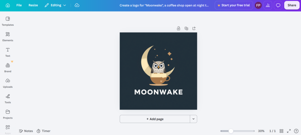
In our experiment, Canva captured the broad aesthetic requested but produced relatively plain or off executions. It’s trying to cram every element into one logo. Some outputs also contained small generative inconsistencies that needed further editing like some weird shadows and misspelled words.
Canva’s editor does make those ideas easy to customize afterward, which is great. You can change typography, graphics, colors, spacing, and other details until the result becomes much more “original”. But like in Adobe Express, it just puts more responsibility and effort on the user side.
Verdict: Canva is excellent for quickly getting an idea onto the screen, but its initial AI concepts tend to favor familiar visual solutions. Expect to customize more heavily if distinctiveness is your main priority.
6. Fiverr Logo Maker
Best for: AI logos built on designer-made foundations
Fiverr Logo Maker works differently from many of the tools above. They are not generative AI in the true sense of the word. Rather, they use AI to match your instructions and find a relevant logo from their library.
These logos are created by human designers, and are top notch as per their site. This is an advantage in a sense, as you avoid the generative AI problem that you saw in Adobe Express and Canva. You won’t see mangled typography, inexplicable shapes, or weird details since these are created by humans that understand the right design principles.
However, there’s a trade-off.
Your result depends on whether Fiverr has an existing design that happens to fit your particular combination of industry, personality, and concept.
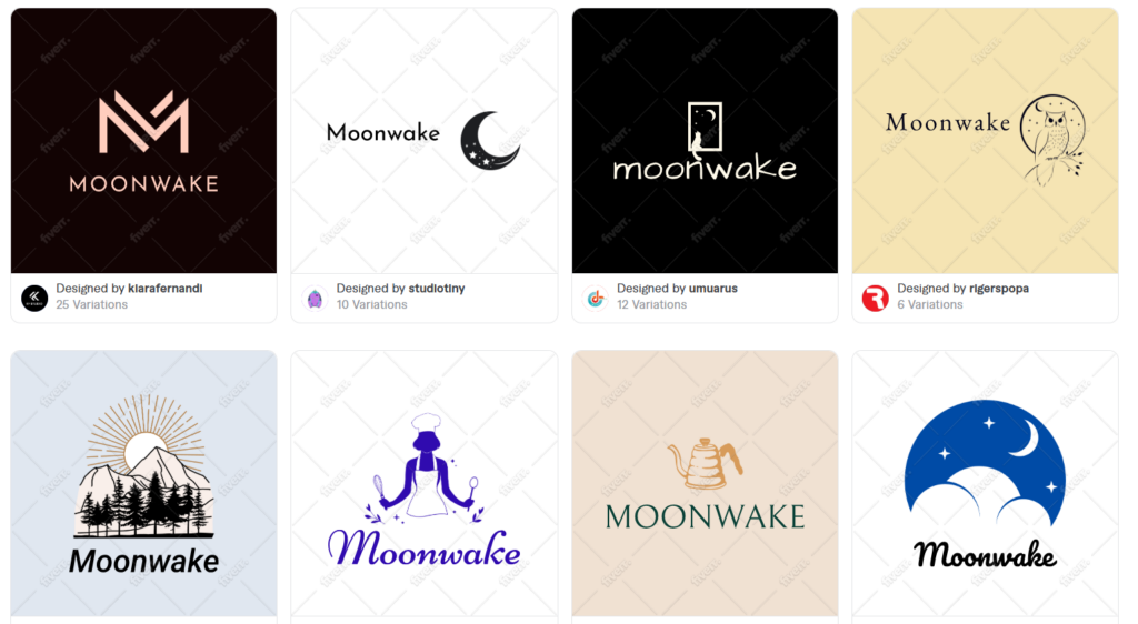
Our testing demonstrated this limitation clearly. Fiverr returned professionally constructed logos, but they weren’t particularly precise matches for the brand brief because its AI was essentially finding the closest available options from an existing pool.
That creates an interesting distinction between originality and uniqueness.
A designer may have created an original underlying logo concept. But if the design isn’t a match to what you want, that originality doesn’t necessarily help you.
And… It’s not like Fiverr’s library is particularly exciting or adventurous. It’s good, but it leans safe and conventional. So if you are looking for truly “original” logos, it will be harder to find on the site, unless you are willing to personalize the logo template.
Verdict: Fiverr Logo Maker offers polished designer-made traditional logos and avoids many generative-AI flaws. However, the matching system makes originality dependent on what suitable concepts already exist in its library.
Final verdict: Which AI logo maker produces the most original designs?
If originality is your priority, Design.com is our top choice, with BrandCrowd following extremely close.
Design.com’s biggest advantage is that originality starts with the resources available to the platform. Their AI pulls from a huge library, with designs spanning across multiple styles and industries. It also houses exclusive fonts and custom shapes, giving its AI logo maker some visual ingredients you aren’t simply going to encounter across every other design platform.
More importantly, Design.com doesn’t rely on unusual assets alone. Its AI is particularly good at understanding the wider brand (the industry, personality, positioning, and visual direction) and bringing those details together into cohesive concepts. That makes the results feel less like a collection of graphics and more like identities that could genuinely belong to a business.
BrandCrowd is the strongest alternative if you want to explore more adventurous directions.
Wix and Canva tend to produce safer concepts, while Adobe Express gives you more freedom to experiment but may require more cleanup. Fiverr’s designer-made approach produces polished results, although how closely they fit your brand depends on what’s already available in its library.
And that concludes our experiment! If you are interested to see how Design.com performs for your brand, hop on to our AI logo maker today and enter your custom prompt. You can also use our other AI design tools like AI business card maker and AI website builder and see the creative outputs you can get in the platform.
Happy designing!