The Complete Guide to AI Logo Generators Using Custom Prompts
AI logo generators can look identical on paper. How do you know the difference between each tool and decide which one is the best AI logo generator for your needs?
Most people judge based on the tools’ feature list: how many templates they offer, what file types they have, etc. However, knowing the features doesn’t necessarily tell you how the AI performs and how good the logo outputs are.
The best way to find out is to give it a custom prompt.
This is because a good prompt reveals the differences between AI logo generators surprisingly quickly. One might follow the brief to a T but produce fairly predictable designs. Some might take more liberties, but lead to more fresh takes. While some might get that right balance and produce accurate and creative logos.
That’s why we’re using a custom prompt to explore six popular AI logo generators: Design.com, BrandCrowd, Wix Logo Maker, Adobe Express, Canva, and Fiverr Logo Maker. This will help you see how each platform approaches a brief, what kinds of logos it will produce based on that brief, and, most importantly, whether the logo outputs are what your brand needs.
TL;DR: How do AI logo generators handle custom prompts?
- Choose Design.com for the most relevant and on-brand results.
- Choose BrandCrowd if you want fresher takes on your prompts, without straying too far from your request.
- Choose Wix if you want guidance when creating your logo.
- Choose Adobe Express if you want more creative control over how the final output will look.
- Choose Canva for a fast, simple way to get your logo.
- Choose Fiverr if you want to avoid common AI flaws.
AI logo generators compared: how they interpret your prompt
Every AI logo generator has its specific strengths and focus. Some follow the brief as accurately as possible, while some prioritize giving you more creative options.
Neither is necessarily better than the other. It all just depends on what you value most or what you need out of your logo.
To make these differences easier to spot, we gave them the same prompt:
“Create a logo for Regal Infusions, a premium loose-leaf tea brand that aims to make tea a part of a person’s day as a calming ritual. The logo should feel calm, serene, refined, and premium.”
It’s a relatively straightforward brief. However, there’s enough nuance to fully compare and contrast how the AI logo generators work:
- First is branding and visual direction. How well does it meet those? For instance, a teacup might technically represent tea, but that’s not enough to communicate “premium” or “calming.” Do the typography, color palette, imagery style, and composition all work together to create the right impression?
- Next is accuracy. Recognizing the word “tea” isn’t enough. Regal Infusions specifically sells loose-leaf tea, so showing a tea bag would be inaccurate. Milk tea, matcha whisks, or other unrelated tea imagery wouldn’t fit either.
- Last is quality regarding the AI itself and the logo results. Does it just latch on to one keyword and ignore the rest? Does it produce obvious AI mistakes, such as misspellings? Are the logo outputs usable? Are the logos creative or conventional? And so on.
1. Design.com
Best for: Getting the most on-brand results
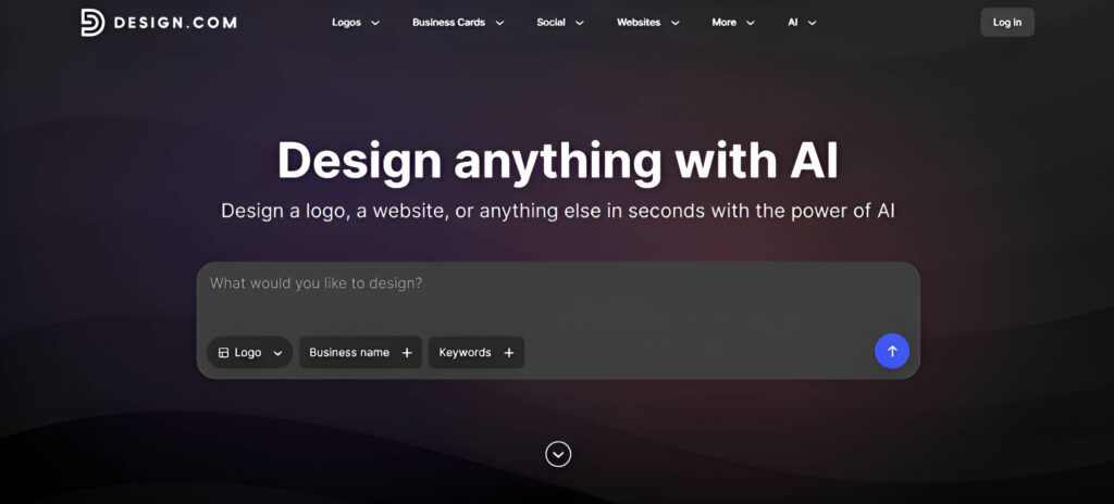
How does prompting work? Users need to enter a prompt that contains their business name and keywords. You can also enter them individually in the “Business name” and “Keywords” tab.
How does it interpret the custom prompt?
Design.com performed particularly well in terms of understanding your prompt. It didn’t just recognize that Regal Infusions was a tea company and ended there – they used the right loose-leaf tea imagery and avoided the matcha or milk tea trap. Design.com also followed the brand personality, which is serene and premium, hitting both elements without forgetting the other.
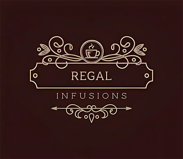
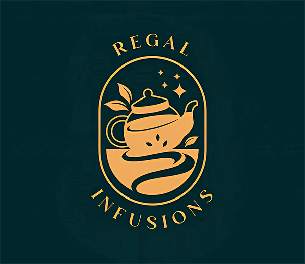
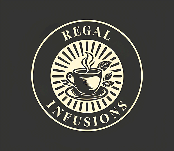
The outputs were consistently polished. Text was spelled correctly, lines and icons were clean, and we didn’t encounter the smearing or malformed details associated with generative AI imagery. The logos also looked like actual logos rather than just icons with a business name placed underneath.
What impressed us most was how few corrections the concepts needed. The visual hierarchy, typography, colors, and imagery felt on-brand as a whole, so you won’t really need to edit much just to make them suitable to your brand.
The experience is closer to working with a brand strategist than asking an AI image generator for a logo: you provide the business context and desired personality, and the results reflect those decisions across the entire design.
Verdict: Design.com is the best AI logo generator if interpreting the brand accurately matters the most to you.
2. BrandCrowd
Best for: More creative interpretations of your brief
How does prompting work? Enter the prompt, which is a description of your business + business name + keywords, then click Generate.
How does it interpret the custom prompt?
It would have been very easy to interpret “premium tea” in one predictable way: dark green background, serif typography, minimalist teacup, done.
BrandCrowd didn’t restrict itself to that formula. Aside from our elegant teacup logos, we also saw tasteful line-art illustrations, more abstract approaches, and colorful concepts. Crucially, that experimentation didn’t stray too far, and the logos still felt suitable for a premium tea company.
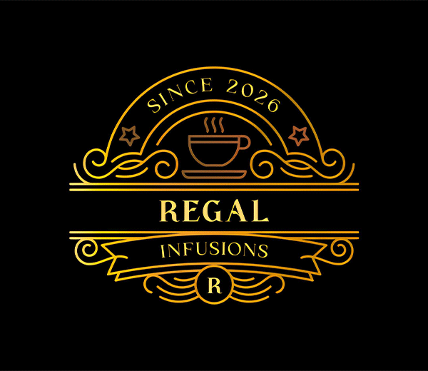
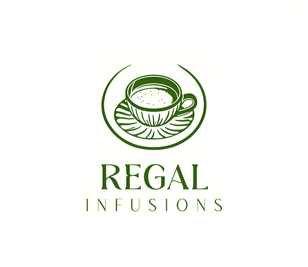
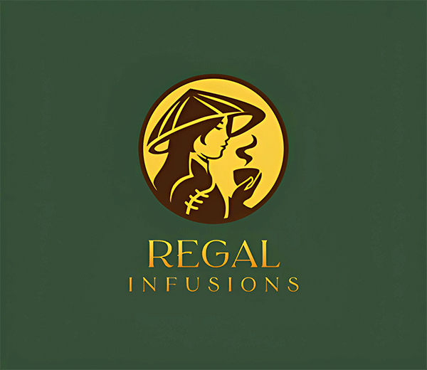
This is where BrandCrowd has the advantage. It’s not filled with logos that rely heavily on predictable industry conventions; it also produces more original designs. Visual quality was also consistently high. We also didn’t encounter the obvious text or image glitches you might see from generative tools.
Thus, you get the convenience of starting from ready-made designs, but the results don’t necessarily look “template-y” or AI-generated.
Verdict: BrandCrowd is the better choice if you want the AI to explore the brief rather than simply find the safest interpretation of it.
3. Wix Logo Maker / Wixel
Best for: Guided logo-making process
How does prompting work? Wix uses a questionnaire to gather information about your business, type of identity, and visual preferences before generating logos.
How does it interpret the custom prompt?
The questionnaire is not just a gimmick – it does pay off in giving the AI more structure and thus more accurate results. Wix understood Regal Infusions well enough to produce designs that felt appropriate for the refined tea brand. The minimalist art style, typography, and color palette are all correct with the brief. Wix also tried to meet both the “calm” and “refined” parts of the brief, which we appreciated.
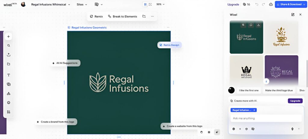
However, Wix isn’t particularly adventurous.
The designs were competent and usable, but not groundbreaking. If your goal is simply to get a professional logo that fits your business, Wix is perfectly fine. But if you’re looking for something even more on-brand or something less “template-y”, you may find Design.com and BrandCrowd as stronger options.
Another limitation is quantity. Wix generates only four concepts at a time, unlike Design.com and BrandCrowd, which produce hundreds to thousands per generation. And speaking of generation, it’s also way slower than the other tools on this list, which might be a deal-breaker for some.
Verdict: Wix is ideal if you want guidance during ideation, plus guidance throughout the editing process (since it shows smart suggestions and marks the spots you can edit).
4. Adobe Express
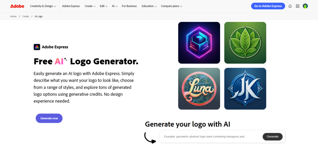
Best for: More experimental customizations
How does prompting work? Enter the prompt in the text box. You can also adjust aspects such as movement (e.g., cubism, pop art), material (e.g., clay, fur), technique (e.g., line drawing, watercolor), and so on.
How does it interpret the custom prompt?
Adobe Express was a mixed experience in how well it understood our prompt.
It did hit the brief in terms of tea and refined aesthetics. It also gave more modern designs. The details on the dark orange logo, in particular, are intricate work we rarely see in most generators and are reminiscent of the logos of Dilmah and Mariage Frères, both premium tea brands.
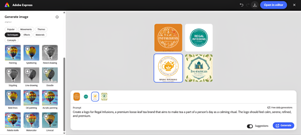
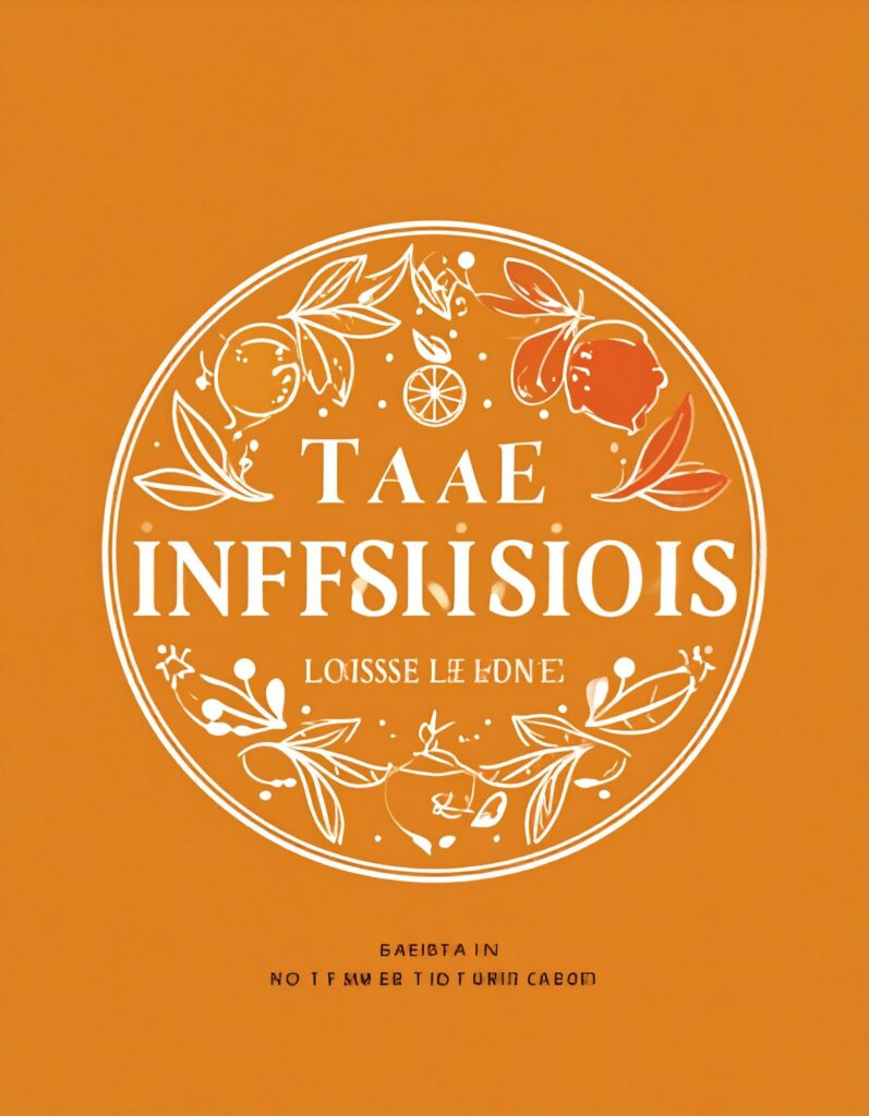
The problem is the traditional generative AI flaws present in all outputs. There are misspelled or smeared text, uneven coloring, randomly placed icons, and such. One result also felt closer to a poster than a logo. While these can be edited, they do require a lot of work just to make them usable.
Adobe Express could be a good option here if you deliberately want something more illustrative, photorealistic, or modern, as most of their outputs tend to lean towards that style. They also offer more ways to guide the style of your generated image so if you don’t mind tinkering with the settings, you can get more distinct designs.
Verdict: Adobe Express offers impressive generative control, but its outputs reflect a lot of AI flaws.
5. Canva
Best for: Getting a usable concept quickly
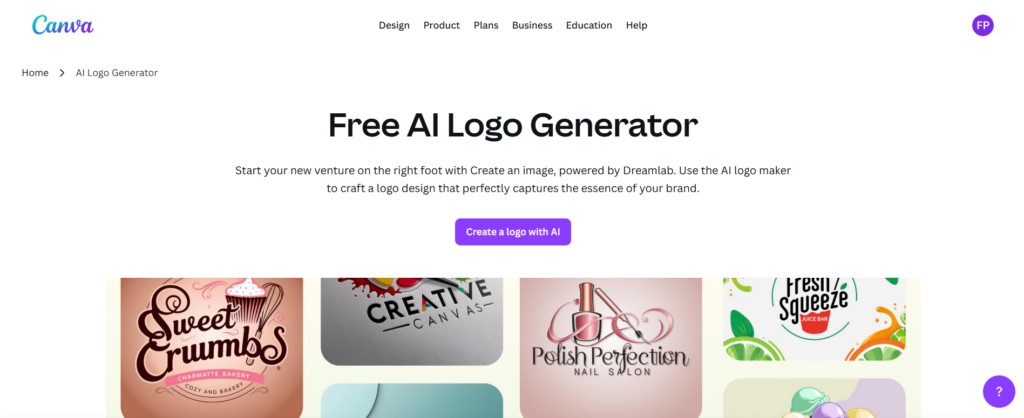
How does prompting work? Users enter their prompt in a chat box, a la ChatGPT.
How does it interpret the custom prompt?
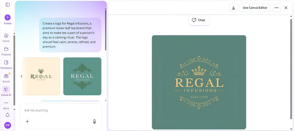
Canva interpreted the general direction of Regal Infusions reasonably well. The overall aesthetic was generally compatible with the brand direction we requested.
The results, however good, were a bit too plain for our tastes. It does hit the premium tea brand vibe, but it leaned too much on the premium and not enough on the tea or serenity. Like Wix, Canva also gives you only three to four concepts at a time, so you don’t have an enormous pool of ideas to compare immediately.
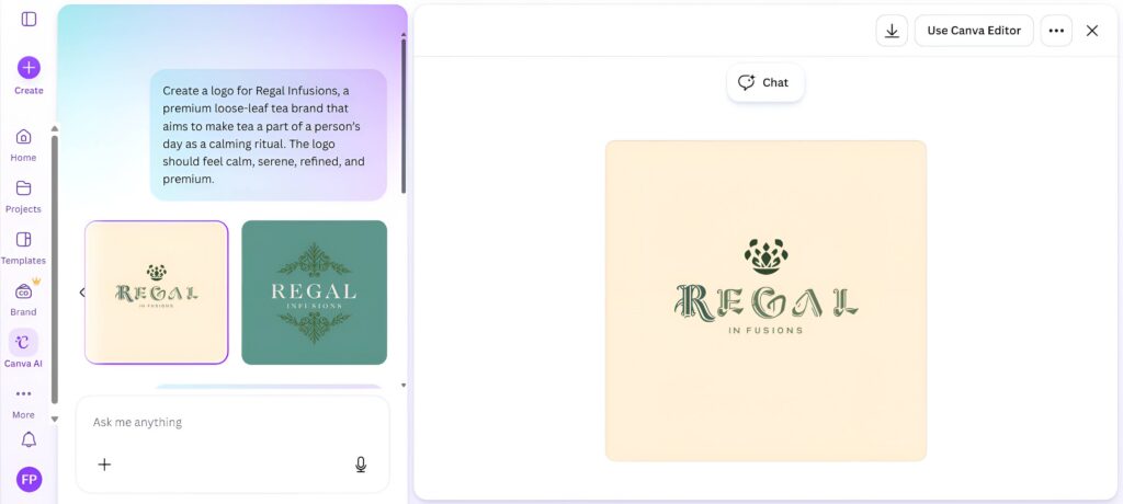
The designs also feature some AI issues if you inspect them closely enough. For example, the text on the logo above says “25A1 – 1910,” which doesn’t exactly make sense. While the second pink logo only has the “R” darkly colored, and the “IN FUSION” has that weird spacing. It’s not as egregious as Adobe Express, but it still needs more work before it’s usable.
The logo can be easily cleaned up, though, as you can just chat again to fix any issues or polish it further with Canva’s beginner-friendly editor.
Verdict: Canva works well when speed and simplicity matter more than getting the most distinctive or original interpretation of your brief.
6. Fiverr Logo Maker
Best for: Avoiding common generative-AI mistakes like misspelled text or misplaced icons
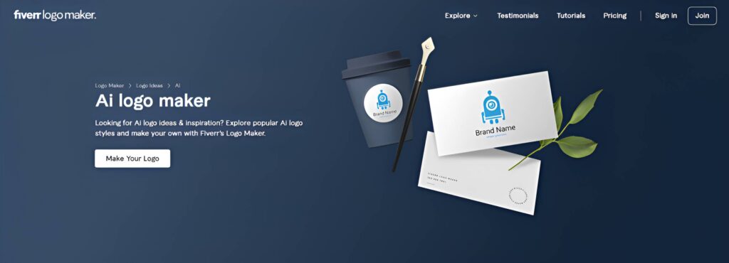
How does prompting work? Fiverr has a questionnaire in which users must enter their brand name, industry, keywords, logo style, and brand personality. The AI then matches those details to logo designs in their library, which is created by their designers.
How does it interpret the custom prompt?
The questionnaire results weren’t as precise as you might expect. We did see some leaves or premium elements in terms of fonts and color scheme, but they don’t feel 100% tailored to the brief. We even saw some that are completely unrelated, like the tech wave or the house.
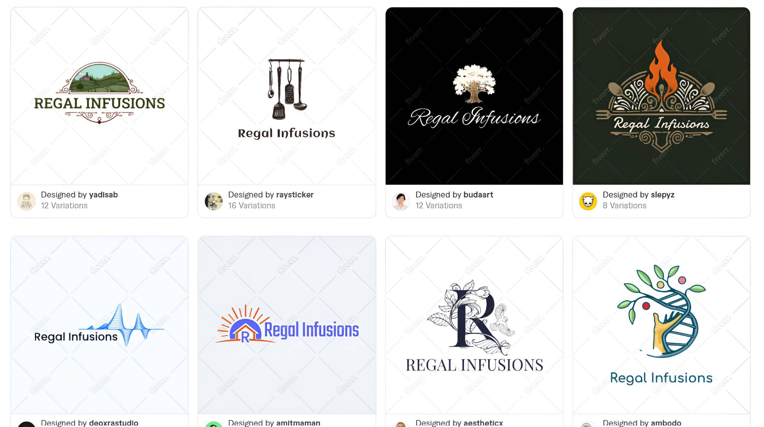
That’s the issue behind Fiverr’s approach. AI is matching your requirements against an existing limited pool of designs, so there isn’t always going to be one that captures every nuance of what you’ve described. Maybe if they have more logos in the library, the matching will improve, but for now it’s pretty mediocre.
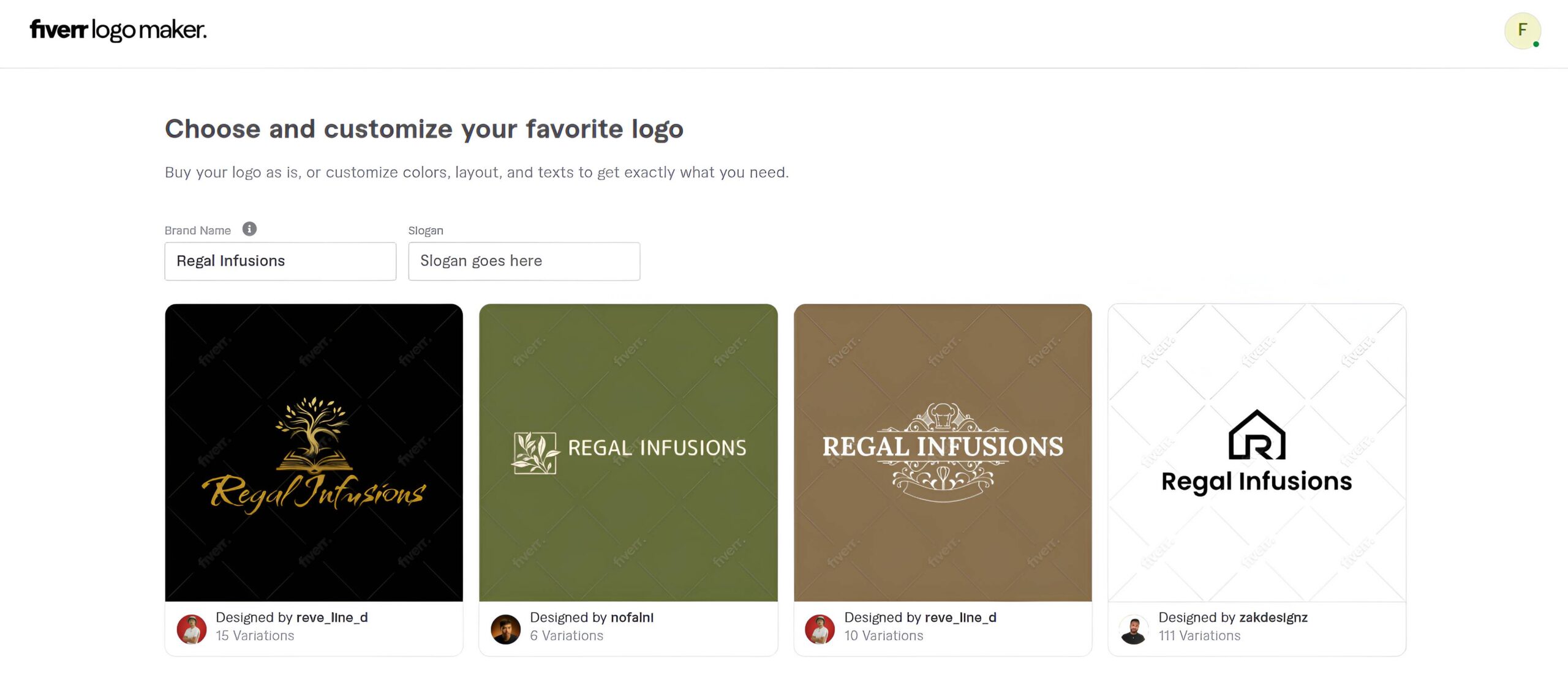
One major benefit, though, is that you encounter fewer of the visual mistakes associated with fully generative AI, because the underlying logos were created by human designers following established design principles. So you won’t see mangled typography, malformed illustrations, nonsensical objects, or other classic AI errors.
But technically polished isn’t the same thing as perfectly on-brand. Tools like Design.com are still better in this regard.
Still, if you happen to find a logo that matches what you are looking for, Fiverr is easy to use since you won’t need much editing.
Verdict: Fiverr is a good option if you prioritize polished, designer-made foundations vs having AI generate a highly specific concept from scratch.
Why does your prompt matter in AI logo generation?
An AI logo generator can only create a logo based on the prompt or information you give it. It can’t read your mind or “read between the lines”. The vaguer your prompt is (e.g., “bakery logo”), the more the AI will lean towards cliches such as croissants or bread loaf, since it doesn’t have much context to work with.
The same goes for your brand personality. Is your bakery more premium? Or cozy and homemade? Are you a gluten-free bakeshop? Focused on sweet and colorful breads? If you don’t specifically mention it, the AI will give a broader result.
A more descriptive prompt gives the AI a more meaningful creative direction and thus leads to more accurate results. A prompt like “an artisanal bakeshop that mainly sells croissants and aimed at young hip customers” is best since it immediately provides information about the product, positioning, audience, and desired personality.
That doesn’t mean every AI logo generator will interpret those instructions in the same way. Some may give more weight to your industry, while others respond more to your preferred visual style. But in general, the more useful context you provide, the less the AI has to guess.
What makes a good AI logo prompt?
A good logo prompt should say what your business does, how the brand should feel, and any specific requirements or restrictions.
- What your business does – “Create a logo for Northfield, a small-batch coffee roaster” is a better prompt since it tells the industry, your specialty, and brand vibe (more premium, artisanal) more accurately than just “Northfield logo”.
- How the brand should feel – Being in one industry doesn’t mean all brands are the same. You’ll have different positioning, target audience, and brand personality. A children’s dentist will need a different logo compared to a high-end cosmetic dentist, for instance. So you should ideally establish your positioning, specialty, or audience in your prompt.
- Requirements / restrictions – If you already have something in mind that you want to see or not see, it’s best to include it in your instructions to ensure accurate results. So if you specifically want a red logo or want the AI to avoid using coffee cup icons, make sure to mention that.
Should you tell AI exactly what your logo should look like?
It depends on why you’re using an AI logo generator in the first place.
Being specific can be helpful if you already have a clear visual concept in mind and just want the AI to execute your idea.
For example:
“Create a logo with a dark blue circular badge with a mountain icon inside, two leaves around the border, and use bold slab serif font for the text.”
There’s very little ambiguity or room for misinterpretation there, which likely gets you what you are envisioning.
But if you’re using AI because you don’t know what your logo should look like yet and want to see what’s out there, being that specific can work against you. Because you already made most of the important design decisions, the AI has less opportunity to suggest an unexpected visual concept or composition.
You can try describing the brand so that the AI will “think” rather than just follow your set of instructions. For example, “Create a logo for an outdoor gear brand that feels tough and masculine”. This gives the AI direction without fully closing it off for any creative interpretation.
Neither method is inherently better than the other. The best method to use is again what will get you the result you want.
Alternatively, you can start broad and just fine-tune the results. So when you get the initial results, you can just send out prompts to edit them such as “Use a dark navy blue for the background” or “Make the circle line thicker”. Or manually edit them, if you prefer a more hands-on approach. After all, you don’t need to get the perfect logo in just one go. You always have the option to edit, refine, or personalize your AI logo.
Conclusion
Custom prompts make it easier for AI logo generators to provide more accurate results compared to logo makers that simply ask for your company name. This is because you can give AI context about your desired positioning, personality, audience, and visual direction, instead of having the AI guess and hope it gets it right.
However, the platform matters as well. You can give the exact same prompt to a hundred tools and the results will be different each time. This is due to each AI logo generator having different systems and prioritizing different workflows.
For instance,
- Design.com is best at following the brand direction of your prompt
- BrandCrowd is useful for exploring different creative directions
- Wix and Canva follows your brief but leans towards conventional designs
- Adobe Express is more illustrative and creative but runs into more AI errors
- Fiverr uses AI to match designs rather than create from scratch
This just shows you how different each tool can be, even if they are all technically AI logo generators.
Still, whatever platform you choose, it’s best to treat the logo prompt as the beginning of the design process rather than a magic command. Make sure to provide the right context and enough information, be ready for any iterations, and you should be on your way to a beautiful logo.