What is a Logo?
Logos are a type of graphic most commonly used by businesses or companies as a visual representation of their brand or product. Logos are an essential element of any business or brand – and they are one of the first things a business needs.
Logos are also used by other entities like governments, charities, or sports teams. Logos can also be used to represent specific events (like a wedding, a marathon, or the Olympics).
But what is a logo? What are the different types of logos? Where can you get a logo?
In this article, we’ll look at the definition of a logo, the elements of a logo, the different styles of logos, examples of famous logos, and your options for where to get a logo designed (including logo templates, AI logo generators, and logo makers).
Dictionary definition of “Logo”
Logo [/ˈloʊ.ɡoʊ/]
Noun
- A graphic representation or symbol of an entity such as a company, business, product, sports team, government body, or organization
- A logotype or distinctive typographic treatment of a brand name
- A visual design element that identifies and differentiates a brand from its competitors
What are the elements of a logo?
Here are the common elements of a logo:
Color palette

Color sets the mood and speaks before words do. Different colors trigger different emotions and associations in people’s minds. Color communicates meaning before your audience reads a single word.
Your color choice is important for ensuring readability and memorability. The colors you select should also align with the brand you want to project.
For example bright yellow and black often communicate budget or value (think taxi cabs). So that color palette doesn’t really make sense for a luxury fashion brand.
Here’s what different colors typically communicate.
- Blue conveys trust, reliability, and professionalism, making it popular among financial institutions and technology companies.
- Red generates excitement, passion, and urgency, which explains why food and beverage brands love it.
- Green connects to nature, growth, and sustainability, appealing to businesses focused on wellness and environmental responsibility.
- Yellow radiates optimism, energy, and warmth, making it effective for brands that want to appear friendly, accessible, and cheerful.
- Purple suggests creativity, luxury, and sophistication, which is why it appeals to beauty brands and companies positioning themselves as premium or imaginative.
Many logos stick to one to three colors maximum – but that is not a hard rule.
It’s worthwhile to consider how your color palette functions across various contexts.
- Will your colors maintain their impact when printed in black and white?
- Do they work on both light and dark backgrounds?
- Can they be reproduced accurately across various media, from business cards to billboards?
Typography

Most logos include typography (text).
Typography in a logo typically includes one of the following:
- Business name
- Organization name
- Product name
- Event name
- Person name
Typography in a logo is also sometimes used for:
- Initials, monogram or lettermark
- A slogan
But some logos do not include any typography.
When typography is included, the font used is an important element of that typography.
Common types of fonts for logo typography include:
- Sans-serif font conveys a modern, strong, and straightforward confidence.
- Serif fonts communicate tradition, reliability, and sophistication.
- Script fonts feel elegant, creative, or suggest artisanal quality.
- Display fonts are stylized and typically feel quirky.
- Slab serif fonts are typically bold and confident.
- Custom fonts are best for lettermarks or wordmarks where you want something totally unique.
If you include typography in your logo, it should be readable at different sizes. Your typography must be consistent throughout, from small social media profile pictures to large storefront signage. Your font selection should feel appropriate for your industry and target audience.
Icons, symbols, and shapes

Icons, symbols, and shapes are graphic elements that let your brand communicate visually without words. They might be literal, like an apple, or they can be abstract, like the swoosh used by Nike.
Shapes carry inherent psychological meaning, for example:
- Circles evoke feelings of friendliness, community, and completeness.
- Triangles suggest direction, energy, and forward momentum.
- Squares and rectangles feel stable, trustworthy, and grounded.
- Organic shapes communicate creativity and flexibility.
The best symbols are simple enough to be instantly memorable but distinctive enough to stand out from competitors and communicate something about your brand (or product or event).
What are the different styles or types of logos?
Here are the main types of logos:
Wordmark (AKA logotype)

A wordmark uses your company name as the entire logo. Think Coca-Cola, Disney, or Sony. The typography does all the work, carrying the whole burden of brand recognition.
This works exceptionally well when you have a distinctive business name that’s easy to remember. It’s also perfect for new businesses that need to build name recognition quickly. The challenge is to ensure your wordmark stands out through thoughtful font choice, careful spacing, and custom letterforms.
Lettermark (AKA monogram)

A lettermark uses initials instead of the full name. IBM, CNN, and NASA are classic examples of lettermark logos.
Lettermark logos work great when your business name is long or hard to pronounce. It creates a compact mark that’s easy to use across different applications, from tiny app icons to large signage.
The downside is that people need to know what the letters stand for. This can take longer to build recognition if you’re just starting out.
Brandmark (AKA logomark or pictorial mark)

A pictorial logo is an icon or symbol that represents your brand. The Apple logo, the Twitter bird, and the Target bullseye all fall into this category. These logos become instantly recognizable once established.
They work beautifully when you need a simple mark for apps or social media. The risk is that symbols take time to build meaning. People have to learn what your icon represents through repeated exposure.
Combination mark

A combination logo combines an icon and a wordmark. Burger King, Adidas, Doritos, and Lacoste use this approach.
This is often the most versatile option because it offers the best of both worlds. You can use the full combination mark when you have space. You can use just the icon when you need something compact. As your brand grows and becomes more recognizable, you can use the icon more frequently on its own.
Abstract (a type of brandmark or combination mark)

An abstract logo is a type of brandmark (icon) or combination mark logo that uses a stylized shape rather than a recognizable image. The Pepsi circle, the Nike swoosh are examples of abstract marks.
If an abstract logo has no typography then it is considered a brandmark, but if it has typography then it would be a combination mark.
This approach allows you to create something unique that isn’t tied to a specific product or service. It gives you flexibility as your business evolves. However, like pictorial marks, abstract logos require time and marketing to build associations in people’s minds.
Mascot (a type of brandmark or a combination mark)

A mascot logo is a type of logo that uses a character – often a person, animal, or fictional figure. KFC’s Colonel Sanders logo, the Pringles man logo, and the Michelin man are good examples of mascot logos.
If a mascot logo has no typography, then it is considered a brandmark, but if it has typography, then it would be a combination mark.
Mascot logos tend to be strong in personality and highly expressive, sometimes conveying emotion or a specific vibe or energy.
Emblem or badge (a type of combination mark)
An emblem is a common type of combination mark. Emblem logos put text inside a shape or symbol. Think Harley-Davidson, Starbucks, or traditional university crests. Emblems convey a sense of tradition, authority, and established credibility.
They work well for organizations that want to convey heritage or prestige. The limitation is that emblems can be complex and may not scale well to tiny sizes like mobile icons.
What are the uses of a logo?
A logo is an essential element for any business or organization, as it’s typically used across lots of different media.
Below are the most common places that logos get used.
Top 3 uses of a logo:
- Websites
- Business cards (including printed and digital business cards)
- Social media (including Facebook, Instagram, LinkedIn, TikTok)
Other common uses of a logo include:
- Email signatures
- Letterheads
- Signage
- T-shirts, hats and other apparel or promotional merchandize
- Presentations, proposals and other documents
- Flyers, posters, brochures and other print materials
- Advertisements
- Videos and animations
- Invoices
- Menus
- Link in bio
- Zoom backgrounds
- Icons (mobile app icons, favicons)
- Packaging
- Billboards
- Vehicle wraps
What are some famous logos?
Here are some examples of famous logos:
Apple

The bitten apple has remained essentially unchanged since 1977. Its simple, clean design works perfectly at any size and has achieved universal recognition across every country and culture. The logo has evolved in style over the decades, but it has retained its core shape, proving that consistency matters more than constant redesign.
Nike

Designer Carolyn Davidson created the swoosh in 1971 for just $35. Today, it’s worth billions and represents athletic excellence globally. The Nike swoosh demonstrates how a simple abstract mark can become synonymous with an entire industry through decades of consistent use and marketing.
McDonald’s

People recognize the golden arches in almost every country. The simple M shape has remained largely unchanged since the 1960s. It works in any culture and language, demonstrating the effectiveness of geometric simplicity for global brands.
Coca-Cola

This flowing script wordmark has remained virtually unchanged since 1887. That’s over 130 years of consistency. The distinctive typography is so embedded in global consciousness that it works in any language using any alphabet.
Starbucks

The Starbucks siren has undergone simplification over the years, yet remains instantly recognizable. The green and white color scheme has become so iconic that the company eventually removed its name from the logo entirely. People knew exactly what it was without any text.
What are some examples of clever logo design?
Beyond longevity and recognition, some logos stand out for their clever design techniques and hidden meanings. These examples demonstrate how thoughtful designers can show multiple messages through a single mark by employing visual tricks and creative problem-solving.
FedEx

Look closely at the FedEx wordmark, and you’ll spot a hidden arrow between the ‘E’ and ‘x’. This subtle detail suggests speed, precision, and forward movement without being obvious. Most people use FedEx for years before someone points out the arrow. It’s a masterclass in subliminal design that warrants a closer inspection.
Amazon

The Amazon logo does double duty with its arrow. It points from A to Z, suggesting they sell everything you could want. But that same arrow curves into a smile, creating a friendly impression about customer satisfaction. One simple element communicates two different brand messages simultaneously.
Baskin-Robbins
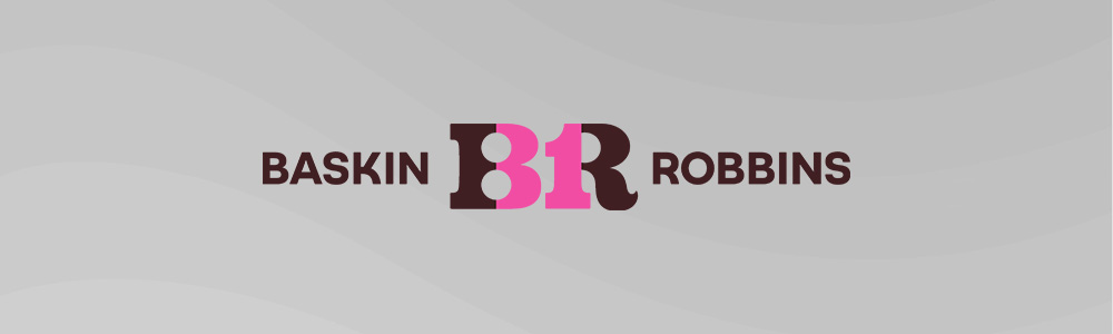
The pink parts of the BR letterforms cleverly form the number 31, representing their famous 31 flavors. It’s hidden in plain sight. Most customers enjoy the ice cream without ever noticing this detail, making it a delightful discovery when someone finally points it out.
Tour de France

The Tour de France logo is brilliantly simple. The letters O, U, and R create a cyclist, with the O forming the bicycle’s wheel and the yellow circle representing the sun. It captures everything the event is about through clever typographic integration.
Formula 1
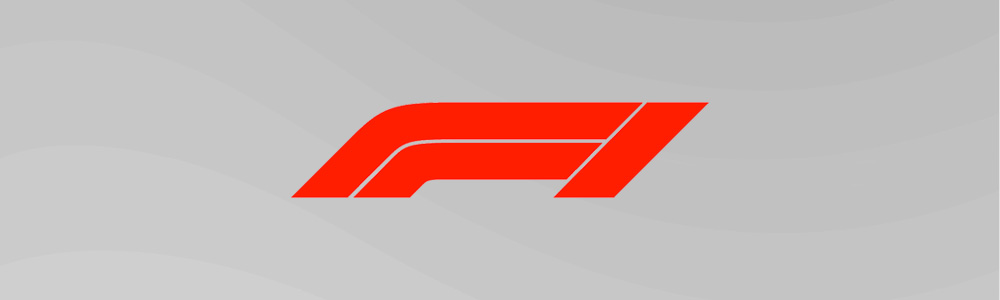
Formula 1’s famous “F1” logo is a great example of a clever lettermark logo. The negative space between the F and the red stripes creates the number 1. The design suggests speed through its angular shapes while cleverly incorporating the sport’s name into a single compact mark.
What Was the World’s First Logo?
The Bass Brewery logo is widely considered to be the world’s first logo, filed as a trademark on 1 January 1876.

How Do I Get a Logo?
There are many options for getting a logo designed.
These include:
- Using a graphic or logo designer
- Finding a logo template and customizing it yourself
- Using an AI logo generator
- Using a logo maker
- Using advanced graphic software (only recommended if you’re a designer)
We recommend using the Design.com AI logo generator. Design.com offers all the different types of logos. It can generate thousands of logo ideas in seconds.
Design.com also offers 50+ different design tools, including business cards, social media graphics, and a website builder to keep your branding consistent everywhere.
If you want to use a designer, we recommend an online marketplace like DesignCrowd.