20 Minimalist Business Card Designs for a Clean, Professional Look
Looking to make your business card stand out?
You don’t always need flashy illustrations, unorthodox shapes, or embossed logo designs. Sometimes, keeping things simple and minimalist is what you need.
We compiled the top minimalist business card designs below to prove that less is really more. Scroll below to find your favorite style, then use our business card maker to create your own.
Ready? Let’s get started!
Minimalist business card design examples
A minimalist business card removes unnecessary elements to create a neat, modern, and elegant look. It features lots of open space, thoughtful typography, restrained color palette, and clean illustrations and icons.
And no, minimalist business cards don’t mean boring or plain. There are plenty of ways to give a simple card some personality and add visual interest without going overboard. You can see how in our samples below:
- Geometric business cards
- Typography business cards
- Color accent business cards
Geometric business cards
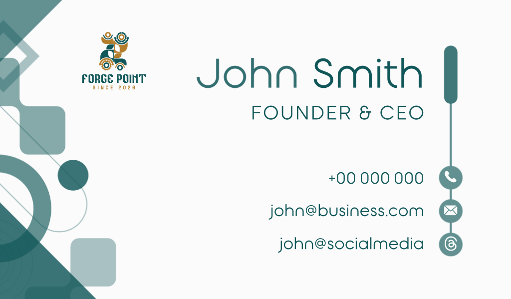
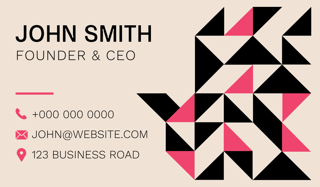
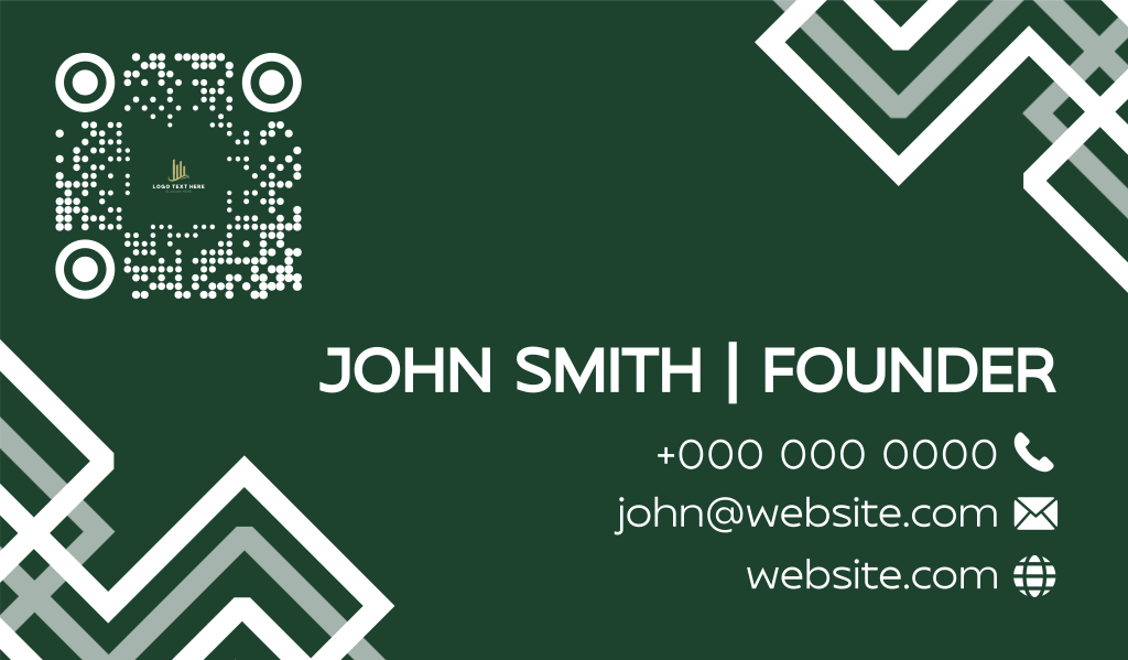
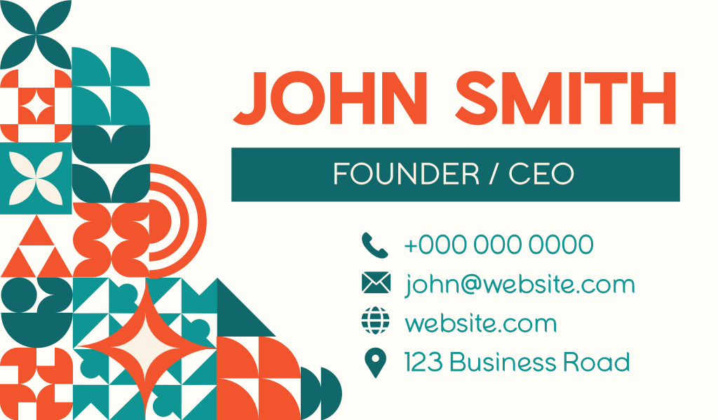
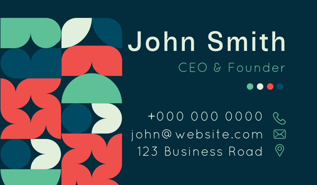
Circles, squares, lines, or abstract shapes can add visual interest without making your card feel cluttered.
A thin line can be used to break up your text. A circle can frame a logo. A few carefully positioned rectangular blocks on the bottom of the card can make an otherwise plain layout look more dynamic.
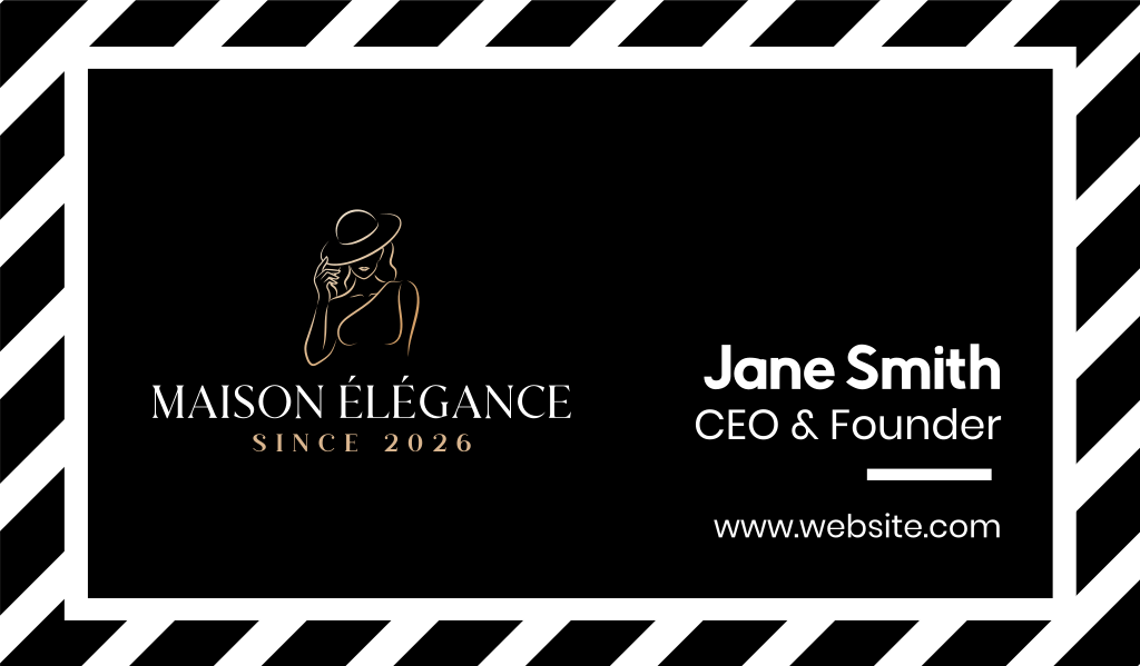
Check out how these cards use geometric shapes to liven up their designs:





Typography business cards
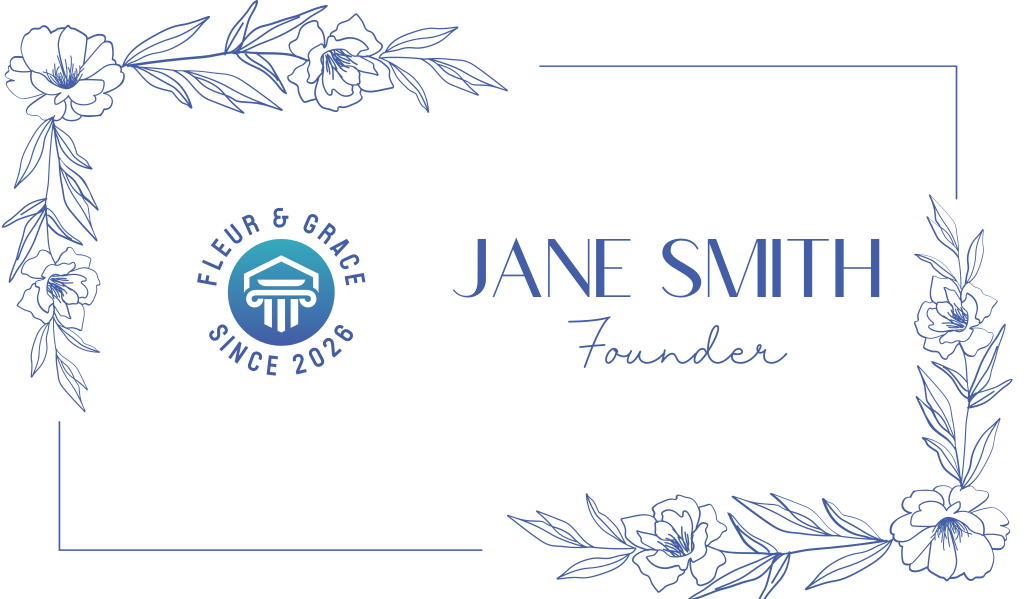
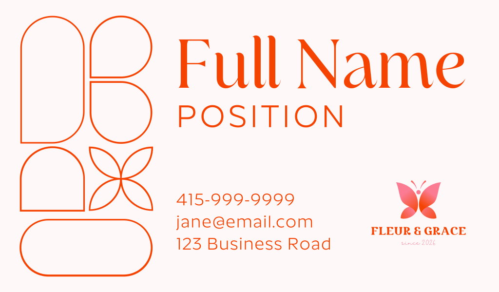
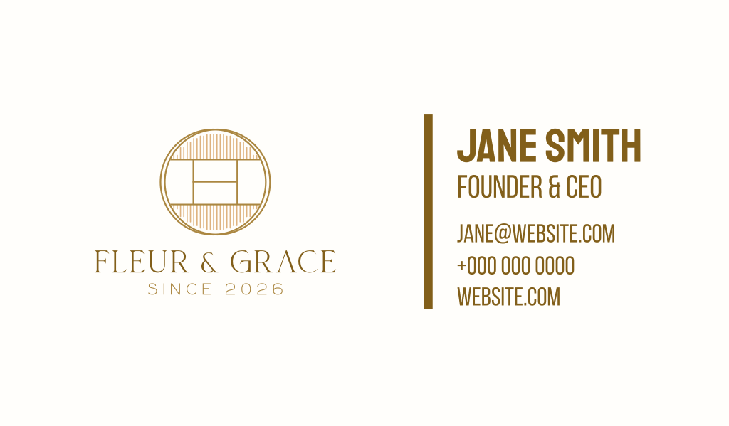
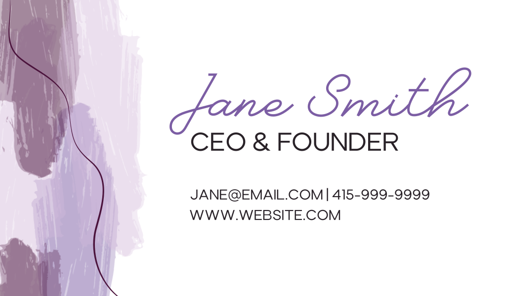
You don’t always need graphics to create an interesting card. Sometimes, how you style your text can make all the difference.
Typography-focused business cards use font size, weight, spacing, or placement to create visual interest. This can be by making the text oversized, experimenting with the alignment, using a bold typeface, adding more space between the letters, and so on.
Just remember to keep things readable. Your contact details should never get lost for the sake of making your text look stylish.
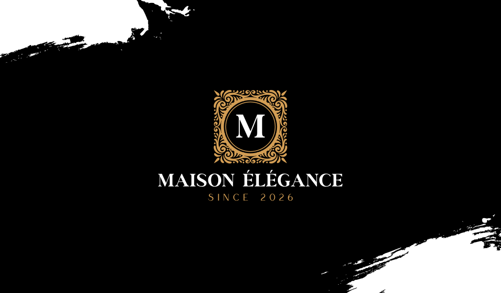
Browse our samples below:

Color accent business cards
Minimalism doesn’t mean you have to stick to black and white all the time.
One way to use color is by going for a muted or dusty version of them. You can do so by lowering its saturation and mixing in subtle gray or white undertones. This mutes the vibrancy and gives it a softer and earthier look. This leads to colors like mauve, ash blue, dusty pink, sage green, or ash blue.
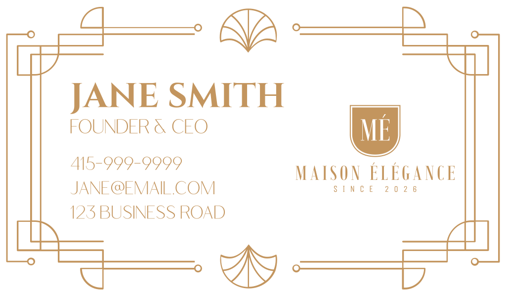
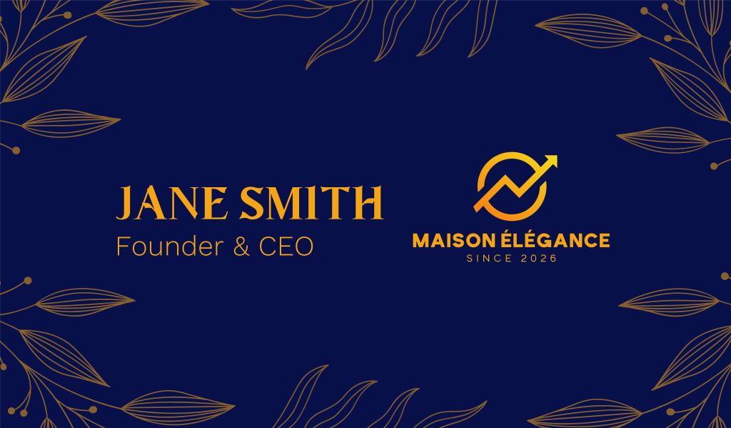
Another is by using colors like black, brown, gray, or white, then adding one splash of color. Think of one dark blue circle against a white background, adding gold borders in your black card, or a single word highlighted in a bright color. This makes it “colorful” without being too much.
Take a look at our samples below:

How to design a minimalist business card
Got inspired by our samples above? Before you start designing a physical or digital business card, take note of these minimalist design principles first:
Stick to the essentials
A business card has limited space, so it’s best to add information that your clients absolutely need to know.
The essentials are:
- Logo
- Name
- Job title
- Phone number
- Email address
- Website
Other things, like your social media handles, can be skipped if needed (unless that’s the primary way to contact you, in which case you should have that on your card).
Think about what’s important for your business, too. If you mainly operate digitally, adding an office address is unnecessary. At the same time, if you mainly operate in a physical office, a phone number and address are more important than your website.
Leave enough space
One of the easiest ways to achieve a minimalist look is to give your design plenty of breathing room.
Leave enough space between your name, logo, and contact details. This makes your business card easier to read and scan, plus it helps this information stand out.
Avoid filling every available space, too. Just add what’s needed. This keeps your design from looking too cluttered or overwhelming to the eyes.
Empty space can also make a business card feel more elegant and chic. When a design isn’t trying to fill every inch, it feels more intentional, refined, and confident.
Think of high-end fashion branding: they often use fewer elements with generous spacing to create a polished, premium feel. The same principle works for business cards.
Create a clear hierarchy
What should someone notice first when they look at your card? Usually, it’s your name or logo.
Make that element the visual focus by making it bigger, giving it more space, or placing it on the top. Secondary details such as your phone number, website, and email address can then appear smaller.
This is especially important in minimalist business cards because there are fewer design elements to guide the eye. Without a clear hierarchy, even a simple card can feel flat or confusing. That’s why you should make use of your element’s size, position, and spacing to guide your reader’s eye and make your details look more purposeful.
Use both sides
You don’t need to squeeze everything onto one side.
Using the front and back of your card gives each element more room. You could place your logo or business name on the front and reserve the back for your contact information.
It’s an easy way to make your card feel even cleaner without removing useful details.
Add a QR code
A QR code is an easy way to share more information without cluttering your business card.
Instead of squeezing in multiple links, you can use one custom QR code to direct people to your website, portfolio, social media profile, online store, or digital contact page. This keeps your layout clean while still giving people quick access to everything they need.
Consider your card’s material
The material you choose can also make a minimalist business card feel more visually interesting or premium, depending on what you’re going for.
Thick matte cards feel and look more expensive. Cotton paper adds more texture to your card, which helps add interest to an otherwise simple design. Recycled or kraft paper can create an organic, down-to-earth feel without adding additional graphics. Subtle finishes such as embossing, debossing, letterpress, or foil can also highlight a logo or name without overwhelming the minimalist design.
As you can see, your material should be a part of your design rather than just an afterthought. Since you can use it to make an impression, without altering your layout or cluttering an already minimalist look.
Create your minimalist business card
A minimalist business card proves you don’t need an elaborate design to make a strong impression. Clean typography, plenty of negative space, a focused color palette, and a few carefully selected details are all that you need to give your brand a polished, premium, and confident look.
And the best part? Minimalist designs can work for almost anyone. Whether you’re launching a photography studio, starting a consulting business, or building a personal brand, there’s surely a style to match your identity.
Ready to create yours?
Browse Design.com’s minimalist, elegant, or luxury business card templates to start your design. You can also check out our minimalist logo maker and AI website builder to create matching designs to fit with your new sleek card.
Get started with Design.com today!