
How the Starbucks Logo History Evolved From 1971 to Today
A logo doesn’t need constant reinvention to stay relevant, and Starbucks’ history proves it. The company has used four major logo designs since 1971, and each one has built on the last rather than starting over from scratch. The result is a mark simple enough to work without any text at all.
That pattern holds up when you trace the actual timeline. Starbucks started with a fully illustrated brown siren in 1971, added green after Howard Schultz’s 1987 acquisition of the company, tightened the crop in 1992, and removed its own name by 2011.
This guide walks through each of those redesigns in order, along with the reasoning behind the siren, the color choices, and what any logo maker working on a new brand can take from the way Starbucks gradually approached each change.
How many times has the Starbucks logo changed?
Starbucks has redesigned its logo four separate times since 1971, with a short-lived 2008 logo that never became official. Each version kept the siren but adjusted her look, the color palette, and the amount of text surrounding her.
| Year | Era | Key change in Starbucks logo |
| 1971 | Original logo | Brown, bare-breasted twin-tailed siren, full company name |
| 1987 | Il Giornale merger | Green replaces brown with the siren’s hair covering her body |
| 1992 | Close-up crop | Tighter framing, sharper typography |
| 2008 | Pike Place Roast revival | Original logo design shortly brought back for one product line |
| 2011 | Modern siren | Name and outer ring removed, siren enlarged |
The Starbucks logo timeline
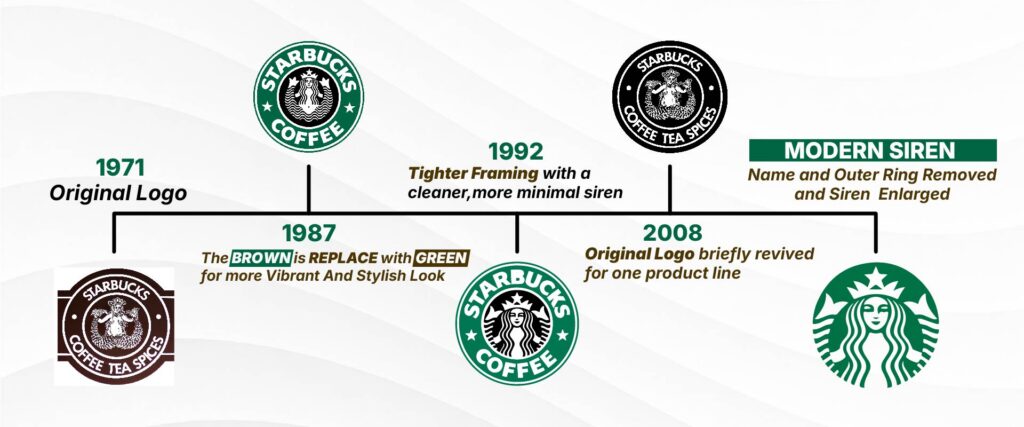
The 1971 original logo
Gordon Bowker, Jerry Baldwin, and Zev Siegl opened the first Starbucks in Seattle in 1971. The founders originally wanted to call the shop Pequod, after the ship in Moby-Dick, but settled on Starbuck, the ship’s first mate, instead.
Seattle’s maritime history shaped the logo from the start. Designer Terry Heckler built the mark around a twin-tailed siren, the kind of mythical figure sailors believed could lure ships toward the rocks. The idea translated well to coffee. A siren could lure customers into the store the same way she lured sailors at sea.

That original siren was fully exposed, holding her tail in both hands, printed in a coffee brown that felt earthy and grounded. The words “Starbucks Coffee, Tea, and Spices” circled her, since the shop sold whole beans and equipment rather than drinks.
The design worked fine at small sizes on signage and cups. However, delivery trucks were a different story. Once, Starbucks needed to paint the logo across the side of a truck, the company asked Heckler to reposition the siren’s hair for a more modest look.
The 1987 redesign after the Il Giornale merger
Howard Schultz joined Starbucks in the early 1980s and, after a trip to Italy, pushed the company to sell espresso drinks. The original founders weren’t interested, so Schultz left and started his own coffee bar, Il Giornale, styled after the cafes he’d seen in Milan.
Il Giornale’s own logo featured the Roman god Mercury in green, chosen to represent speed and quality. When Schultz bought Starbucks from its founders in 1987, he merged the two identities. Terry Heckler came back to redesign the logo, combining Il Giornale’s green with the Starbucks siren.

The 1987 siren kept her crown but lost her original exposure, her hair now completely covering her chest. Brown gave way to Kelly green across the whole logo. The name was also shortened from “Starbucks Coffee, Tea, and Spices” to simply “Starbucks Coffee,” with two small stars connecting the words. That green has stayed part of the brand ever since.
The 1992 close-up redesign
Starbucks tightened the logo again in 1992. The siren’s navel disappeared from view, and only a portion of her tail remained visible along the edges. The company sharpened the typography, too, giving the wordmark a cleaner, more modern feel than the slightly rougher 1987 version.

This close-up design lasted nearly two decades without a major change, longer than any other version in Starbucks’ history. Its staying power says something about how well a logo can perform once a brand finds a version that customers recognize instantly.
The 2008 Pike Place Roast revival

Starbucks brought back a version of its original 1971 logo in April 2008, timed to the launch of its new Pike Place Roast blend. This retro design appeared specifically on Pike Place Roast cups and coffee bags.
A smaller version of the same idea had already been run in select Pacific Northwest stores in 2006, for the brand’s 35th anniversary. The siren in this version remained fully exposed, closer to the original 1971 design than the more modest 1987 version.
The 2011 modern siren
Starbucks unveiled its current logo in 2011, timed to the company’s 40th anniversary. The outer ring disappeared completely, along with the word “Starbucks” itself. What remained was a larger, simplified siren on a solid green circle.

Schultz explained the decision by saying the change gave the company room to grow beyond coffee, since customers no longer needed the name to recognize the brand. Designers also made a deliberate tweak to the siren’s face during this update.
An early symmetrical version looked unsettling rather than appealing, so the team added a slight shadow to one eye. That small asymmetry made her look more natural and less like an AI-generated image.
What the Starbucks logo symbolizes
Every element of the current Starbucks logo carries meaning built up across five decades of redesigns.
- The siren: Represents allure and Seattle’s maritime roots, tied to the mythology of sailors being lured by sirens at sea.
- The color green: Represents growth, freshness, and calm. Introduced during the 1987 merger with Il Giornale and never removed since.
- The missing name: Represents global recognition, reflecting the point in 2011 when Starbucks no longer needed text to be identified.
- The asymmetrical eye: Represents a deliberate, human imperfection, added in 2011, so the siren’s face would feel approachable rather than mechanically perfect.
Together, these choices turned a fairly literal 1971 illustration into one of the most recognizable marks in retail. Few companies can remove their own name from their logo and still be instantly identifiable. Starbucks pulled that off because every earlier redesign built toward it gradually rather than all at once.
What can other brands learn from the Starbucks logo?
Starbucks’ logo history offers a few practical lessons for anyone building a brand identity. Here are some of them:
- A strong visual mark can eventually carry a brand without any text at all.
- Consistent colors build equity over time, which is why Starbucks kept its green logo as the primary design.
- Small imperfections, like the siren’s asymmetrical eye, can make a design feel more human rather than sterile.
- Gradual redesigns protect customer recognition better than sudden overhauls.
Building a logo that lasts
Most brands redesign out of panic, chasing a trend or reacting to a bad quarter. Starbucks did the opposite. Every change is built on what customers already recognize, which is why the company could eventually remove its name and remain instantly identifiable.
Building a logo with that kind of staying power usually takes more than instinct. Design.com gives you access to a library of customizable templates and an AI logo generator built to help new brands find a mark that can grow the same way Starbucks did.
From there, the platform extends that same branding into a matching website, business cards, posters, flyers, and social media graphics, so everything stays consistent as your brand grows.
Consistency built the Starbucks brand. It can build yours too.
FAQs on Starbucks’ logo history
1. When was the Starbucks logo created?
Terry Heckler designed the first Starbucks logo in 1971, the same year the company opened its first store in Seattle’s Pike Place Market. That original version stayed in use until Howard Schultz’s Il Giornale acquired the company in 1987 and introduced the first major redesign.
2. Why is the Starbucks logo a mermaid?
The mermaid, technically a twin-tailed siren, ties back to Seattle’s maritime history and the seafaring culture the founders wanted to reflect in the brand. The mythology of sirens luring sailors at sea gave the founders a fitting metaphor for attracting customers with good coffee.
3. Who designed the Starbucks logo?
Terry Heckler designed the original 1971 logo and redesigned it again in 1987 after the merger with Il Giornale. His work established both the siren imagery and the green color scheme that Starbucks still uses today, making him the single most influential designer in the brand’s visual history.
4. Has the Starbucks logo always been green?
No, the original 1971 logo was brown, chosen to feel earthy and grounded for a shop that sold coffee beans, tea, and spices. Green first appeared in 1987, following the Il Giornale merger, and has remained the primary color ever since, aside from a brief throwback in 2008.
5. Why did Starbucks remove the word “Starbucks” from its logo?
Starbucks removed its name in 2011 because the siren alone had become recognizable enough to represent the brand without any text. Howard Schultz said the change also gave the company more flexibility to expand into products beyond coffee without a text-heavy logo limiting that image.
6. How many times has the Starbucks logo changed?
Starbucks has gone through four major logo redesigns, in 1971, 1987, 1992, and 2011, along with a brief revival of the original brown design in 2008 tied to the Pike Place Roast launch. Each major redesign kept the siren as the central figure while adjusting her appearance, the color palette, and the amount of text surrounding her.
7. What does the green in the Starbucks logo represent?
Green represents growth, freshness, and prosperity, values that lined up with the direction Howard Schultz wanted for the company after the 1987 merger. The color choice also connected back to Il Giornale’s own branding, which used a similar shade before the two companies combined.
8. Is the Starbucks siren based on a real myth?
The siren draws on general mythology surrounding sea creatures that lure sailors with their voices, rather than on a specific documented myth or story. Starbucks leaned on that broad symbolism to represent the pull of a good cup of coffee, using the siren as a stand-in for something irresistible rather than a literal reference to any single legend.
Read more on logo design here:
- The Complete History of the Pepsi Logo: 130+ Years of Reinvention
- Bass Brewery Logo History: Is it the World’s First Logo?
- 55 Famous Logos with Hidden Meanings
Hannah Suroy suroy brings clarity to complex topics across entertainment, business, and creative industries. She specializes in translating industry trends and innovations into engaging content that helps readers understand the creative process behind the work they love.