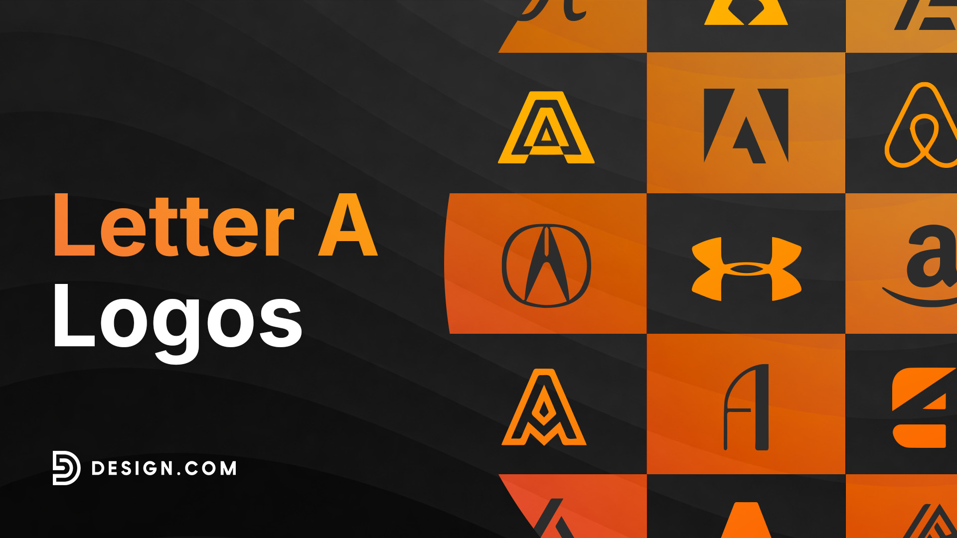
60 Powerful Letter A Logos
For brands built around the letter A, your logo has an important advantage and an equally important challenge. As the first letter of the alphabet and one of the most commonly used business initials, A is instantly familiar, but that also means it appears everywhere.
Standing out requires more than simply placing the letter in a bold font. Every appearance across your website, business cards, social media, and email signatures shapes how customers recognize and remember your brand.
A weak letter A logo blends into countless others. It fails to communicate confidence, originality, or professionalism, making your business easier to overlook. A strong logo design shows how a single, familiar letter can become a distinctive brand asset through thoughtful choices in shape, spacing, proportion, and style.
We’ve gathered some of the best letter A logo examples to show what works today and why. You’ll also find practical ideas you can apply when creating your own logo.
What makes a letter A logo work?
Letter A logos share certain qualities that set the strong ones apart from the forgettable ones. These designs prioritize instant recognition while still leaving room for personality.
Here’s what sets standout letter A logos apart from generic initials:
- Strong silhouette that reads clearly as an A even at a glance or at a small size, like a favicon or app icon
- Purposeful structure, using the letter’s natural triangular shape and crossbar as opportunities rather than obstacles
- Distinct personality, whether that comes from a custom typeface, a clever negative-space cutout, or an unexpected color treatment
- Versatility across digital and print, so a single initial looks just as sharp on a phone screen as it does on a storefront sign
- Ownable detail, some small twist that makes the A unmistakably yours and hard for competitors to replicate.
Companies whose logo is genuinely built around the letter A
Adobe
A white A inside a red square, introduced in 1993; one of the most recognized software icons in the world.

American Airlines
Look at the twin red-and-blue As with a stylized eagle between them, dating back to designer Massimo Vignelli’s 1967 redesign.

Airbnb
The “Bélo” symbol is designed to read simultaneously as a heart, a location pin, a person, and the letter A.
Amazon
The lowercase “a” wordmark with the orange arrow smiling from A to Z.

Acura
Acura’s logo uses a stylized letter A inspired by a precision caliper, reflecting accuracy, engineering, and premium craftsmanship.

Under Armour
The Under Armour icon combines the letter U and letter A into a bold, interlocking symbol that’s instantly recognizable across its products.

Armani Exchange
Armani Exchange features the minimalist A|X lettermark, creating a clean, modern logo that’s easy to recognize in fashion.
Los Angeles Angels
The Los Angeles Angels use a red serif letter A topped with a halo, giving the team one of baseball’s most recognizable logos.

Atlanta Braves
A flowing script letter A appears on the Atlanta Braves’ caps, creating a timeless look that stands out on the field.

Oakland Athletics
The Oakland Athletics built their identity around a simple letter A monogram, strengthened by the team’s signature green and gold colors.

Alabama Crimson Tide
The Alabama Crimson Tide’s script A has become an iconic college sports logo through decades of consistent use across its athletic programs.

What are some letter A logo design trends?
Letter A logo design is constantly evolving, but the strongest approaches share one thing in common. They treat the letter itself as the entire brand asset rather than an afterthought tacked onto a wordmark.
Some styles lean into clean lettermarks and monogram simplicity. Understanding which direction fits your brand is the first step toward a letter A logo that actually works.
Let’s explore three popular approaches shaping letter A logo design today.
Lettermark logos
Lettermark logos build the entire identity around a clean, confident rendering of the letter A itself. They are some of the most efficient logos in branding, relying on typography alone to convey authority and professionalism. This is the approach agencies, consultancies, and tech companies reach for when they want a mark that feels serious and instantly legible.
Weight and proportion matter enormously here. A bold, geometric sans-serif A reads as modern and stable, while a slimmer monoline treatment feels more digital and understated. Small details like a sliced crossbar or an angled apex can turn a plain letter into a genuine trademark.
Browse through our lettermark letter A logo examples below:
Gradient Letter A Diamond by Design.com

Professional Company Letter A by Design.com
Studio Advertising Letter A by Design.com
Modern Advertising Letter A by Design.com
Generic Wave Letter A by Design.com
Luxury Author Publishing Letter A by Design.com
Brand Agency Letter A by Design.com
Simple Mint Green Letter A by Design.com
Modern Creative Letter A by Design.com
Studio Agency Letter A by Design.com
Modern Business Letter A by Design.com
Generic Modern Letter A by Design.com
Generic Monogram Letter A by Design.com
Innovation Square Letter A by Design.com
Premium Agency Letter A by Design.com
Modern Marketing Letter A by Design.com
Elegant Deluxe Letter A by Design.com
Premium Yellow Letter A by Design.com
Startup Studio Letter A by Design.com
Simple Architecture Letter A by Design.com
Abstract & geometric logos
Abstract and geometric letter A logos use the shape’s natural triangle as a launchpad for something more conceptual. Instead of a straightforward character, the letter becomes a peak, an arrow, an intersection, or a piece of architecture. These shapes carry psychological associations that reinforce your brand message, like upward movement, precision, or connection.
The tech and startup world has particularly embraced this approach because it feels innovative without sacrificing legibility. But abstract A marks work well far beyond tech. Architecture firms use angular A forms to suggest structure, while media and marketing agencies use intersecting shapes to imply collaboration and reach.
Check out our abstract and geometric letter A logo samples:
Professional Studio Letter A by Design.com
Modern Technology Software by Design.com
Modern Business Letter A by Design.com
Startup Media Letter A by Design.com
Industrial Circuitry Letter A by Design.com
Generic Marketing Business by Design.com
Gas Flame Letter A by Design.com
Professional Company Letter A by Design.com
Modern Business Agency by Design.com
Modern Loop Gradient by Design.com
Architect Builder Letter A by Design.com
Tech Studio Letter A by Design.com
Software Digital Technology by Design.com
Firm Agency Letter A by Design.com
Professional Brand Letter A by Design.com
Swoosh Consulting Letter A by Design.com
Generic Firm Agency by Design.com
Green Startup Letter A by Design.com
Firm Creative Letter A by Design.com
Vintage logos
Vintage logos trade sharp minimalism for craftsmanship and flourish. Ornate serifs, hand-lettered script, and decorative flourishes give a single initial a sense of heritage and personal touch that a clean sans-serif simply can’t replicate. This is the treatment that signals a brand has history, care, or artistry behind it.
The approach works especially well for hospitality, beauty, publishing, and boutique retail brands, where customers are buying into a feeling as much as a product. A well-drawn script A can suggest everything from old-world elegance to modern artisanal cool, depending on how it’s weighted and paired with color.
Get started with our vintage and calligraphy letter A logos:
Initial Intersect Letter A by Design.com
Premium Brand Letter A by Design.com
Vintage Luxury Brand by Design.com
Luxury Deco Boutique by Design.com
Elegant Antique Medieval Letter A by Design.com
Fancy Fashion Boutique Letter A by Design.com
Artisan Elegant Letter A by Design.com
Luxury Shield Letter A by Design.com
Antique Boutique Letter A by Design.com
Generic Retro Letter A by Design.com
Will your letter A logo still work in ten years?
A logo built around a single letter has less room to hide than a full wordmark, so it needs to earn its place at every size and in every context, not just the one it was designed for.
Here’s how to create a letter A logo that stands the test of time.
Design for tiny spaces first
Your letter A logo will spend most of its life small: as an app icon, a favicon, a social avatar, a watermark. Build the design to hold up at those sizes before you ever worry about a billboard. This means avoiding fine detail, thin hairlines, or subtle negative-space cutouts that disappear below a certain size.
The best letter A logos scale down cleanly without losing their identity. Test yours as a 32-pixel icon early in the process, not as an afterthought once the full design is finished.
Balance trends with timeless letterforms
Certain proportions and structures will always read well because they’re rooted in basic legibility and geometry. A confident apex, balanced stroke weight, and generous crossbar spacing never go out of style. These are the timeless principles to build your A around.
However, specific effects, like heavy gradients, 3D bevels, or a font that’s having a viral moment, might look dated within a couple of years. Know the difference and use trendy elements sparingly, only where they genuinely serve your brand message.
Test for long-term versatility
A letter A logo that will last needs to hold its own in black and white, not just in its signature color palette. If your design relies on a gradient or a multi-tone effect, make sure you have a solid single-color version that still reads clearly.
Test it on light, dark, and busy photo backgrounds. Try it as a favicon, a social profile picture, and a large-format print. The more contexts your A survives, the longer it will serve your brand.
Build a system, not just a symbol
A truly future-proof letter A logo doesn’t try to do everything at once. It establishes a strong, simple foundation, plus a small set of rules for color, spacing, and pairing with a wordmark, so the mark can flex across new products or platforms without needing a redesign.
When you design flexibly, your A can adapt to new contexts without losing what makes it recognizable. This approach saves money, keeps your brand consistent, and strengthens your visual identity as your business grows.
Conclusion
A strong letter A logo can turn a single character into one of your most valuable brand assets, instantly recognizable on an app icon, a storefront, or a business card. Whether you choose a clean lettermark, an abstract geometric form, or a vintage calligraphic script, finding an approach that authentically represents your brand values and connects with your audience is key.
Design.com offers tools and resources to help you create a letter A logo that works across all platforms. From websites and digital business cards to complete branding packages, you’ll find everything you need to succeed in your branding.