50 Serif Logos to Keep Your Identity Clean and Classic
Have you ever noticed how a simple change in font can completely shift how a brand feels?
Typography does a lot more heavy lifting in branding than most people realize. It’s not just about how a word looks… It’s about how it feels.
Serif fonts, in particular, bring a certain weight and character that instantly shifts how a brand is perceived. Some feel traditional and trustworthy, others feel elegant and editorial, and some even feel bold and luxurious depending on how they’re used.
In this roundup, we’re focusing on serif logos and why they work so well for clean, classic branding. You’ll notice how small changes in letterforms, spacing, and contrast can completely change the personality of a logo.
If you’re aiming for a brand identity that feels established, refined, and timeless, serif typography in logo design is often where we start.
Let’s get started!
What makes serif fonts in logos work?
Before we jump into the roundup, let’s quickly talk about why serif logos show up so often in branding. There’s just something about serif fonts that instantly changes the mood of a logo.
They feel a bit more thoughtful, a bit more grounded, and they carry this natural sense of history and trust that many brands want to lean into.
Here’s why they work so well:
Feelings of trust and experience
Serif typography often comes across as established and reliable. That’s why it’s commonly used by industries like law, publishing, and luxury brands; there’s an immediate sense of credibility built into the letterforms.
Personality is built into the letters
Even without icons or extra graphics, serif fonts already carry style. Each letter has its own character, so the logo doesn’t need much else to feel complete or distinctive.
Flexible range of moods
Different serif styles can completely change the vibe. Thin, high-contrast serifs can feel elegant and upscale, while heavier ones feel more classic and authoritative. That flexibility makes them a strong choice for many brand types.
Subtle way to stand out
In a sea of clean sans-serif logos, serif designs offer a little more detail and expressiveness. Nothing loud or flashy, just enough character to feel memorable without trying too hard.
Serif logo ideas
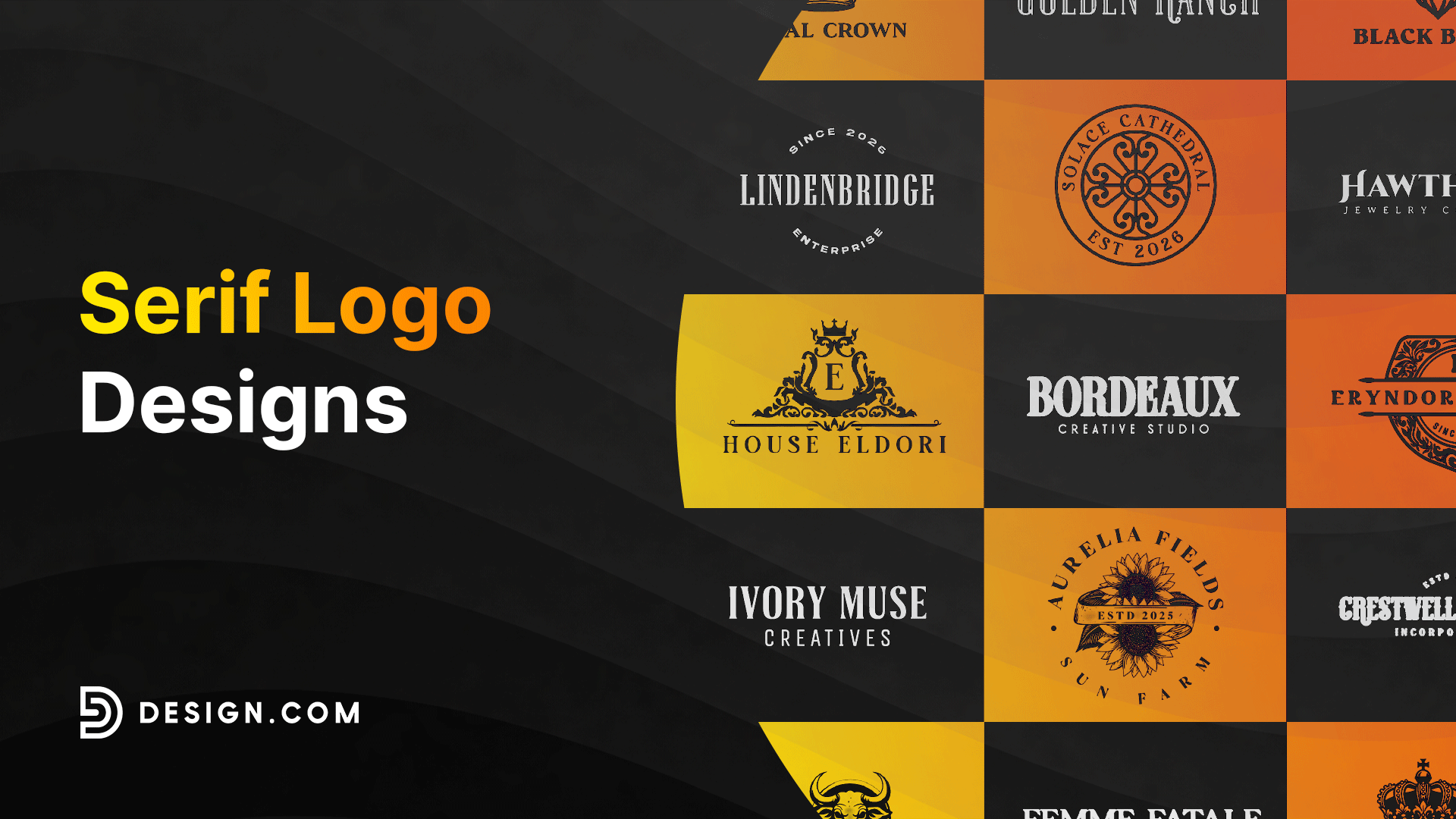
Serif logos come in all kinds of styles, but the common thread is that clean, classic letterform that instantly adds weight and personality to a brand. Some feel luxurious and editorial, others feel traditional and trustworthy, but all of them rely on typography to do the heavy lifting.
We’ve divided them into three major categories:
- Famous Serif Font Logos
- Wordmark Serif Logos
- Combination Mark Serif Logos
Famous serif font logos
Some of the most recognizable brands in the world rely on serif typography not just for style, but for identity, history, and trust. These logos have evolved over decades, yet the serif foundation has stayed at the core of their branding.
Mercedes-Benz
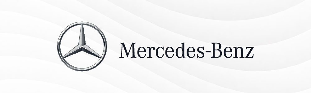
Mercedes-Benz is a German multinational company known for luxury vehicles, buses, and trucks, with a logo history dating back to 1909. One of its earliest versions featured a roundel and wordmark in white over a blue background using the serif style “Das Wappen von Mannheim”, meaning “The Coat of Arms from Mannheim.”
This serif font style is still part of its visual identity today. It’s a heritage serif wordmark, rooted in tradition and excellence.
GAP

GAP is a global clothing and accessories retailer founded in 1969, known for its casual and everyday apparel. Its serif wordmark, often associated with the Haas Unica typeface, gives the brand a clean, timeless retail presence.
The simplicity of the serif design keeps it approachable while still feeling established. This is a minimal retail serif wordmark, built for clarity and recognition.
ING Bank

ING Bank is an international financial institution headquartered in Amsterdam. Its serif-inspired identity traces back to the early 1900s, originally created by Dutch designer Fred Smeijers, who later donated the typeface to ING Group.
The logo also pairs with the iconic lion symbol, reinforcing strength and trust. This is a corporate serif wordmark, designed to communicate stability and credibility.
Tiffany & Co.

Tiffany & Co. is a luxury jewelry brand founded in 1837, with a long evolution of serif typography in its branding. One of its notable historical styles, “Tiffany’s New Roman Bold,” designed by Louis Comfort Tiffany, was used until 1999 before evolving into its current refined serif identity.
Its roots trace back to typefaces like Emerald by Morris Fuller Benton. This is a luxury editorial serif wordmark, focused on elegance and heritage.
Whole Foods

Whole Foods Market is an international supermarket chain founded in 1980, built around natural and organic living. Its serif wordmark was created in the early 1970s by Walter Landor, a pioneer in brand identity design.
The typography reflects trust, authenticity, and a grounded lifestyle approach. This is a friendly organic serif wordmark, built for warmth and reliability.
Vogue
Vogue is a global fashion magazine founded in 1892, with its serif logo evolving since 1909. The current print identity uses Bodoni Seventy Two, originally designed by Giambattista Bodoni in the 1700s. Its high-contrast serif styling gives it a bold, editorial, and high-fashion feel. This is a Didone serif editorial wordmark, known for elegance and drama.
The Wall Street Journal

The Wall Street Journal (WSJ), founded in 1889, has long used serif typography to reinforce its authority in journalism. Its logo is based on Caslon 540, originally inspired by William Caslon IV and rooted in classic 18th-century type design. The result is a highly traditional and trustworthy news identity. This is a classic editorial serif wordmark, built for credibility and legacy.
Rolex

Rolex, founded in 1905 by Hans Wilsdorf, is a Swiss luxury watchmaker known for precision and prestige. Its serif wordmark, Rolex Title, is inspired by historical typefaces such as Stempel Schneidler-Lubell Pro and Venetian old-style serifs.
Paired with its iconic crown, the typography reinforces luxury and craftsmanship. This is a luxury heritage serif wordmark, focused on exclusivity and refinement.
TIME

TIME Magazine, founded in 1923 by Henry Luce, has built its identity around strong serif typography and a red logo since its early print days in 1927. Its current logo uses Times New Roman, designed by Stanley Morison, one of the most influential serif typefaces in publishing history.
The bold serif styling gives it authority and clarity. This is a classic news serif wordmark, designed for impact and readability.
McKinsey & Company

McKinsey & Company is a global management consulting firm founded in 1926 by James O. McKinsey and Marvin Bower. Its serif logo has evolved over the years, with one of its major branding updates created by the New York design studio Chermayeff & Geismar, known for corporate identity and brand development.
The logo uses the serif typeface “McKinsey,” which is based on Bodoni Obelisk, a typeface by Italian typographer Giambattista Bodoni. The typography gives the brand a refined, intelligent, and authoritative feel, making it a strong example of a corporate editorial serif wordmark.
Wordmark serif logos
Wordmark serif logos are probably the most common serif style we see…. and honestly, it makes sense why. This is the type where the brand name itself becomes the logo. No icons, no extras, just clean serif typography doing all the work.
What we like about this approach is how straightforward it is. The serif details add just enough character to make it feel classic and trustworthy, while the simplicity keeps everything easy to read and remember. It’s a style you’ll often see with brands that want to feel established, confident, and timeless without overthinking the design.
Check out our wordmark logos here:
Simple Professional Brand by Design.com
Stylish Feminine Serif by Design.com
Retro Elegant Brand by Design.com
Western Ranch Antique by Design.com
Cosmetics Makeup Boutique by Design.com
Retro Professional Creative by Design.com
Feminine Cosmetics Stylish by Design.com
Retail Brand Boutique by Design.com
Premium Art Deco Brand by Design.com
Firm Brand Company by Design.com
Rustic Western Brand by Design.com
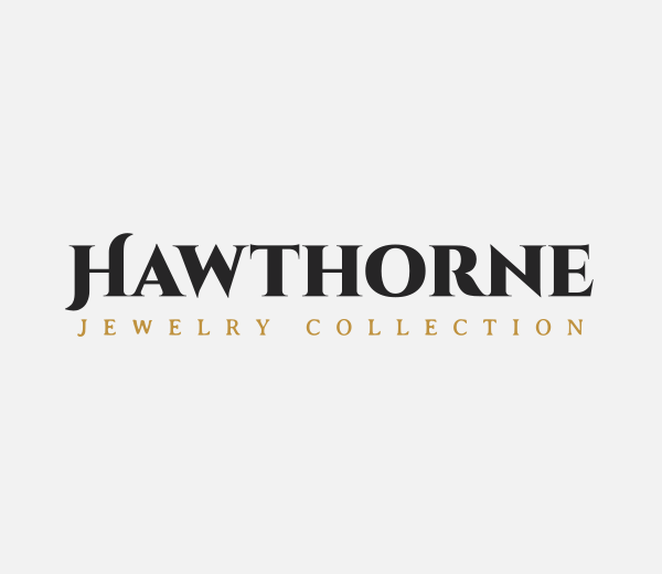
Luxury Swash Brand by Design.com
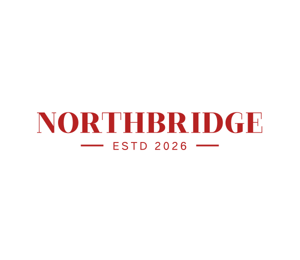
Serif Professional Consulting by Design.com
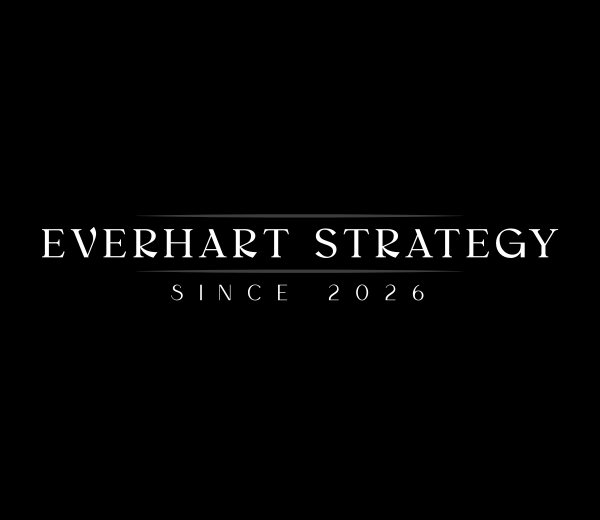
Generic Professional Consulting by Design.com
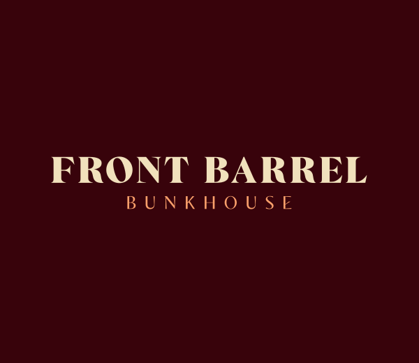
Antique Bistro Pub by Design.com
Generic Serif Company by Design.com
Serif Professional Consulting II by Design.com
Minimalist Luxury Serif by Design.com
Professional Serif Brand by Design.com
Professional Premium Brand by Design.com
Combination serif logos
Combination serif logos are where things get a bit more flexible. Here, we pair serif typography with a symbol or icon, so the logo has two parts working together—the name and a visual mark.
This works really well because we’re not relying on just one element to carry the identity. The serif text brings that sense of tradition and trust, while the icon adds personality or meaning. And the best part? We can use them together or separately, depending on where the logo appears, making this style super practical for real-world branding.
Western Bull Skull by Design.com
Honey Bee Apiary by Design.com
Hairstylist Barber Comb by Design.com
Royalty Crown Ornate by Design.com
Luxury Deco Boutique by Design.com
Royal Beard King by Design.com
Candle Jar Fragrance by Design.com
Griffin Crest Shield by Design.com
Regal Lion Crown by Design.com
Luxury Lion Boutique by Design.com
Sunflower Farm Agriculture by Design.com
Shield Crest Insignia by Design.com
Floral Decorative Brand by Design.com
Violin Instrument Music by Design.com
Elegant Leaf Ornament by Design.com
Hipster Brewery Badge by Design.com
Christian Church Cross Chapel by Design.com
Royalty Ornament Jewelry by Design.com
Luxury Royalty Crest by Design.com
Conclusion
Serif logos show us that good design doesn’t have to be complicated to be powerful. With the right typography, a brand can feel timeless, trustworthy, and instantly recognizable.
If you’re ready to create your own serif logo, check out Design.com to get started and explore creative ideas using AI-powered tools. You can easily experiment with different styles and bring your brand vision to life in just a few clicks.
Get started today!