We Tested 5 AI Logo Generators Using the Same Prompt — Here’s What Happened
If you’ve been looking for the best AI logo generator for your business, you’ve probably already read tons of roundups and comparison articles trying to find it.
And you probably noticed one thing: all these articles sound exactly the same. They gather all the popular tools, list the features and pricing, and call it a day.
But the problem is that it doesn’t actually tell you which tool is the best AI logo generator.
So instead of creating another “best AI logo generators” list, we decided to run an experiment.
We wanted to approach this scientifically, so we used five popular logo maker tools and gave them the exact same prompt to see how each would perform.
We wanted to test whether the logos are actually good, on-brand, and whether the AI listens to our instructions, and how much editing flexibility each platform offers.
With this, we can then prove which AI logo generator is actually the best (with data and science backing our claims) and not just simply list them based on popularity.
Let’s get to the experiment, shall we?
The rules of the AI logo experiment
To evaluate each platform fairly, we asked every tool to complete the same task: create an AI-generated logo for a fictional sustainable skincare brand called Rooted Radiance.
To ensure a consistent comparison:
- We used the same brand across all platforms.
- We provided the same creative brief wherever possible (some platforms use guided questionnaires rather than a traditional prompt field).
- We evaluated the initial logo concepts generated by each platform, rather than heavily edited final versions.
- We assessed the customization options available after selecting a logo, including the editing tools and controls provided.
- We did not add extra instructions or adjust advanced settings, focusing instead on the experience and results a typical user would receive.
The prompt used throughout the test was:
“Create a logo for a brand called Rooted Radiance, which is a sustainable skincare brand. Create a logo that balances beauty and sustainability. The logo should feel elegant, premium, modern, and natural.”
The scoring system
Each logo generator was judged by these criteria for a total of 100 points.
| Criteria | Score | What We Are Looking For |
| Brand Relevance | 25 | Does the AI logo match the brand brief? |
| Visual Quality | 20 | Does it look professional and polished? |
| Creativity and Originality | 15 | Does it avoid generic, predictable designs? |
| Ease of Use | 10 | Is the platform easy to use and navigate? |
| Customization | 10 | How much editing control does the user have after generation? |
| Speed | 10 | How quickly does the AI produce the designs? |
| Logo Variety | 10 | How many meaningful options does the platform provide? |
We gave the highest weighting to Brand Relevance because a logo’s primary purpose is to represent a brand. For Rooted Radiance, that meant capturing both sides of the identity: sustainability and skincare.
For Visual Quality, we recognized that all of the logos were AI-generated, but that didn’t lower our expectations. We looked for designs that felt polished, cohesive, and professional – not random combinations of icons, awkward layouts, or glitchy text. Strong logos achieved a balanced use of color, shape, typography, and composition.
Creativity was another important factor. Did the AI rely on generic skincare logo tropes, or did it produce something more original and distinctive? Logos that felt unique and memorable scored higher than those that simply followed common industry conventions.
Ease of Use and Customization focused on the user experience. How beginner-friendly is the platform? How much control does it give users to refine and edit their designs? We assessed the range of customization options and how easy they were to use.
Finally, we included Speed and Logo Variety because business owners need both efficiency and choice. A good logo generator should deliver results quickly while providing enough options to help users find a design that matches their vision. Platforms that took a long time to generate logos or offered only a limited selection received lower scores.
Best AI logo generator — experiment results
In a nutshell: Design.com and BrandCrowd were the clear winners of our AI logo generator test, significantly outperforming Canva, Adobe Express, and Wix Logo Maker. Both platforms produced highly relevant, visually polished logos, generated far more design options, and offered superior editing flexibility.
Wix delivered decent results but lacked the creativity and variety of the top two, while Canva and Adobe Express struggled with generic concepts, limited customization, and occasional text glitches. If you’re looking for the best overall AI logo generator, Design.com came out on top, with BrandCrowd a close second.
1. Design.com – Best for on-brand logos
Score:
- Brand Relevance: 25/25
- Visual Quality: 20/20
- Creativity: 14/15
- Ease of Use: 10/10
- Customization: 10/10
- Speed: 10/10
- Logo Variety: 10/10
Design.com’s AI logo generator is the first we tried.
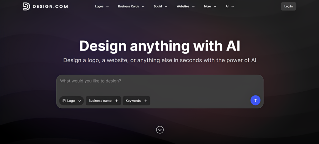
The tool is really easy to navigate. As soon as you get to the site, you are greeted with a prompt box where you can enter the prompt.
You can also set it to produce a logo, business card, website, etc. Then just add the business name and keyword, instead of writing out a whole prompt. But since we want to keep everything similar, we entered the agreed-upon prompt from earlier.
Here are the results:
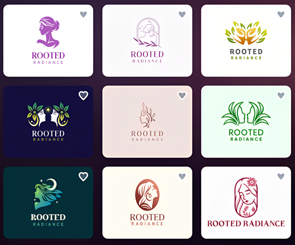
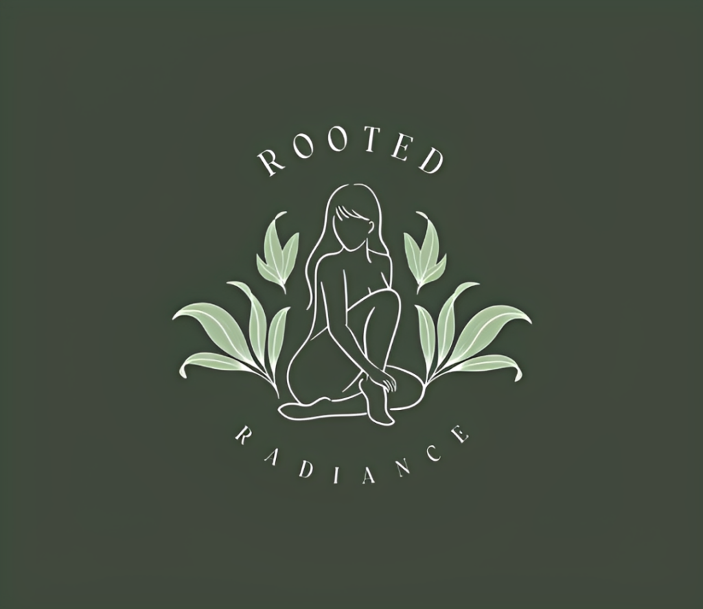
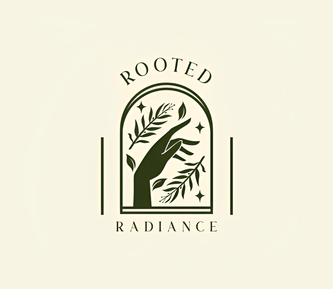
Design.com scores really high on brand relevance. They managed to hit both the sustainable and skincare elements in one logo, without making it look forced or out of place.
The sheer variety is also a plus – the tool generated thousands of logos, unlike other tools that only generate a handful. If you’re the type to want to explore different styles before committing to one, Design.com is a great option for you.
Variety in terms of art style is also superb. As you can see above, there is a great mix of colors, style, typography, and layout. None of the logos look identical to each other.
There are also no obvious “AI” tells. The text is spelled correctly and doesn’t have any weird smears or glitches, and every icon looks polished and clean. No extra fingers, no weird eyes – nothing. Every design just looks like a handcrafted logo, which is exactly what we are looking for.
Speed is also top-notch. It took less than 2 seconds for the tool to produce the designs.
Now, how about the editing?
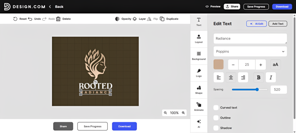
What’s great about Design.com is that you can edit every element of the logo individually and manually. You can change the color of the icon, make the background a gradient, change the font of the text, move things around – whatever you want.
You can also do edits via an AI chat, instead of doing it manually. The AI is trained to do copyright-safe edits only, so no need to worry about the AI accidentally going rogue and adding elements that are not safe to use. It will also automatically adjust other elements for you to ensure that the design remains visually harmonious, or give you design suggestions. A pretty handy feature if you ask us!
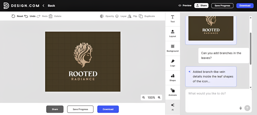
Another notable thing to mention is that all editing and generation are free on the Design.com platform. You can have the AI generate new logos or make edits absolutely free. This, combined with all the other good things we found earlier, easily puts them in our #1 spot.
All in all, a really great start to our experiment. It’s going to take a lot to take the crown away from Design.com.
2. BrandCrowd – Best for creative logos
Score:
- Brand Relevance: 23/25
- Visual Quality: 19/20
- Creativity: 15/15
- Ease of Use: 10/10
- Customization: 10/10
- Speed: 9/10
- Logo Variety: 10/10
Next on our list is BrandCrowd.
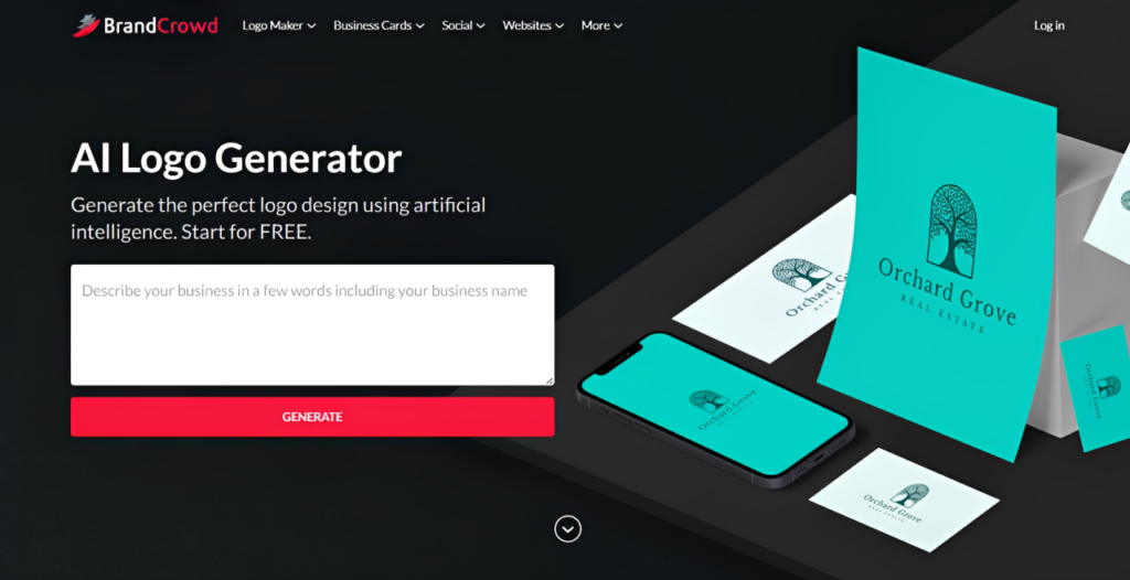
Just like with Design.com, BrandCrowd is really easy to navigate. You get to the home page of the AI logo generator, where you can enter your prompt, then wait for the logos. Pretty straightforward as there are no other settings or buttons to tinker about.
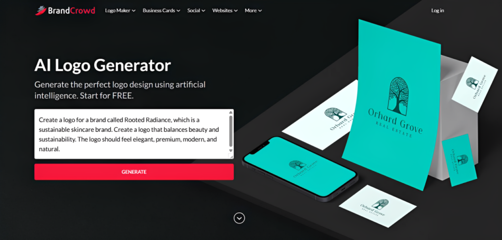
There’s almost no waiting time involved – it took just about 2 seconds for the logos to come up once you hit “Generate”. It’s really fast, which is great if you don’t have a lot of time to waste.
Here are some of the results. Just like Design.com, they generate thousands of logos in one go, so there are a lot of options to choose from:
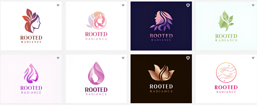
And just like Design.com, all of the options are great. There is a great variety in terms of color schemes and typography styles.
BrandCrowd also checked off both sustainability and skincare elements in our list. The designs look intentional and well-thought-out, rather than just shoving in a leaf to make it look “eco-friendly”.
BrandCrowd also impressed us with its creativity. They have given bolder and more unique designs compared to the other tools in our experiment. Just look at these samples:
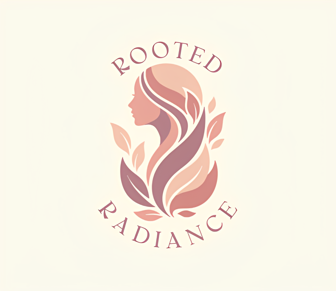
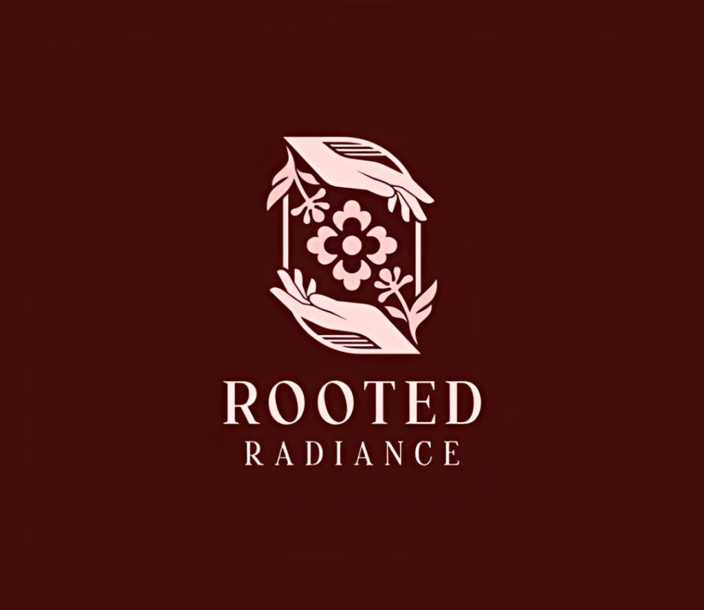
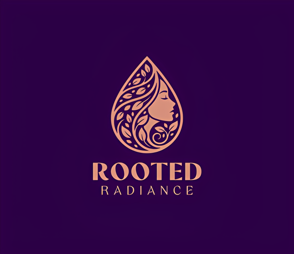
You can see that there is a lot more work and detail done into these logos, which makes them look more handcrafted and less like a simple AI generation. All text and icons are also clean, again avoiding that weird glitchy AI look.
Now, let’s dig into their editing tools. BrandCrowd has a simple and intuitive editor. You can also freely edit every element (unlike some other tools where the AI logo is one finished image that you can’t micro-edit), so you can easily personalize the logo as you please.
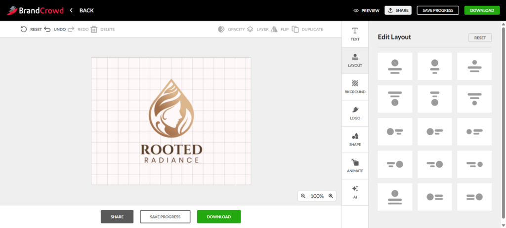
BrandCrowd also provides an AI editing feature where you can make edits with simple prompts. They also offer preset layouts and animation styles, if you want to make editing easier for you.
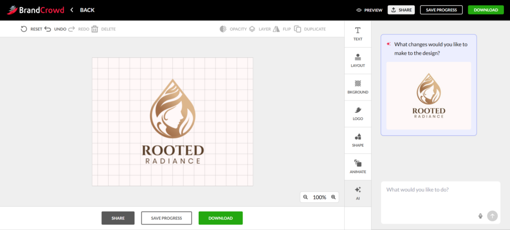
So, how did we find the BrandCrowd tool? Really great, especially in terms of visual quality and creativity. Brand relevance is also very high, but could be better, since we noticed that as we scroll more and more into their options, the relevance declines a bit. Some of the logos near the 300+ mark just started to zero in on either leaves or woman icons.
But still, the logos generated are very professional and high quality. There are thousands of options, and we think you can find a fantastic logo from the first page of results. But for now, BrandCrowd sits just below Design.com in our rankings.
3. Canva – Best for beginner-friendly editing
Score:
- Brand Relevance: 20/25
- Visual Quality: 16/20
- Creativity: 12/15
- Ease of Use: 9/10
- Customization: 7/10
- Speed: 9/10
- Logo Variety: 7/10
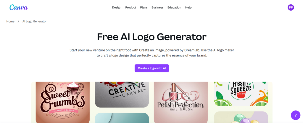
Canva is the tool that most users are probably familiar with, as it is highly popular owing to their wide range of templates and beginner-friendly editor.
The process was straightforward. You go into the AI logo maker, enter the prompt, and then wait for the results. Very simple and easy.
However, right from the start, we already found the chink in Canva’s armor. The generation time is slow. Not extremely slow, but it does take a while for them to load. Not good if you’re busy (or impatient).
Then you only get four options at a time. It feels pretty limiting to wait for a long time, then only get four options.
And if you want more options, you can regenerate, but take note that it will eat up your monthly AI usage credits.
Now for the quality of the logo. The results are ok… if not a bit bland. They did get the color palette and typography right. The overall premium and minimalist logo feel is also pretty spot on. But Canva’s AI focused on “sustainability” too much, because every result just had a leaf. Where are the skincare elements?
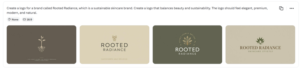
“Sustainability” is also a pretty generic interpretation. At this point the logos can be used for an environmental organization or a vegan snack and you wouldn’t really notice a difference. It’s not particularly on brief for Rooted Radiance itself.
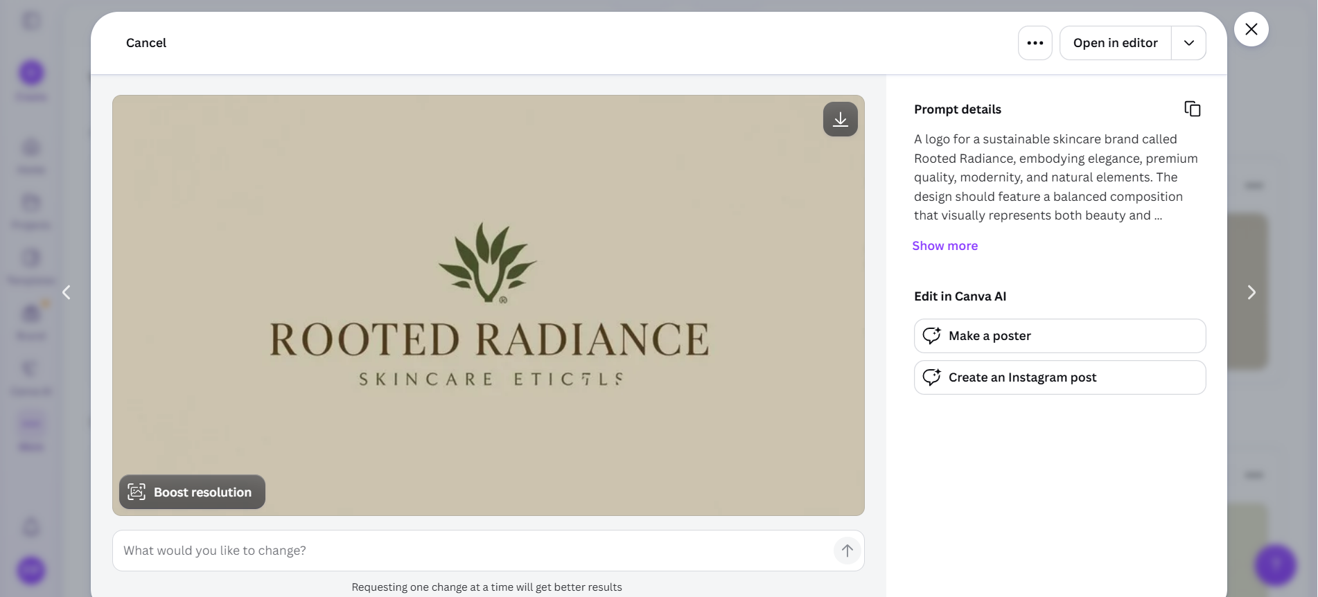
The text on the logos also glitched a bit. Look at the “Eticals” here; some of the letters become unreadable. Of course, this can be fixed eventually, but if we are talking first results, then they get minus points.
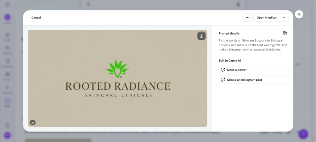
Now for the editing. If you want to make changes to the AI logos, enter prompts in the “What would you like to change?” bar below the image. This is where we changed the color of the leaves and fixed the glitch in the text as well. Sadly, every prompt or edit you do here also consumes credits.
Now if you want to add more elements (and do it hands-on), you can go to the manual editor. This is one of Canva’s strong points. The editor works like their other tools, so if you have any previous experience editing on Canva, this should be a breeze for you. If not, the tool is really straightforward to understand. You just need to click the elements you want to edit or drag them around to move.
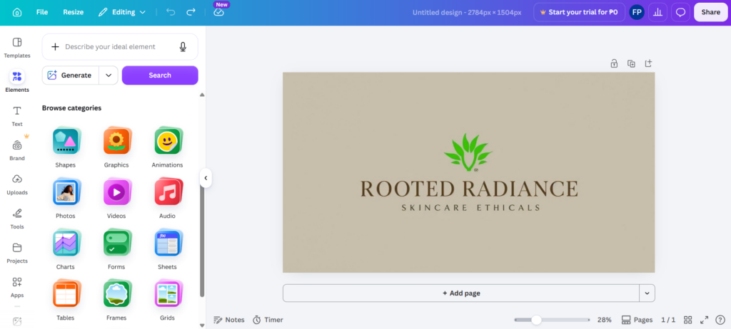
However, keep in mind that the AI logo is already one finished piece once you get inside the manual editor. You can’t change the “Skincare Ethicals” text here, or move the leaf icon below, or change the color to a different green, unlike in Design.com or BrandCrowd, where you can change every element manually at all times.
On the manual editor, you can only add elements, crop, and change the corner shape of the logo – basically just edits you can do on that one finished image.
All in all, a pretty mediocre run for Canva’s AI logo generator. We would recommend their normal customizable templates over this AI one.
4. Adobe Express – Best for quick AI concepts

Score:
- Brand Relevance: 17/25
- Visual Quality: 15/20
- Creativity: 11/15
- Ease of Use: 9/10
- Customization: 8/10
- Speed: 10/10
- Logo Variety: 6/10
Adobe Express is Adobe’s answer to the beginner-friendly and template-based editing tools that are on the market right now. Think of it as a more lightweight and less complicated version of Photoshop.
Considering Adobe’s reputation, we have high expectations on their AI logo generator. Will they meet them? Let’s check it out.
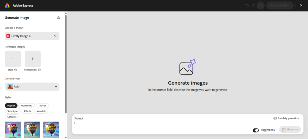
The process is simple, like the others. Once you click “Generate Now” on their homepage, you will get redirected to this screen, where you can enter the prompt. As per the experiment rules, we entered the same prompt as usual for Rooted Radiance.
Here are the results. It’s… fine. It doesn’t exactly scream “logo”, unlike what we’ve seen from the previous tools. This one feels more fitting as a hero image for an illustrated poster or a social media graphic than a logo.
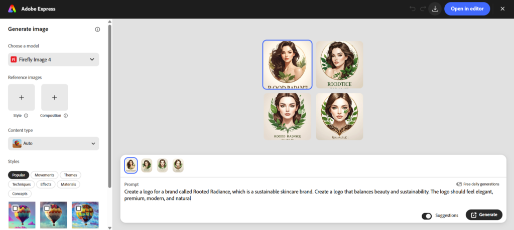
And something about this particular shiny art style also feels very “AI” to us. If you are trying to avoid your logo looking obviously AI-generated, this might not be a great option for you.
Their logos also suffer from the same glitchy text error that we saw in Canva. Their AI couldn’t even spell out the name “Rooted Radiance” properly. Minus points.
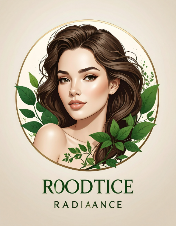
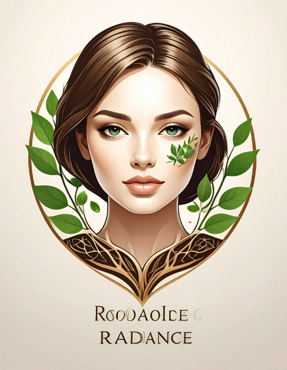
We are also pretty disappointed that all the logos look essentially the same. Same color palette, same layout, same art style. There’s no variety. And just like Canva, there are only four options per generation available. And like Canva, every prompt and additional edit will cost you credits. Considering the results, you’re going to run out of credits fast just trying to get a workable design.
Now, what are the positives? They do edge Canva out in terms of getting the brief correct – they both include the skincare and sustainability elements. The generation is also really fast, unlike Canva.
You can also add more settings for the results to be more accurate with what you want. For example, you can add a reference image for both the style and composition, or change the styles from the preset available. So if you want the results to look like a pencil drawing or to look like it was made from clay, that is all possible with Adobe Express.
However, while we do give them bonus points for that, we are looking at it through a beginner or a busy-entrepreneur lens. Would you really think to tinker with the setting? Do you have the time to look through and experiment with the different style techniques? Probably not. You’ll probably just head straight to typing your prompt. So, looking at this with the first result view (as in no editing, no added settings), it’s pretty bad.
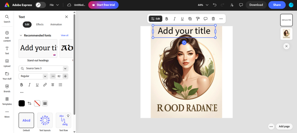
Just like with Canva, manually editing every element of the AI logo in Adobe Express is not possible in the manual editor. You’ll need to send prompts to edit them, say “change the background into a dark pink” or “change the girl icon”, etc. Or you can enter a completely different prompt for Rooted Radiance. You can only add elements in the manual editor, such as a frame or additional text.
5. Wix Logo Maker – Best for guided logo creation

Score:
- Brand Relevance: 21/25
- Visual Quality: 17/20
- Creativity: 13/15
- Ease of Use: 9/10
- Customization: 9/10
- Speed: 8/10
- Logo Variety: 8/10
Wix Logo Maker (now called Wixel) is a questionnaire-based logo maker tool, unlike the others on the list.
To get a logo, users need to answer a series of guided questions from Wixel. Things like “What is the name of your business or brand?”, “What is your industry in?”, and so on. All this information is then gathered by their AI to deliver tailored results.
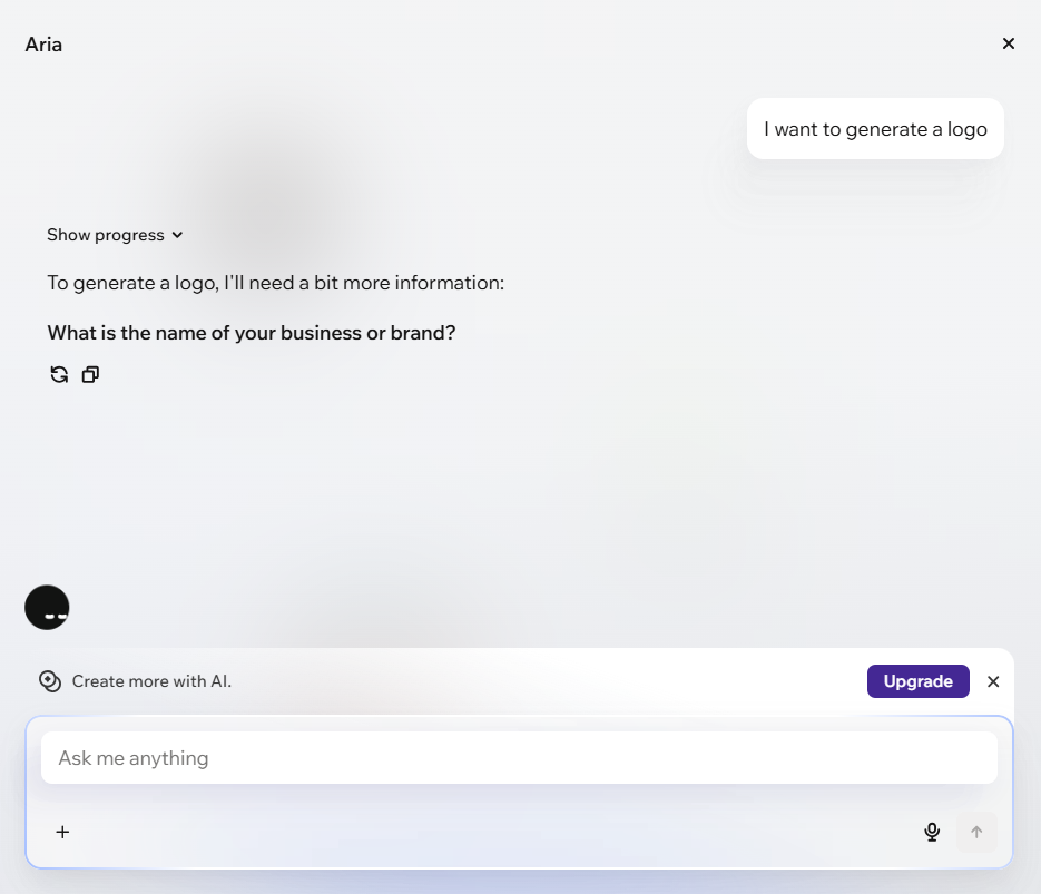
So we tried it out for Rooted Radiance. We answered their questions step by step, rather than sending the one prompt as we did before. Of course, we tailored our answers to still give the same information.
Here are the results:
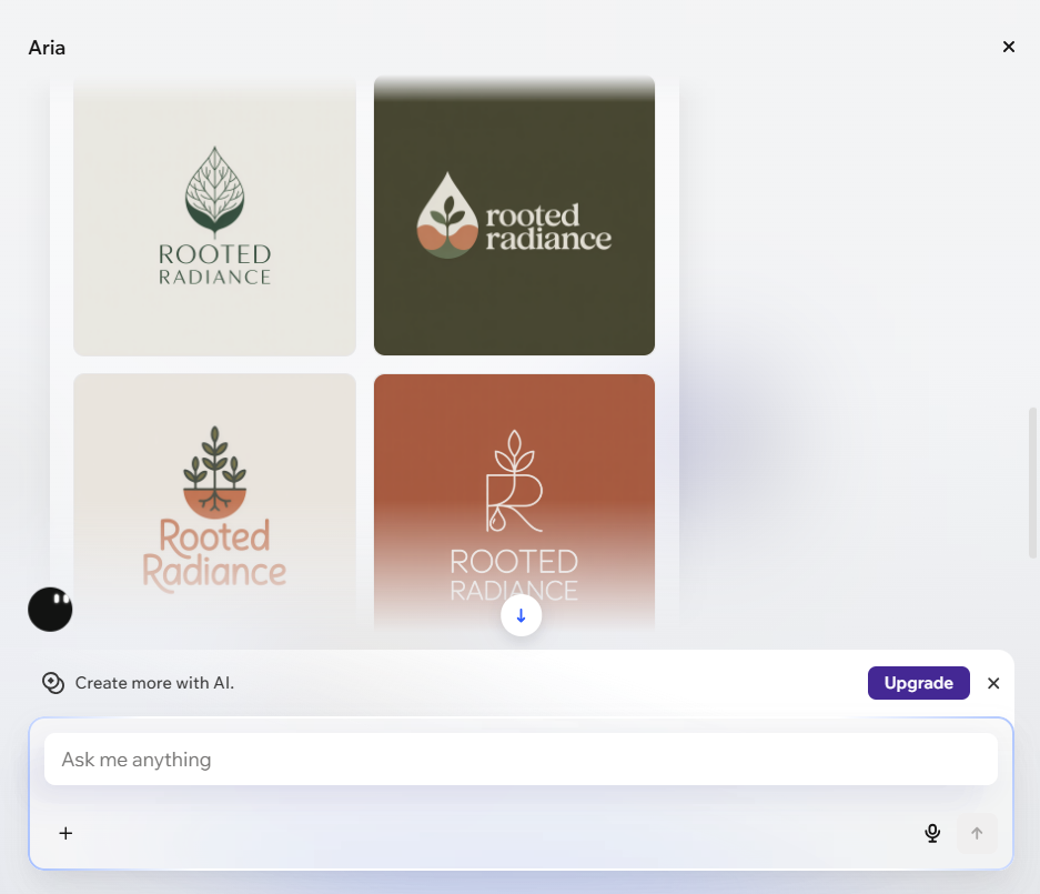
Just like Canva and Adobe Express, Wix offers only 4 options per generation. Though we find them better than both in terms of variety. You can see a mix of layouts, typography, colors, and styles that still align with the sustainable skincare brief.
“Rooted Radiance” is also spelled properly, without any glitches. Plus points for that.
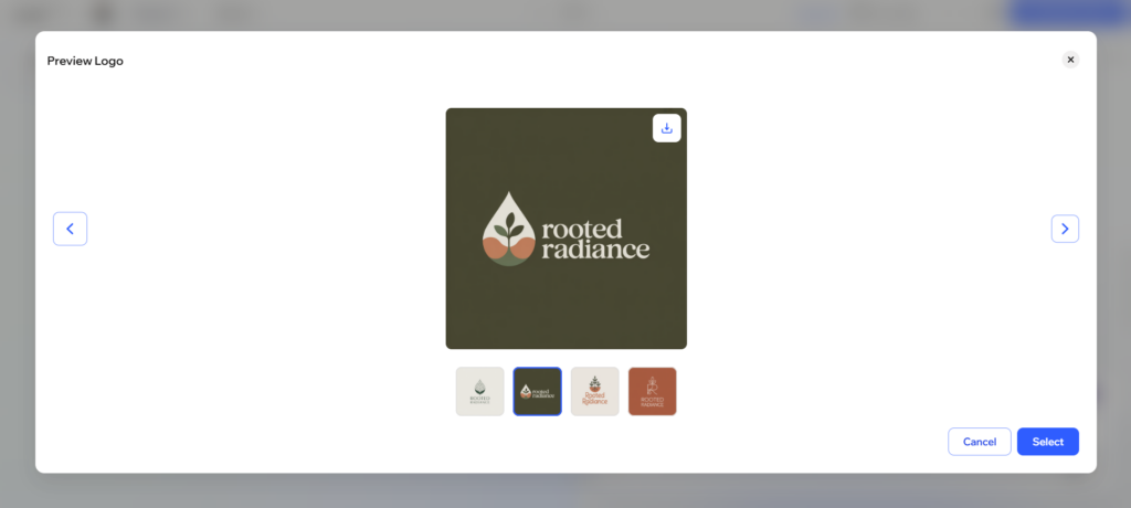
What we noticed, though, is that Wixel is really slow on generation. Even slower than Canva. We suppose it’s a trade-off for getting more accurate results, but it’s really slow.
Now for the editing. You can change the elements of the logo manually or via AI in Wixel, like in Design.com and BrandCrowd. We also appreciate that every element that can be changed is marked in the editor, so it’s more intuitive for beginners.
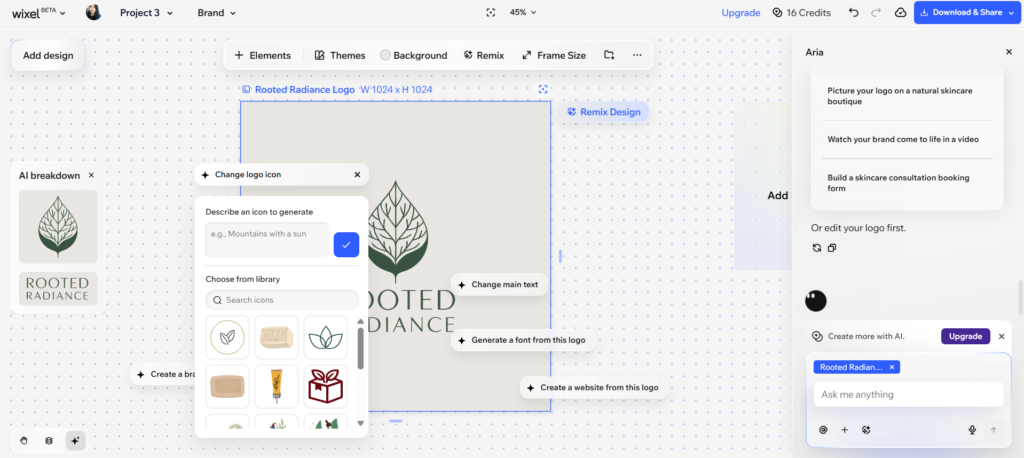
So if you want to change the icon, you can do so. You can choose from the library of available assets (which are already sorted into relevant ones) or have the AI generate an entirely new icon (which costs credit, unlike Design.com).
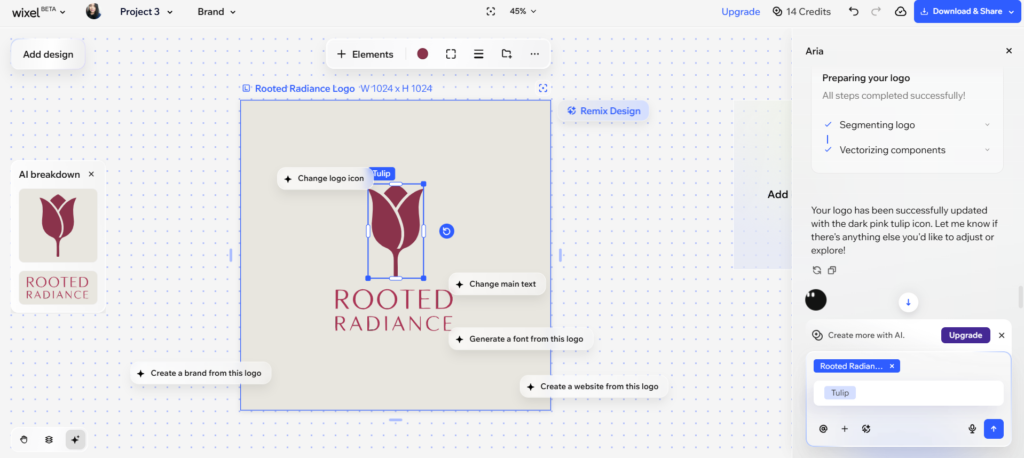
For example, changing the leaf into a generated pink tulip here costs 2 credits. But changing the color of the “Rooted Radiance” text from the available colors cost zero.
Now does this mean we like Wixel the best? Compared to Canva and Adobe Express, then yes Wixel is better.
But overall Design.com and BrandCrowd still have the edge for us. The lack of logo options really limits Wixel. And having every generation and AI editing to cost credits can add up to a lot.
The logos Wixel gave are fine but are a bit bland. And we tested out Wixel before for different types of brands and their logos really lean towards the simpler side (so no, it’s not a matter of prompt).
It works now for Rooted Radiance since it’s a more minimalist brand but if your logo needs to look bolder or more creative, you’ll need to spend more time editing it (which means needing to generate more assets and thus eating up your credits).
Best AI logo generator — Final results
After testing all five AI logo generators using the exact same Rooted Radiance brief and noting down their performance, we got this final scoring:
| Tool | Brand Relevance (25) | Visual Quality (20) | Creativity (15) | Ease of Use (10) | Customization (10) | Speed (10) | Logo Variety (10) | Total |
| Design.com | 25 | 19 | 14 | 10 | 10 | 10 | 10 | 98 |
| BrandCrowd | 23 | 20 | 15 | 10 | 10 | 9 | 10 | 97 |
| Wix | 21 | 17 | 13 | 9 | 9 | 8 | 8 | 84 |
| Canva | 20 | 16 | 12 | 9 | 7 | 9 | 7 | 80 |
| Adobe Express | 17 | 15 | 11 | 9 | 8 | 10 | 6 | 76 |
Design.com emerged as the clear best AI logo generator, with BrandCrowd right behind.
This is because Design.com consistently generated logos that balanced both skincare and sustainability, produced the widest variety of results, and offered the most flexible editing experience. While BrandCrowd delivered some of the most visually impressive and creative concepts in the experiment, Design.com ultimately provided the strongest combination of relevance, usability, customization, speed, and variety.
That’s not to say BrandCrowd is far behind. In fact, if your top priority is creativity and visual polish, BrandCrowd may be the better choice. But if you’re looking for the best all-around AI logo generator—one that can understand your brand, generate thousands of options, and give you complete control over the final result—Design.com takes the crown in this experiment.
How about our other key findings?
We found that not all AI logo generators interpret brand briefs equally well. Canva and Adobe Express both understood parts of the prompt, but leaned too heavily into either sustainability or beauty rather than balancing both. Their results also contained spelling glitches and other obvious AI marks, which hurt their scores. Wix did understand the brief, but the logos they produced are still too bland for our taste.
Logo variety proved to be a great differentiator. While Canva, Adobe Express, and Wix produced only four concepts at a time, Design.com and BrandCrowd generated thousands of distinct logo options, making it much easier to explore different creative directions without repeatedly regenerating results (and thus wasting credits).
Conclusion
At the start of this article, we said we were tired of AI logo generator roundups that simply list features and pricing plans.
After running this experiment, we’re even more convinced that features alone don’t tell the whole story.
What truly matters is whether the AI can understand your brand and turn it into a logo that actually feels relevant.
For Rooted Radiance, Design.com delivered the strongest overall performance. It consistently generated logos that balanced sustainability and skincare, offered the widest range of options, and gave us the most flexibility when it came to editing and customization. It’s truly the best overall option for small business owners and entrepreneurs.
So if you’re ready to create your own brand logo or company logo, why not put it to the test? Enter your business name, describe your brand, and see what Design.com’s AI comes up with. Your great new logo could be just a few clicks away!